
Margin Club
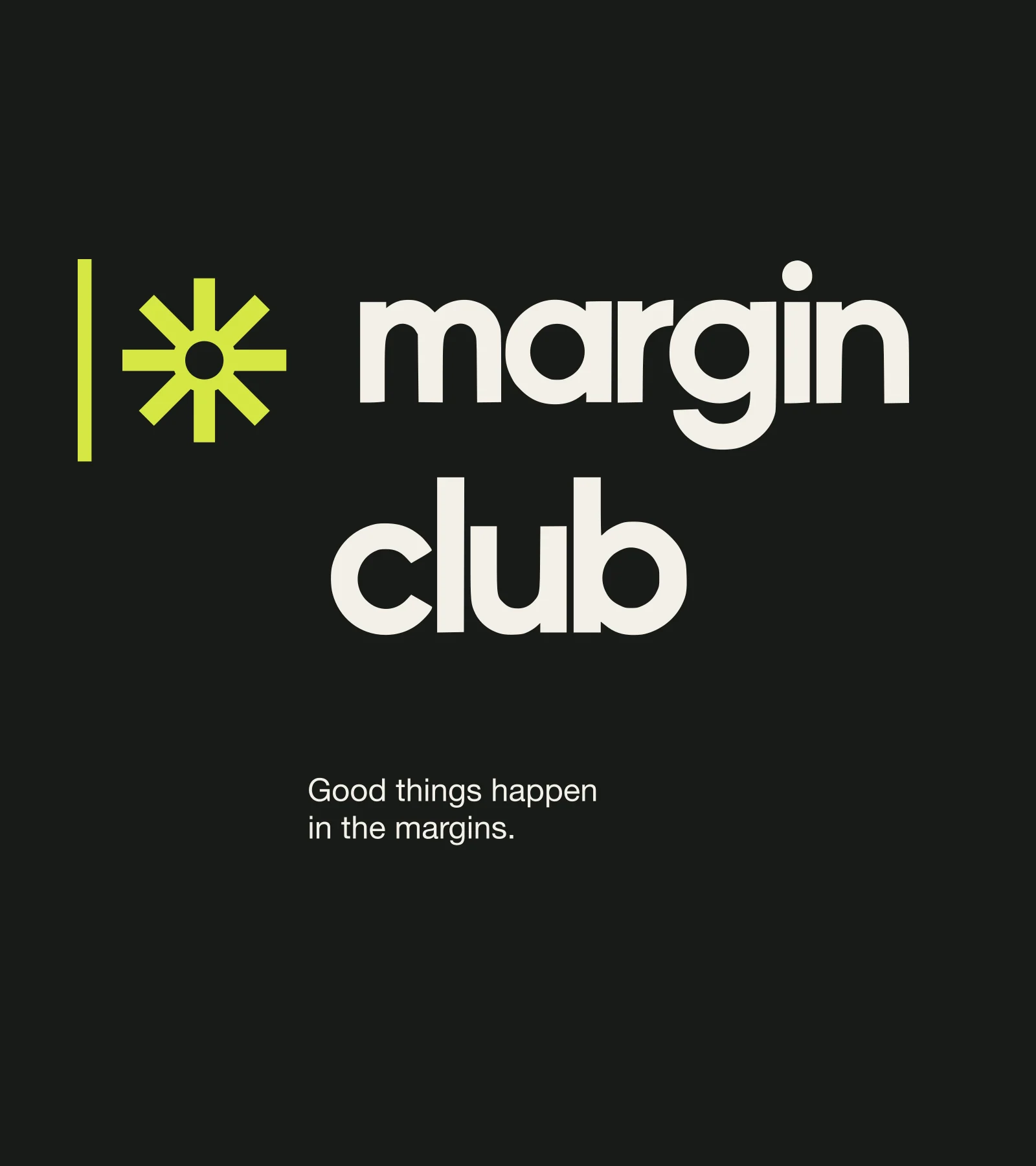
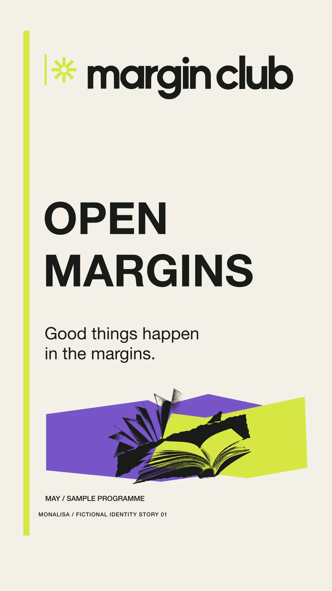
Good things happen in the margins.
SELF-INITIATED CONCEPTFICTIONAL BRAND / 2026

Interesting conversations happen in the margins: readings, exhibitions, screenings, and independent publishing.
The imagined audience is made of readers, independent publishers, and curious neighbours looking for a place to read, talk, and make.
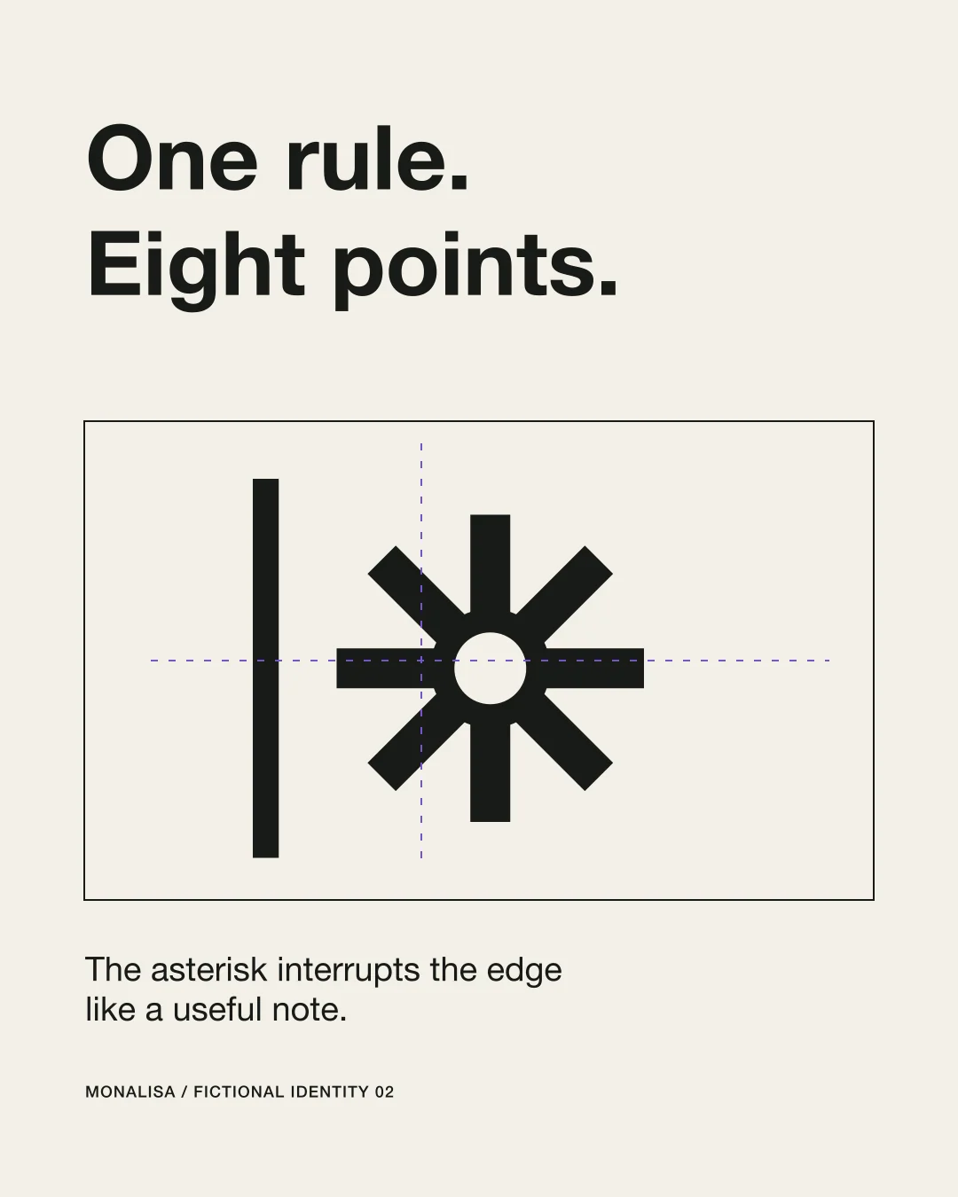
The margin is an active social space. A vertical rule becomes the edge of the page; an eight-point annotation asterisk interrupts it like a note worth following.
- Audience
- Readers, independent publishers, and curious neighbours who want a cultural space for conversations that continue off-page.
- Design scope
- Visual identity, Application artwork, Social series, Motion
- Project type
- Self-initiated identity exploration. Fictional business.
Room for another thought.
A margin rule and an open asterisk make a small space for books, annotations and conversation.

A place to look a little longer.
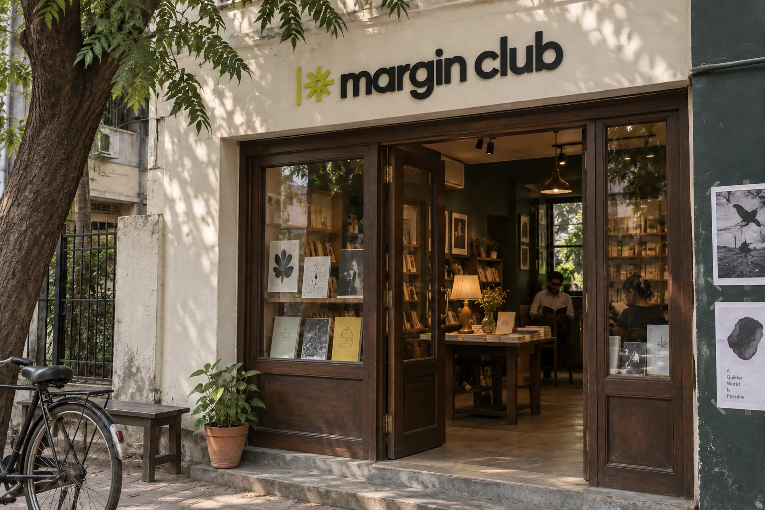
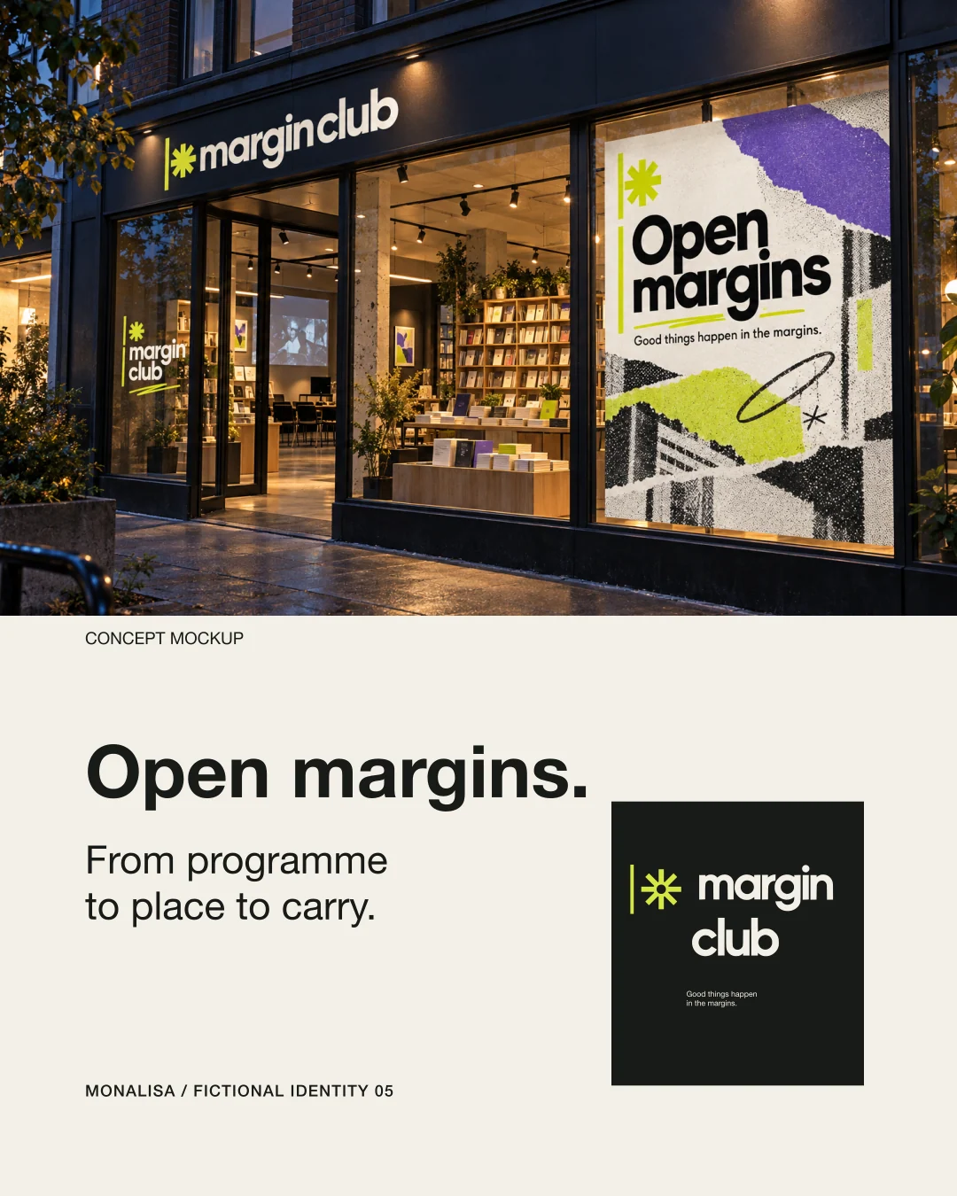
A simple fascia and a generous threshold put the identity at the scale of a neighbourhood bookshop.
Ink with a live edge.
Ink and Ivory hold the reading experience. Chartreuse marks the interruption; Violet gives one secondary field room to move.
Primary type, rule, tote, and high-contrast field.
Margin rule, annotation asterisk, navigation marker, and small interruption plane.
Paper, programme/page base, poster ground, ticket and card face.
Secondary collage plane and one event/category accent.
Helvetica Neue
Print that invites participation.
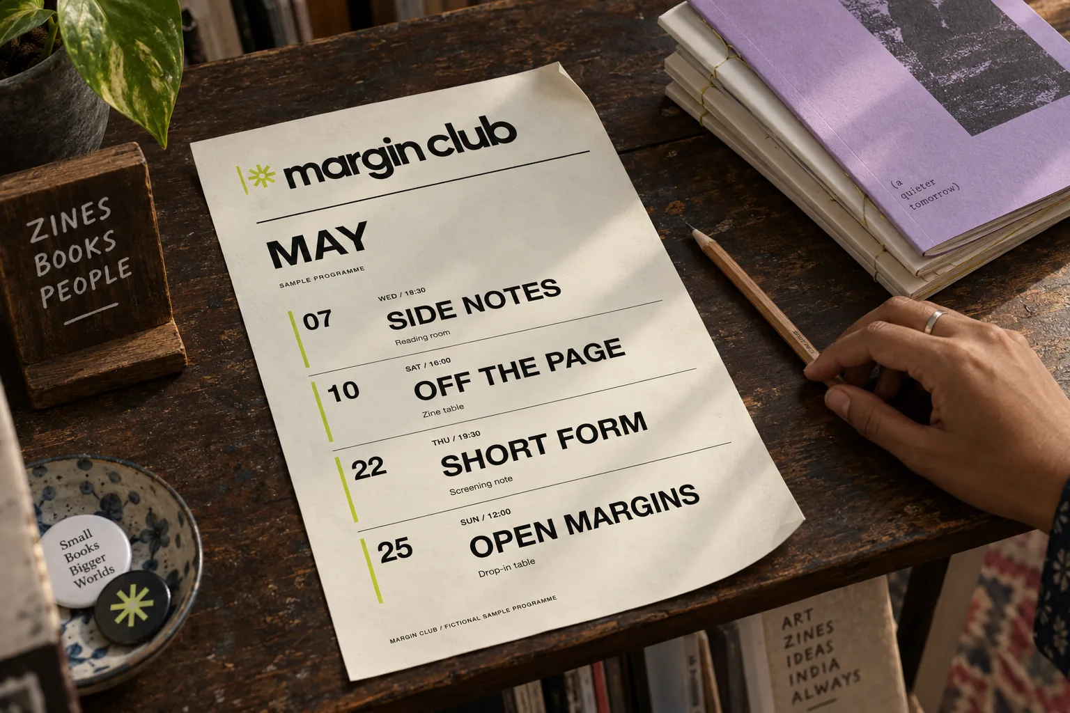
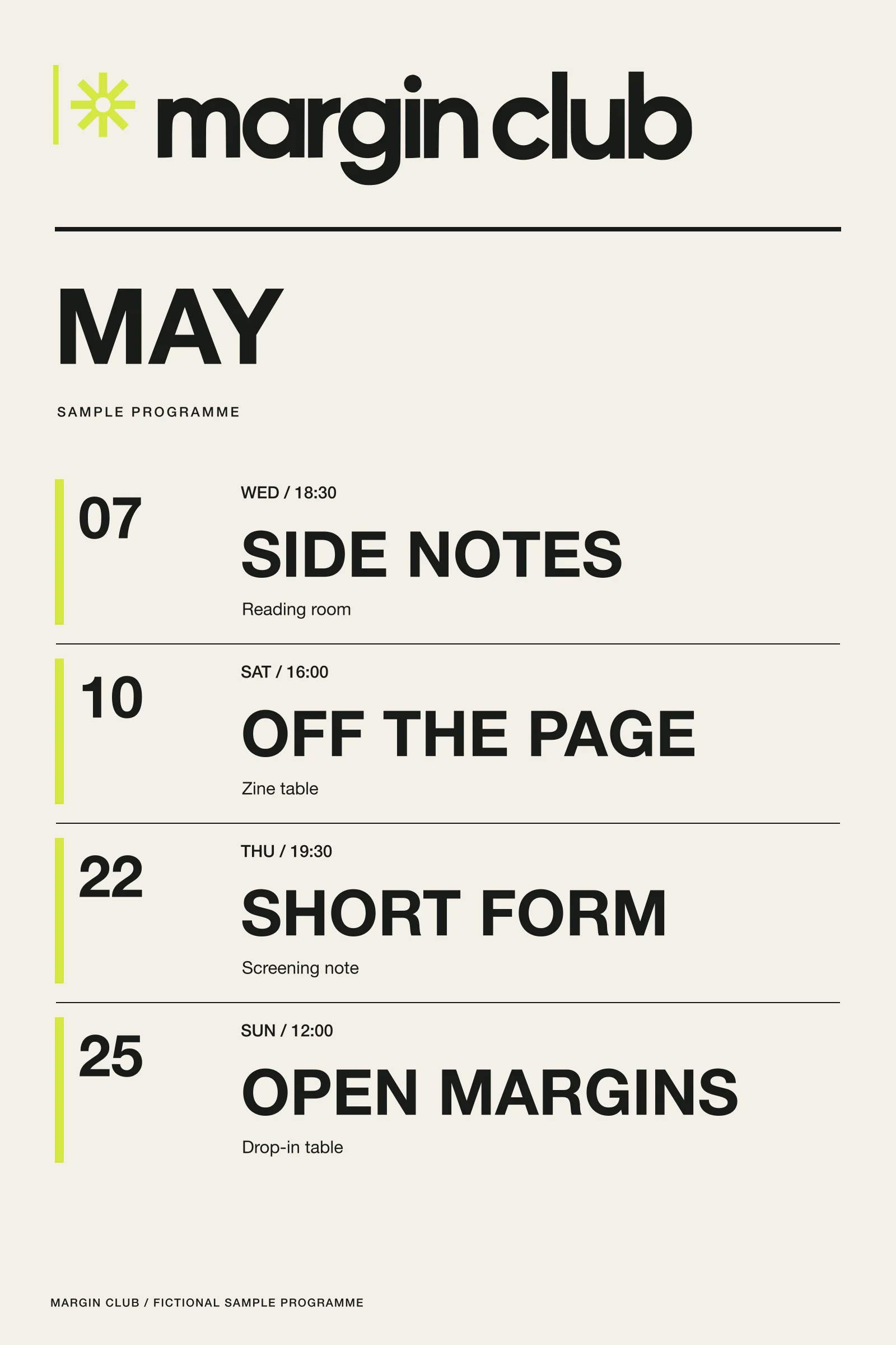
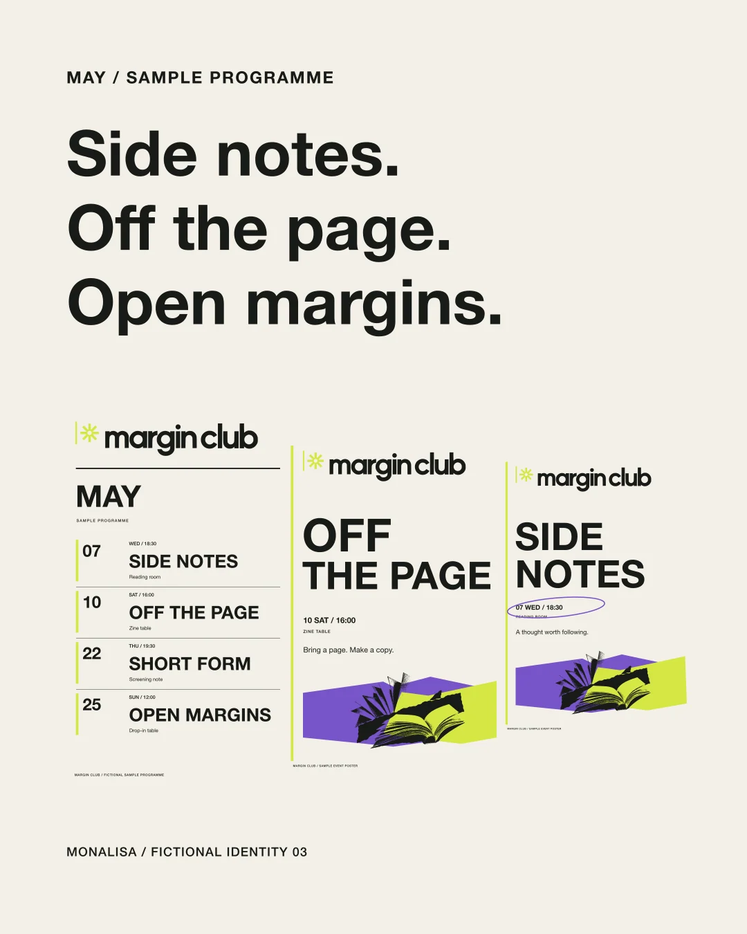
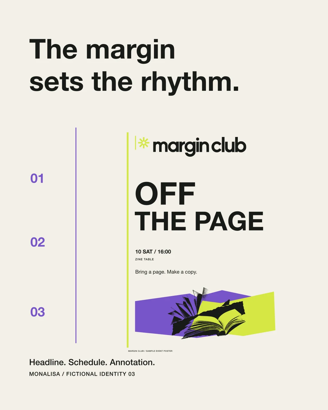
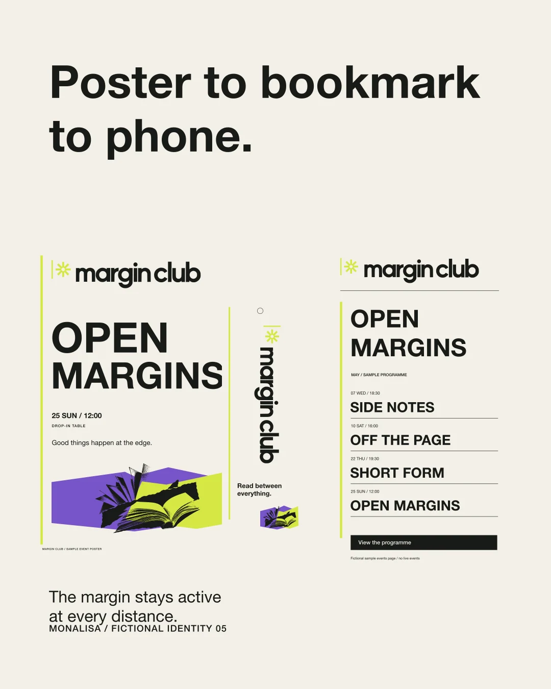
The programme behaves like a useful piece of paper: clear dates, confident titles and a bright margin that keeps everything in place.
A small movement. A distinct character.
A short, silent animation built from the same vector identity. The poster provides a still alternative.
Download the filmTHE COMPLETE IDENTITY SYSTEMGo a little deeper.Explore the full artwork, applications and social series.
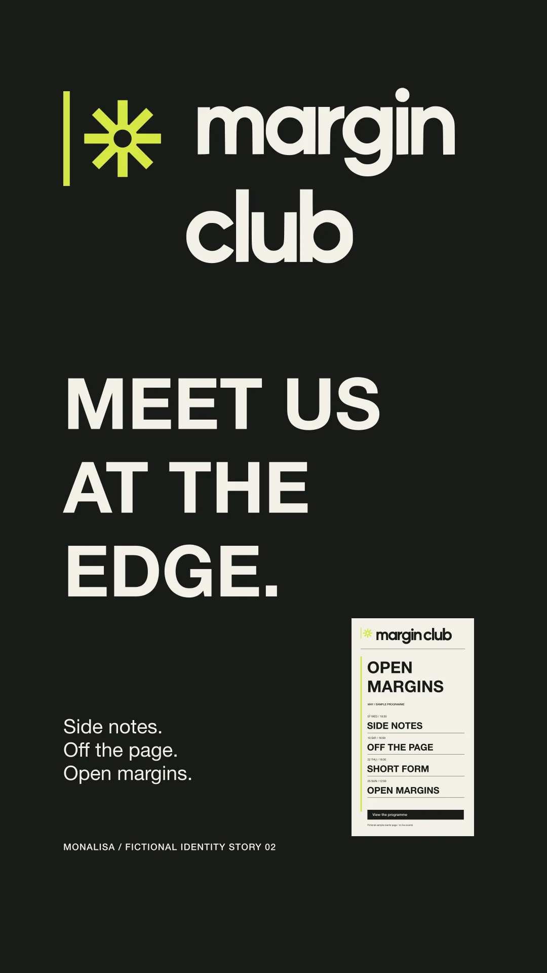
Conversation continues at the edge.
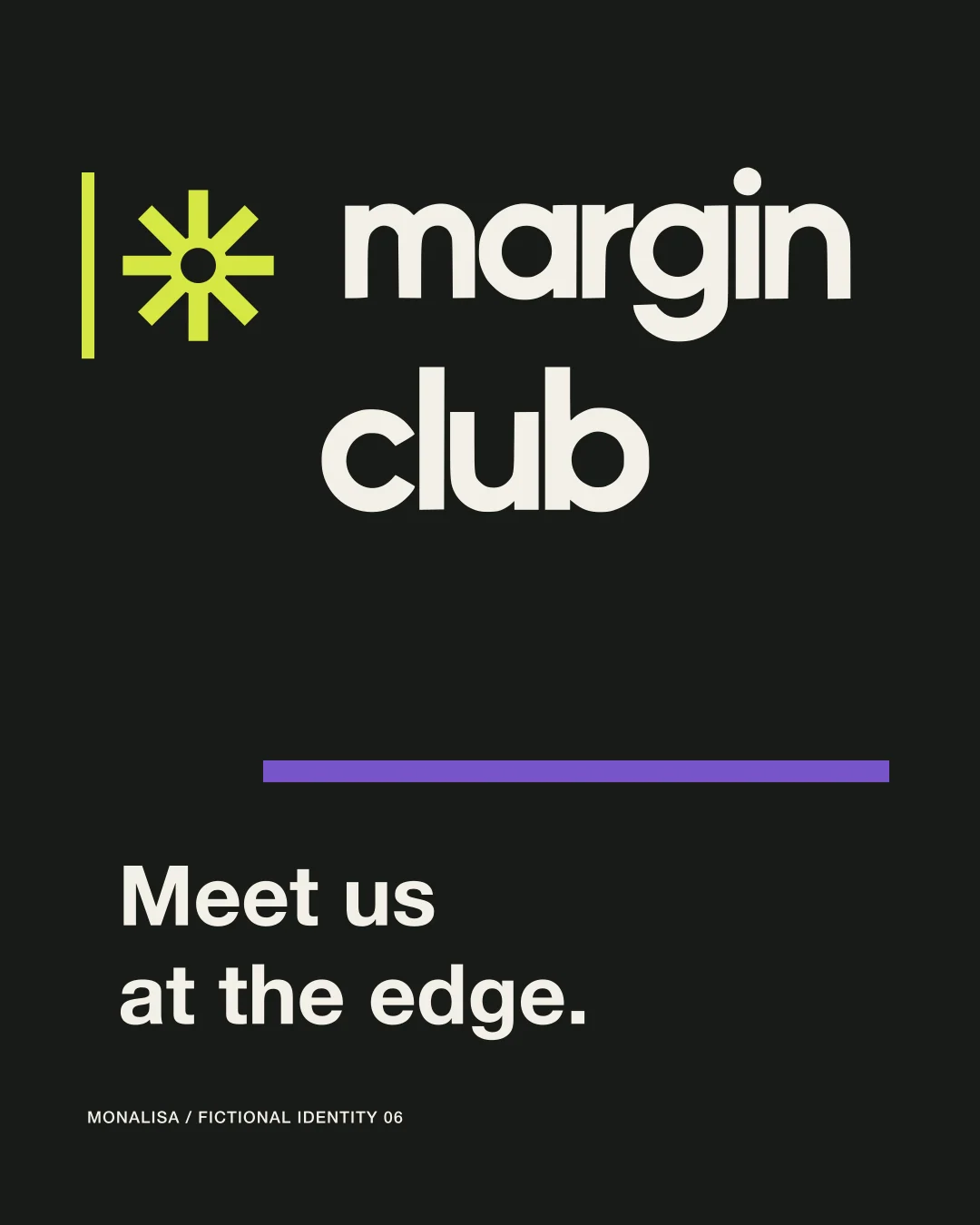
A vertical rule turns the page edge into an invitation. The asterisk interrupts it like a note worth following.

A mark that annotates.
The rule and eight-point asterisk work as one signal: edge, interruption, and invitation.
Editorial, never static.
Helvetica Neue keeps listings clear while oversized type, crops, circles, and underlines make the programme feel alive.
Ink with a live edge.
Ink and Ivory hold the reading experience. Chartreuse marks the interruption; Violet gives one secondary field room to move.
Primary type, rule, tote, and high-contrast field.
Margin rule, annotation asterisk, navigation marker, and small interruption plane.
Paper, programme/page base, poster ground, ticket and card face.
Secondary collage plane and one event/category accent.
Helvetica Neue
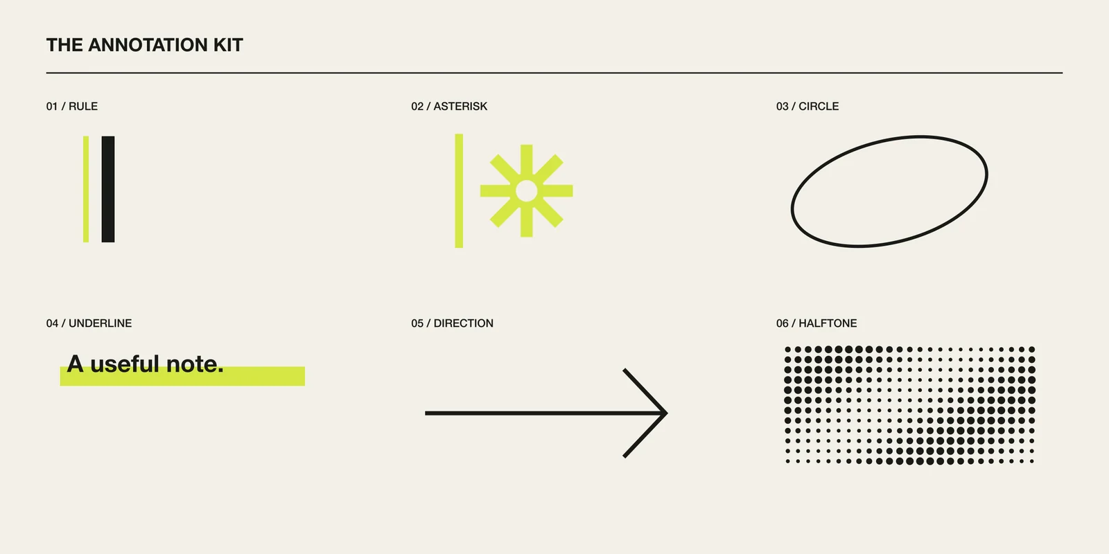
A flexible note-taking kit.
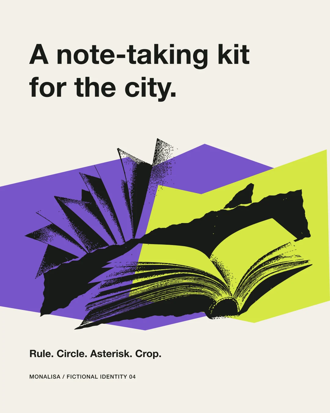
Rules, circles, arrows, underlines, crop marks, and the asterisk create a practical graphic grammar for many event types.
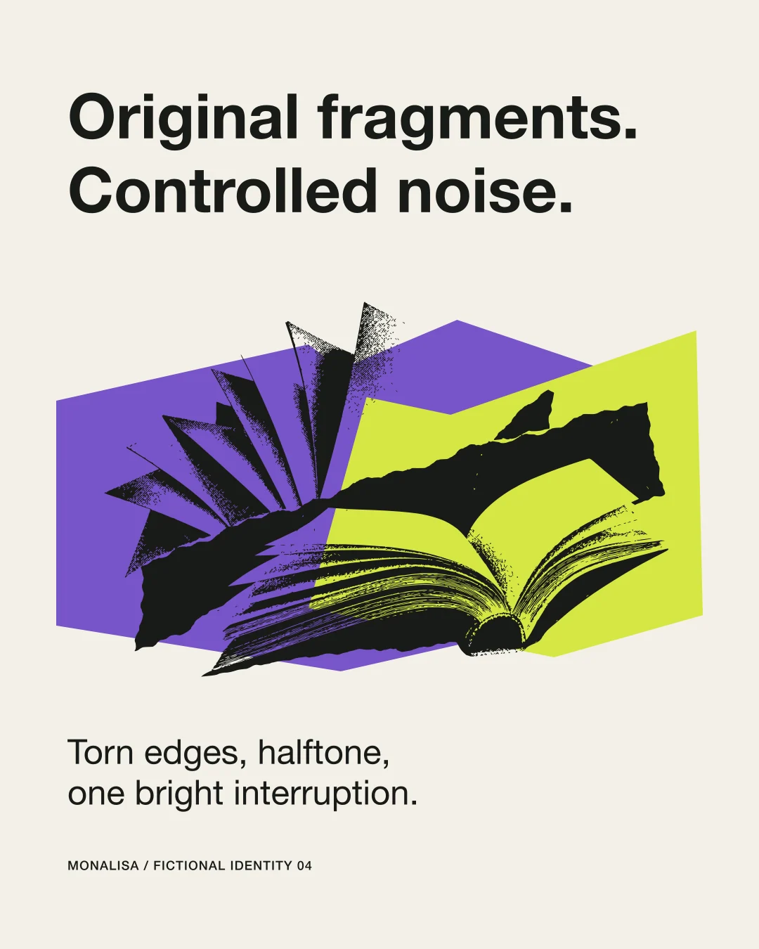
Original fragments, open margins.
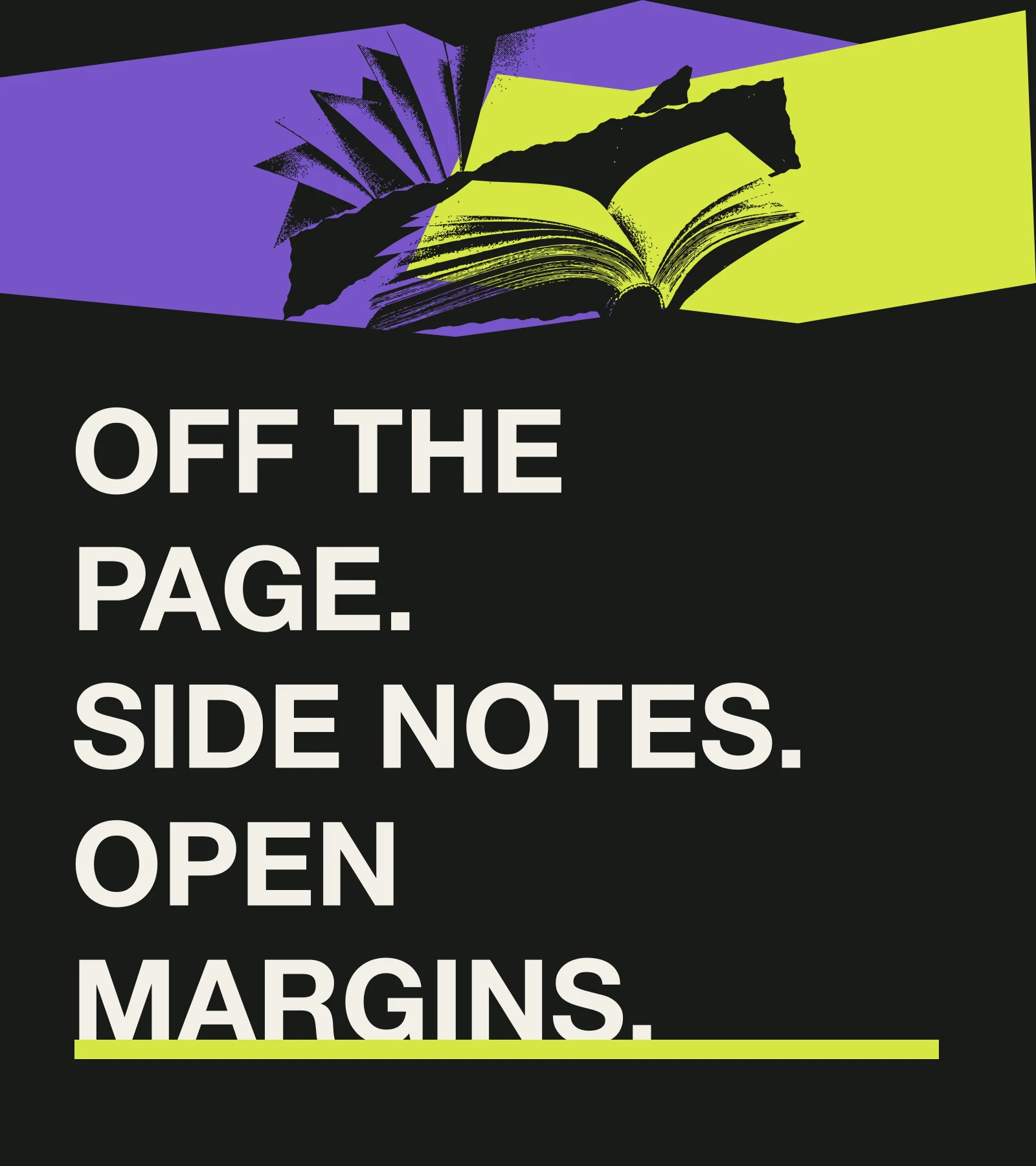
Torn polygons and halftone fields make the collage tactile without borrowing third-party covers or real publications.
A month with a clear rhythm.
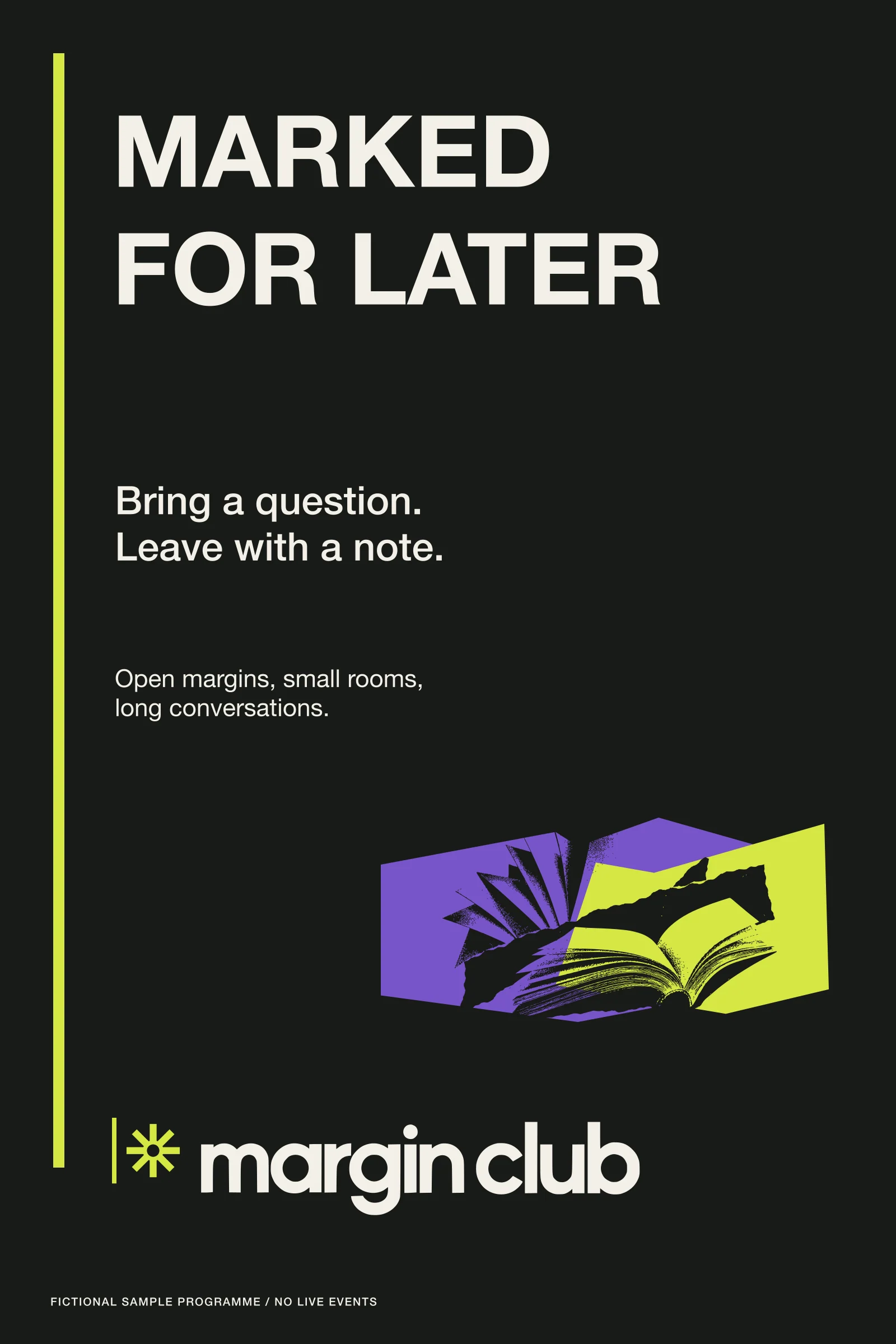
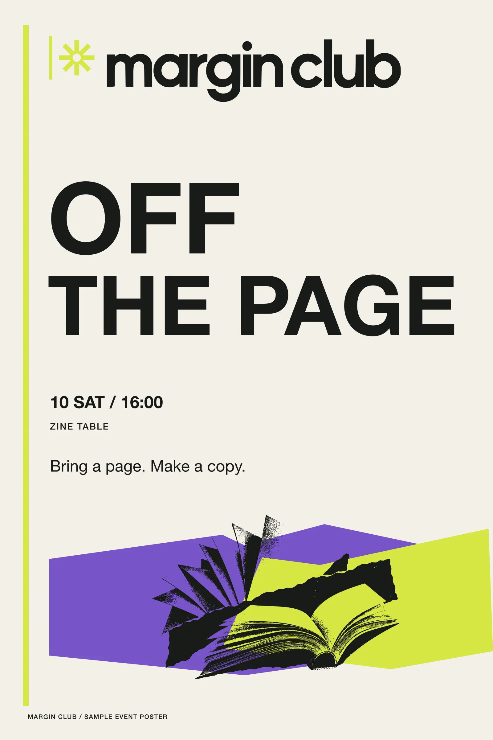
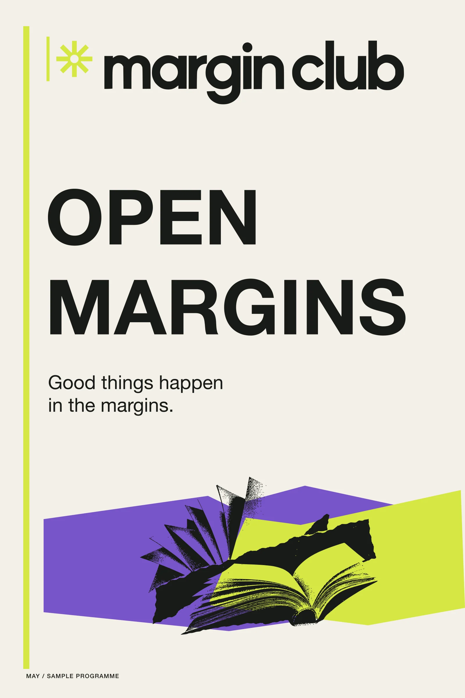
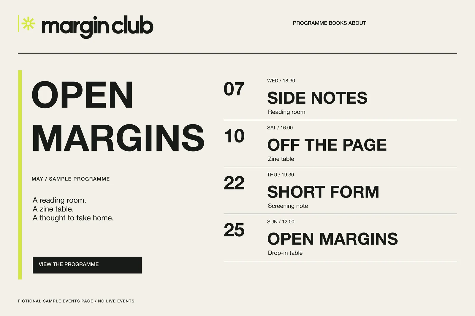
The programme hierarchy is date/day/time first, event title second, format third. The three posters use the same schedule logic with different crops.
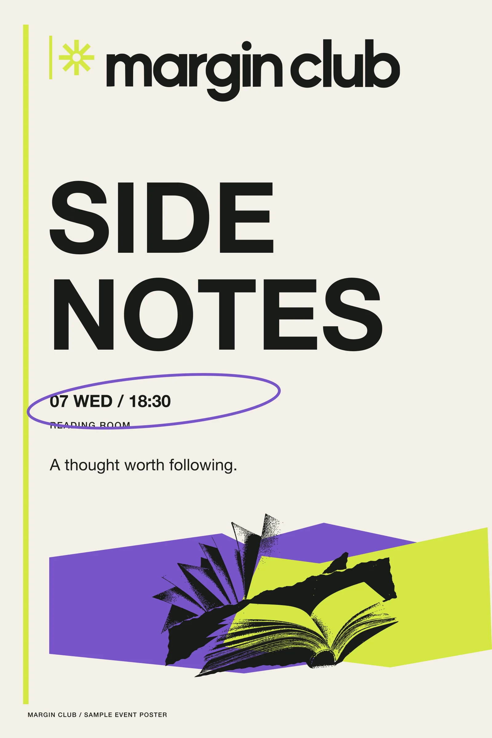
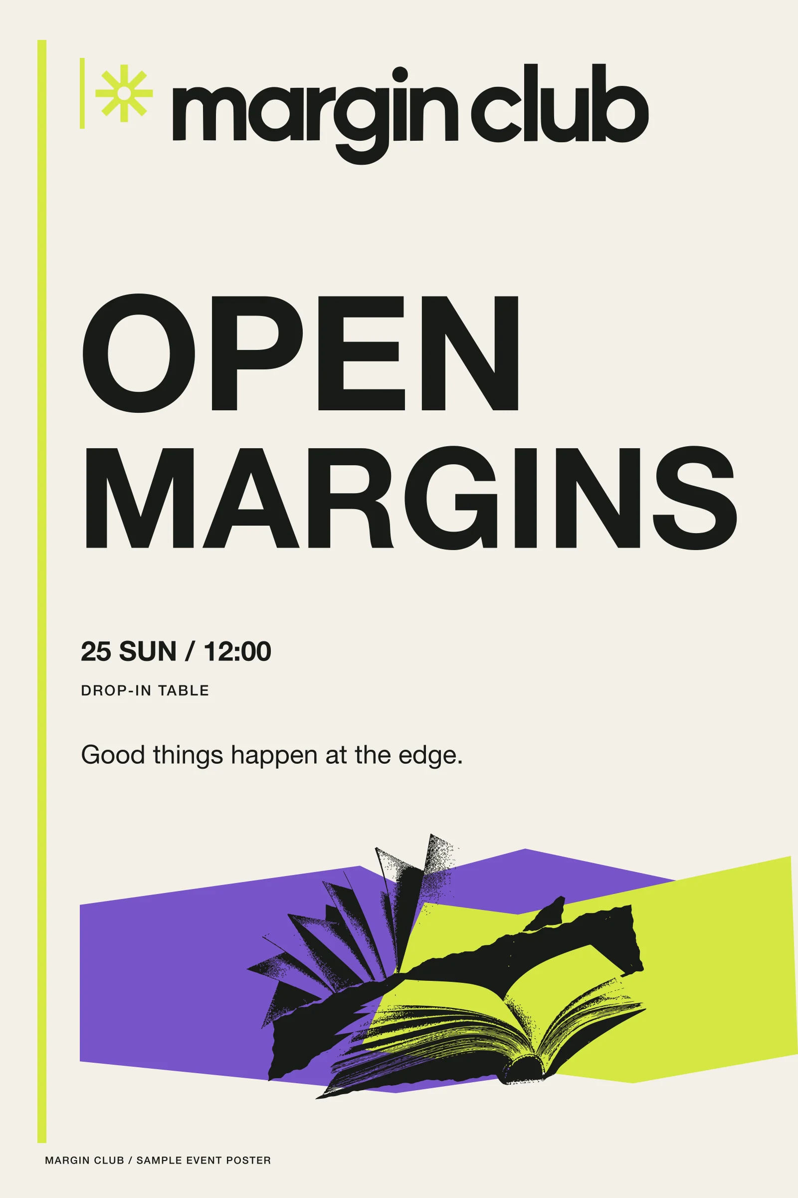
For the reader who carries the note.
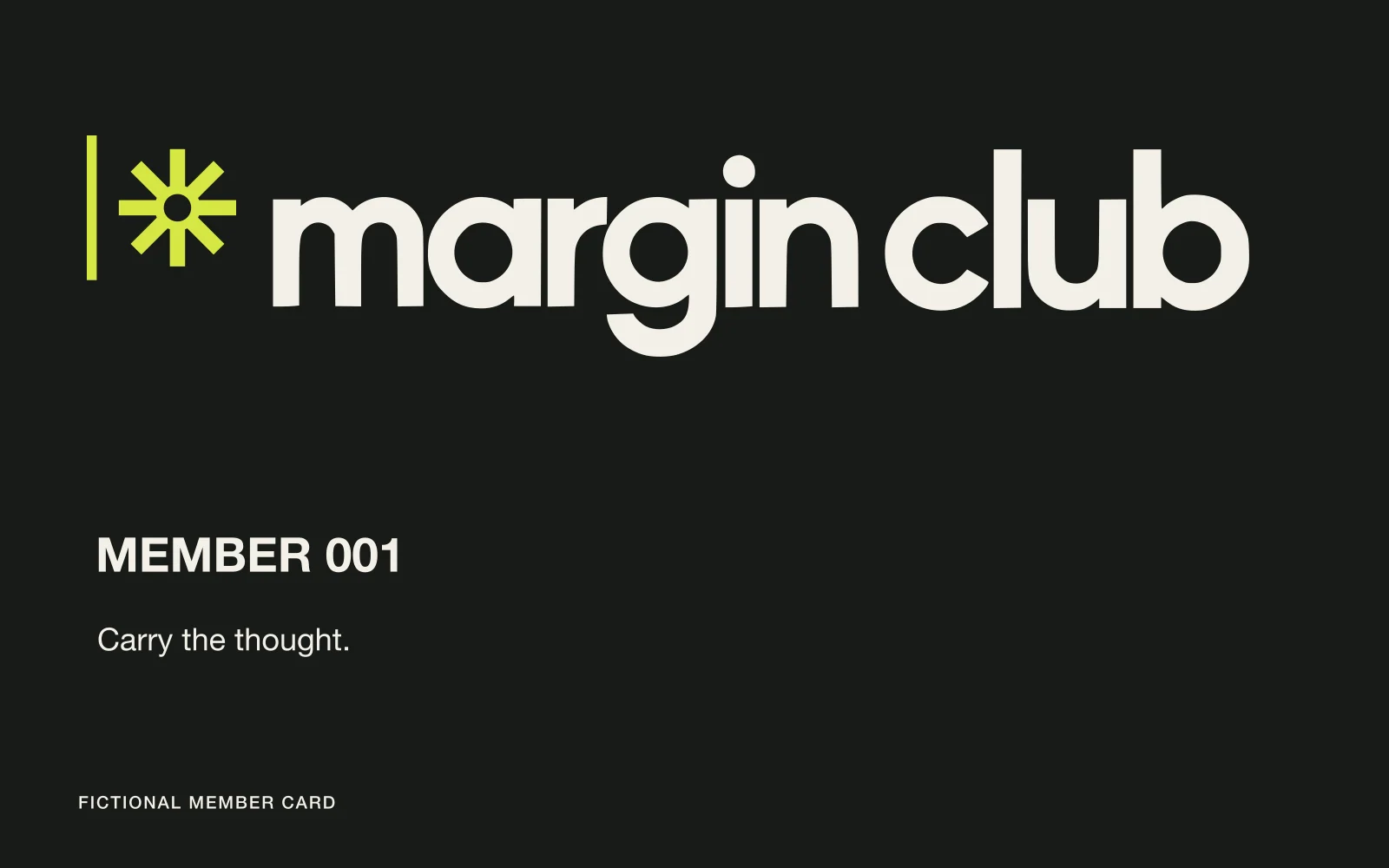
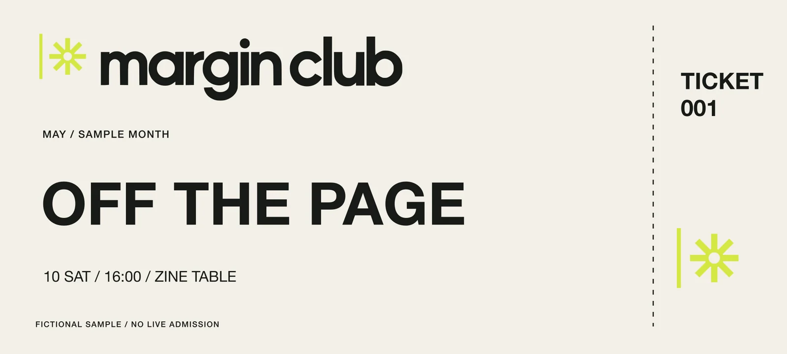
Bookmark, membership card, and ticket turn the active margin into objects that travel beyond the page.
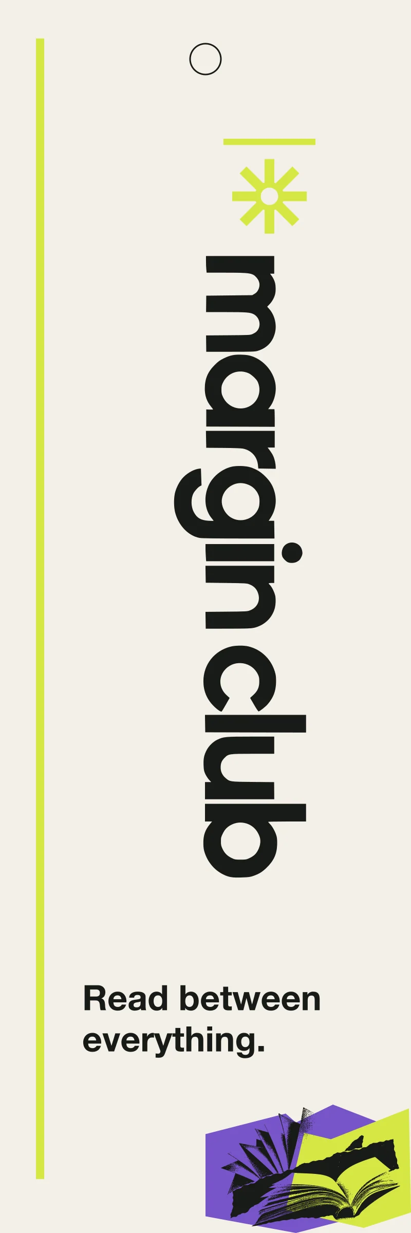
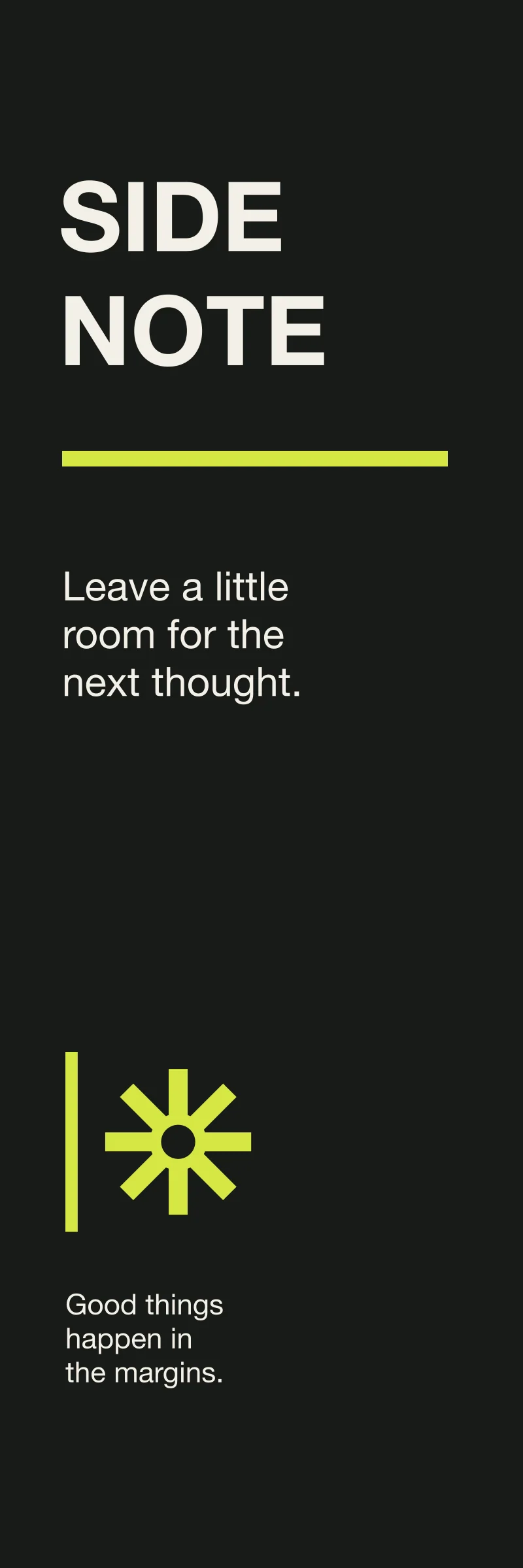
From place to carry.
Fascia, window poster, and tote let the margin language move from the street to the shoulder. The generated storefront is a concept scene only.

Open margins on a small screen.
The responsive events page preserves the date/time/title/format hierarchy and lets the margin remain a navigational edge.
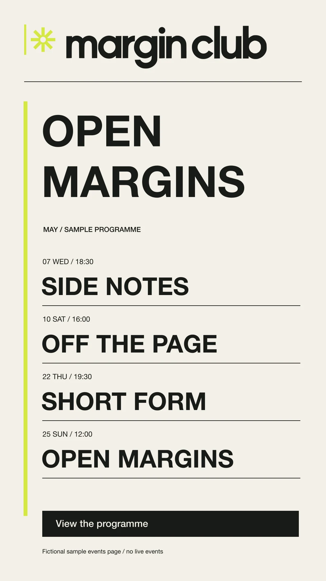
Read between everything.
The rule, asterisk, collage, and schedule grammar make room for programmes, objects, and conversations without closing the page. Fictional identity concept by Monalisa Design Studio.
The smaller details, considered.
Supporting artwork from the same identity system.
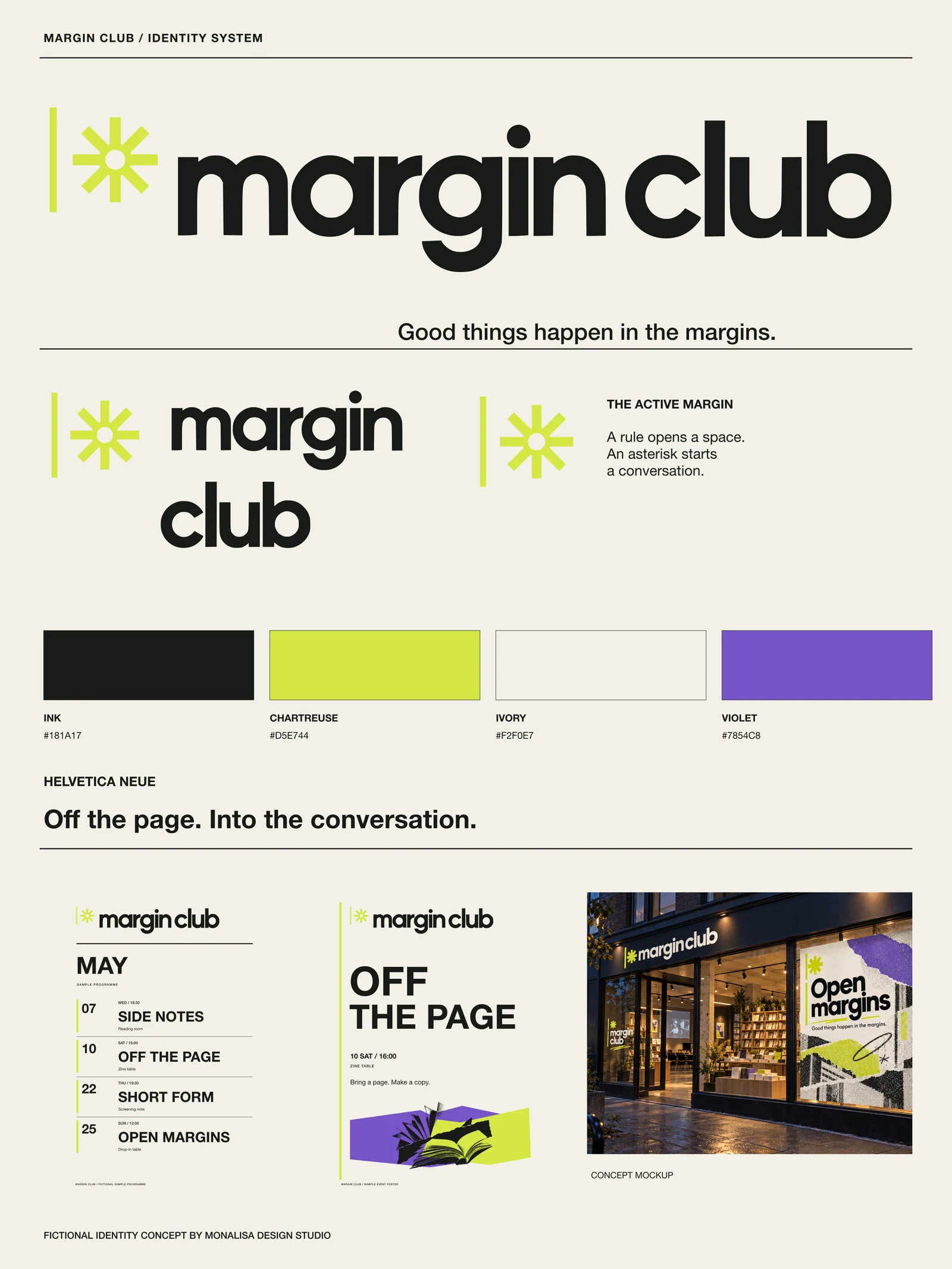
The system, together.
A complete identity overview, from the mark to its everyday applications.
The reveal, frame by frame.
Six portraits introduce the identity, its idea and its applications.
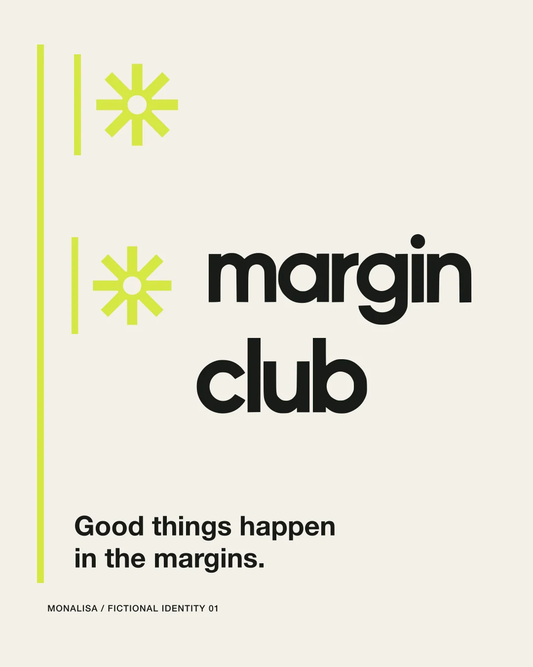
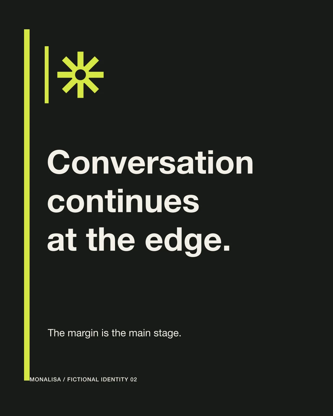
A sequence designed for the small screen. Scroll to explore.
The decisions behind the identity.
A closer look at the geometry, hierarchy and choices that hold the system together.
A sequence designed for the small screen. Scroll to explore.
Small screen, full character.
Supporting story compositions from the same identity system.
A sequence designed for the small screen. Scroll to explore.
Concept, visual identity and art direction for Monalisa Design Studio. This is a self-initiated portfolio project for a fictional brand.
Application artwork is supplied as SVG and PNG. Photographic scenes use AI-generated concept imagery. The project does not represent a client commission or an operating business.