
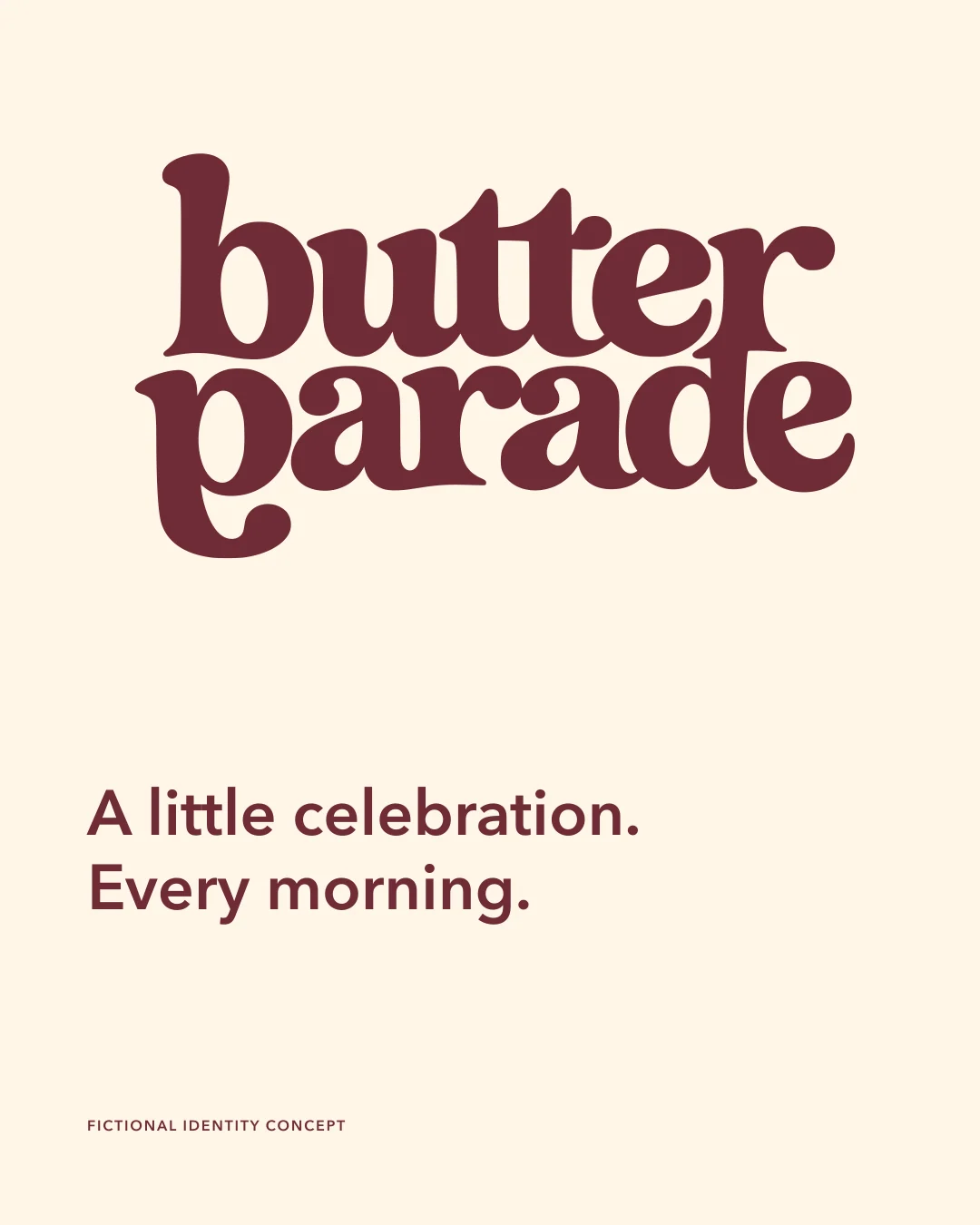
Butter Parade
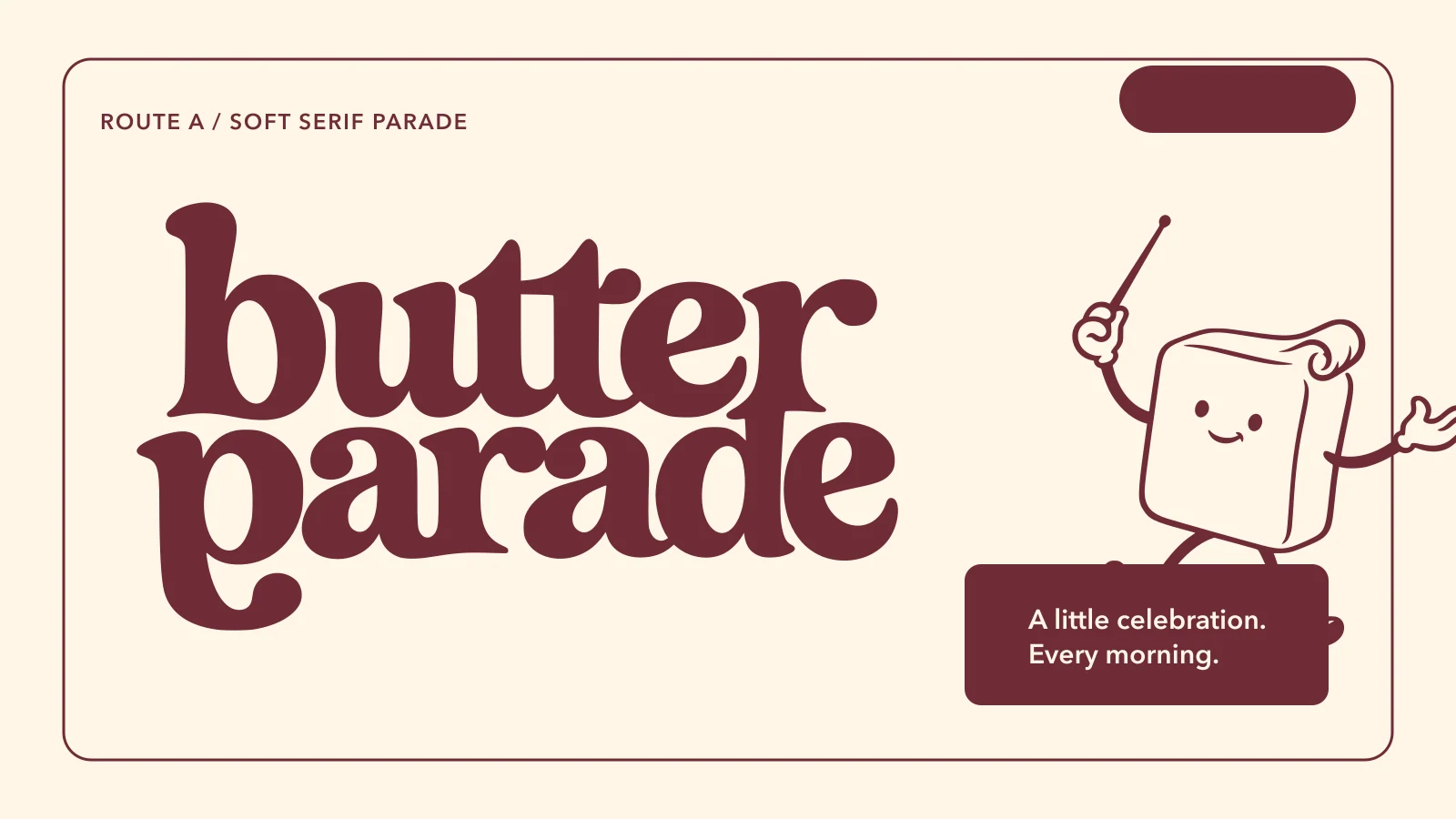
A little celebration. Every morning.
SELF-INITIATED CONCEPTFICTIONAL BRAND / 2026
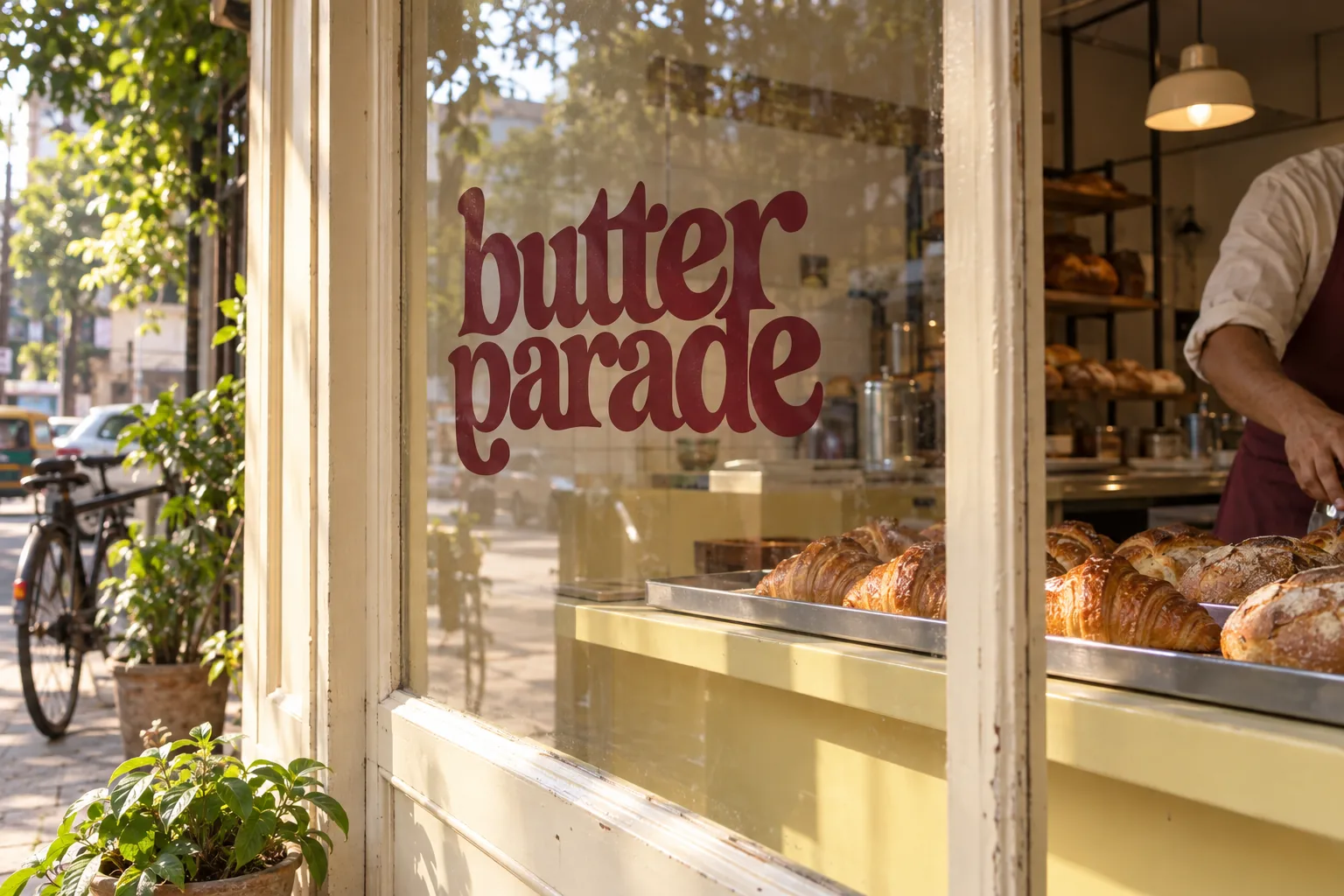
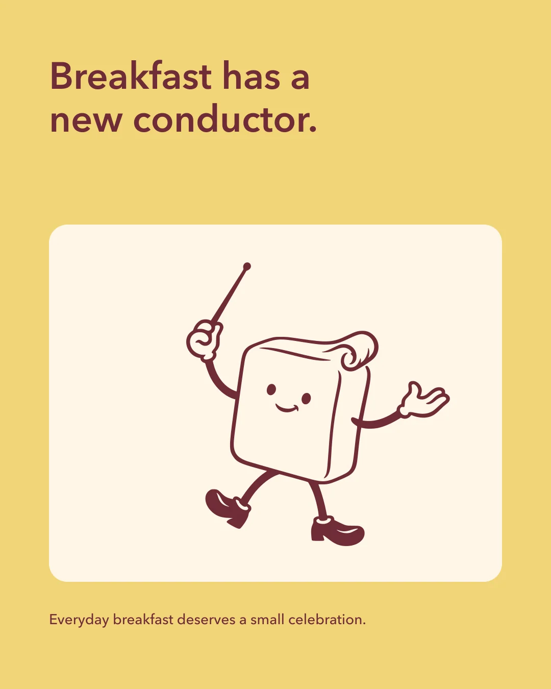
Everyday breakfast deserves a small celebration.
The imagined audience is a neighbourhood morning regular. The design needed warmth and speed, with enough restraint to feel grown-up.
A baton gives an ordinary breakfast a small fanfare before nine. The wordmark carries the musical rhythm; the conductor leads the repeat pattern and motion.
- Audience
- Neighbourhood morning regulars who want a warm, quick bakery stop with a little personality.
- Design scope
- Visual identity, Application artwork, Social series, Motion
- Project type
- Self-initiated identity exploration. Fictional business.
A little warmth, with a wink.
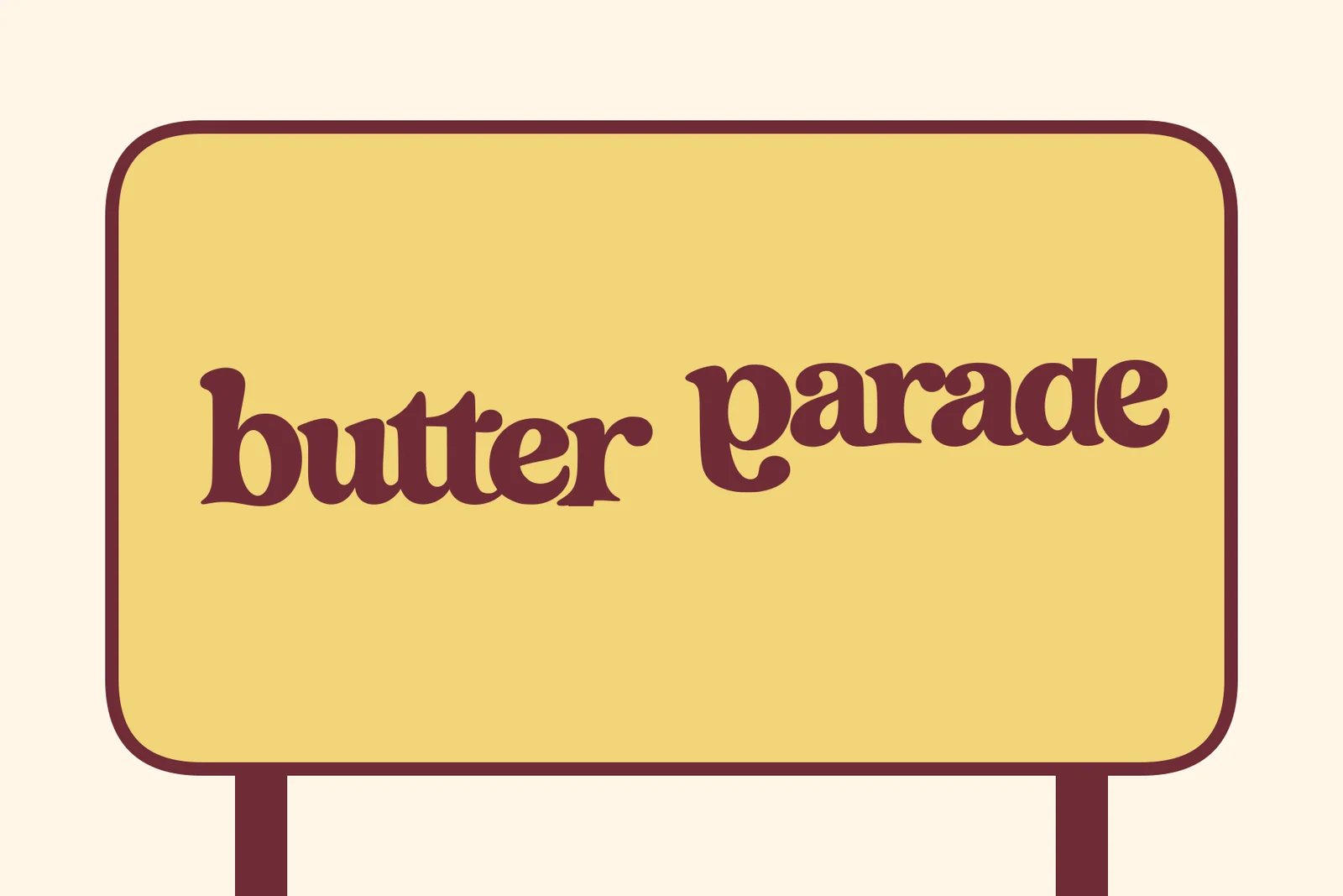
The soft serif wordmark and small conductor turn a morning stop into a familiar ritual.
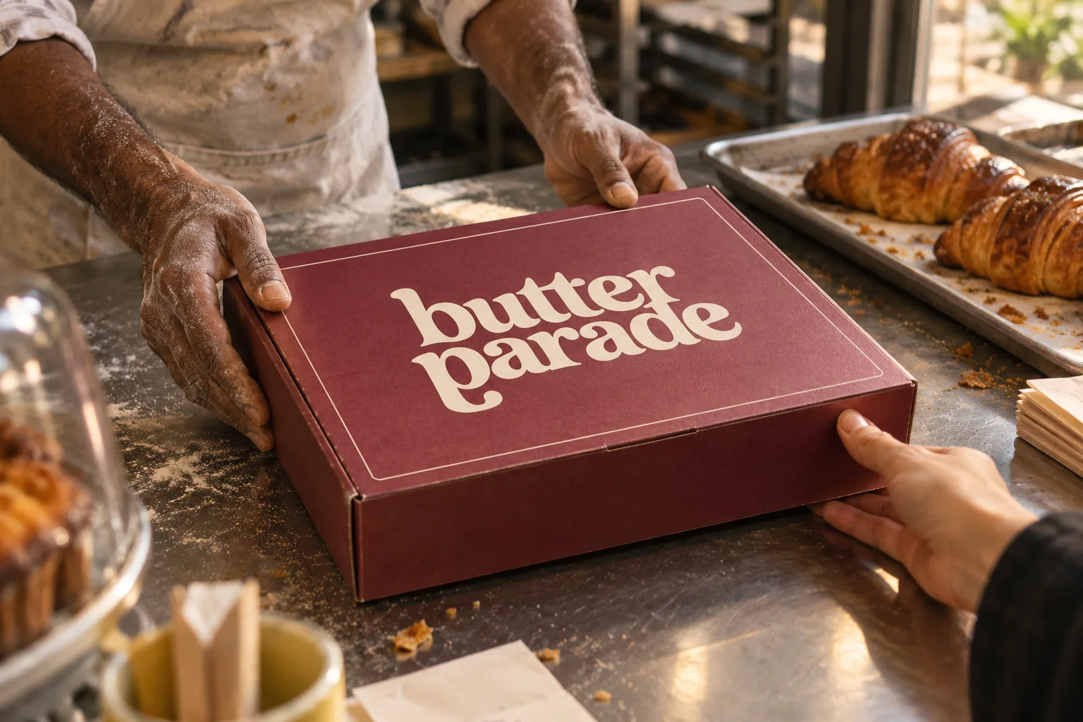
Good things, handed over.
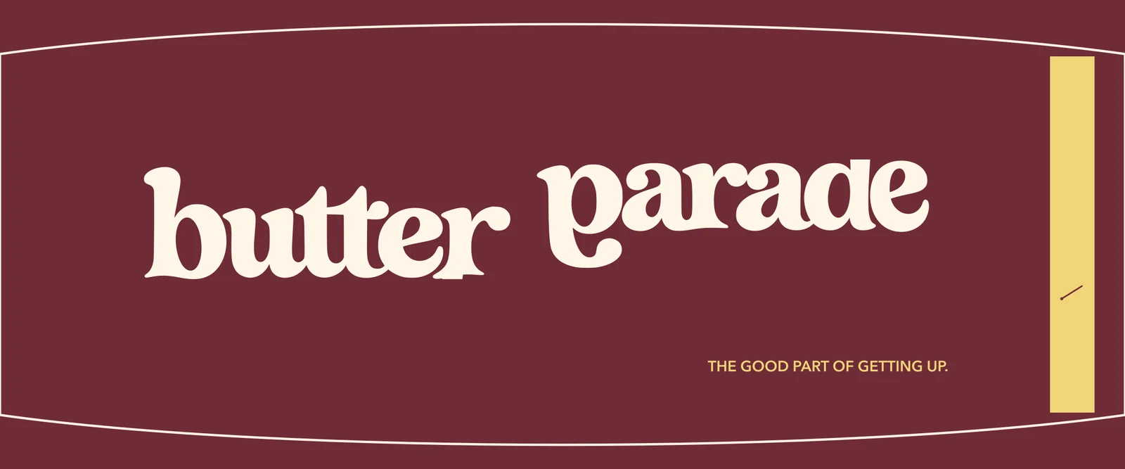
The colour and wordmark do their work on ordinary uncoated paper, with enough presence to be recognised across a busy counter.
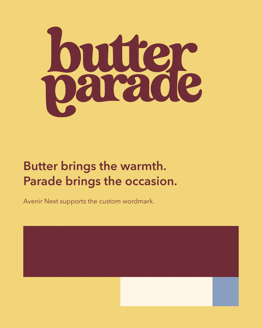
Cherry leads. Butter lifts.
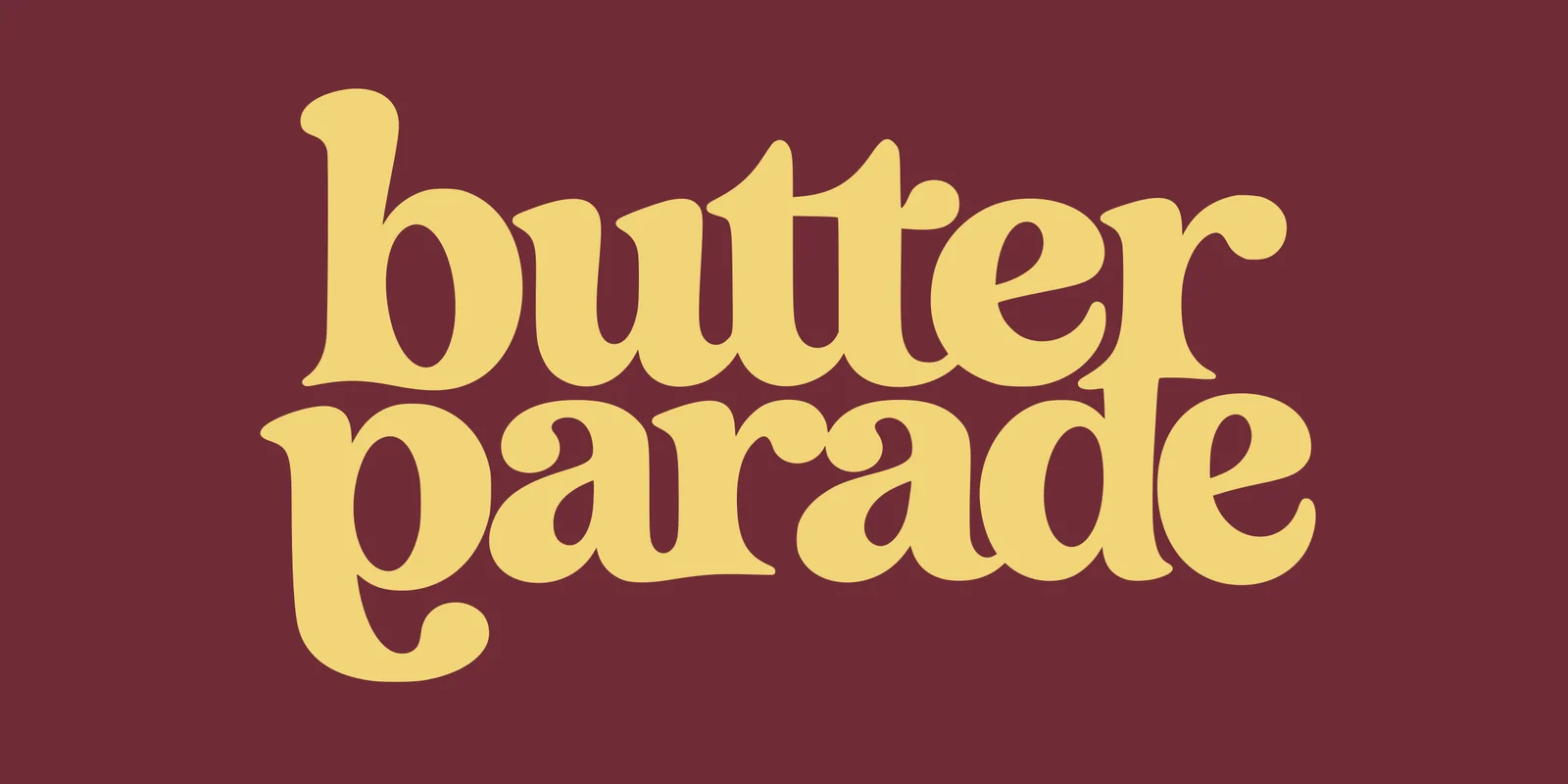
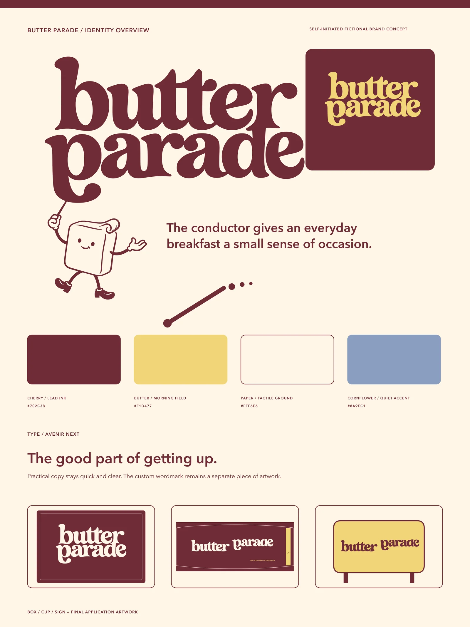
Avenir Next keeps the practical language quick and clear. Cherry is the ink; Butter is the morning field; Paper keeps the system tactile; Cornflower appears only as a quiet accent.
Primary ink, wordmark, body text on Paper, shop frame, reverse field.
Morning field, reverse wordmark, highlight blocks, cup accent.
Base stock, label ground, menu and story negative space.
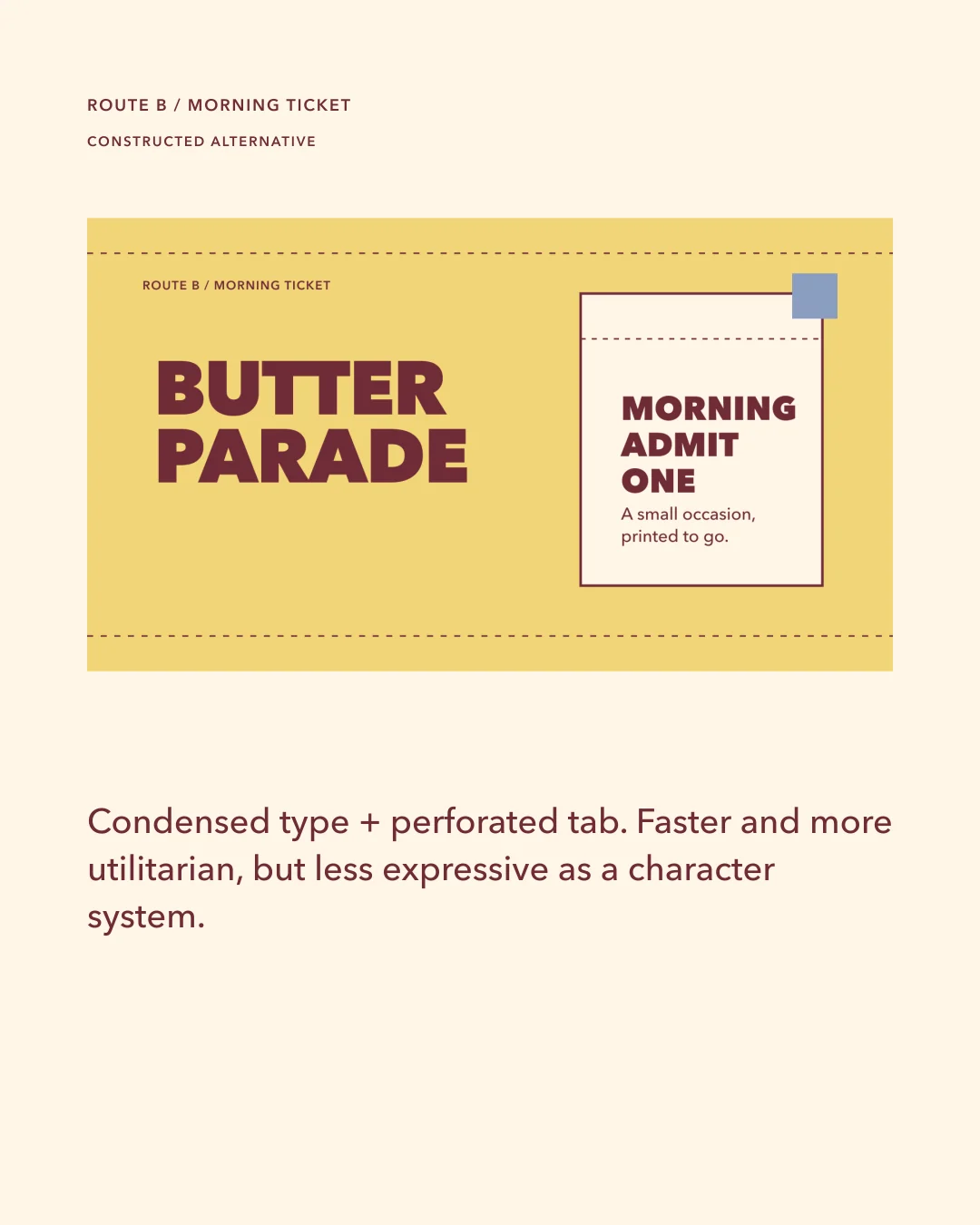
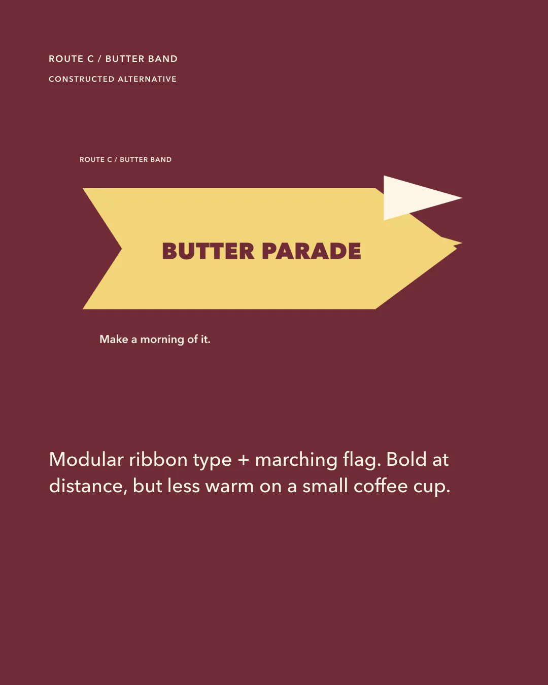
Sparing accent for one menu rule, launch campaign tab, or route comparison; maximum 10 percent of a frame.
Avenir Next
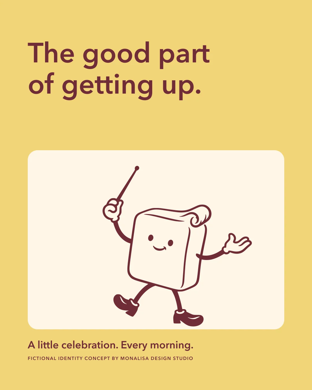
The good part of getting up.
A cup sleeve, a pastry and a pavement table bring the identity into the small routines it was imagined for.

A small movement. A distinct character.
A short, silent animation built from the same vector identity. The poster provides a still alternative.
Download the filmTHE COMPLETE IDENTITY SYSTEMGo a little deeper.Explore the full artwork, applications and social series.
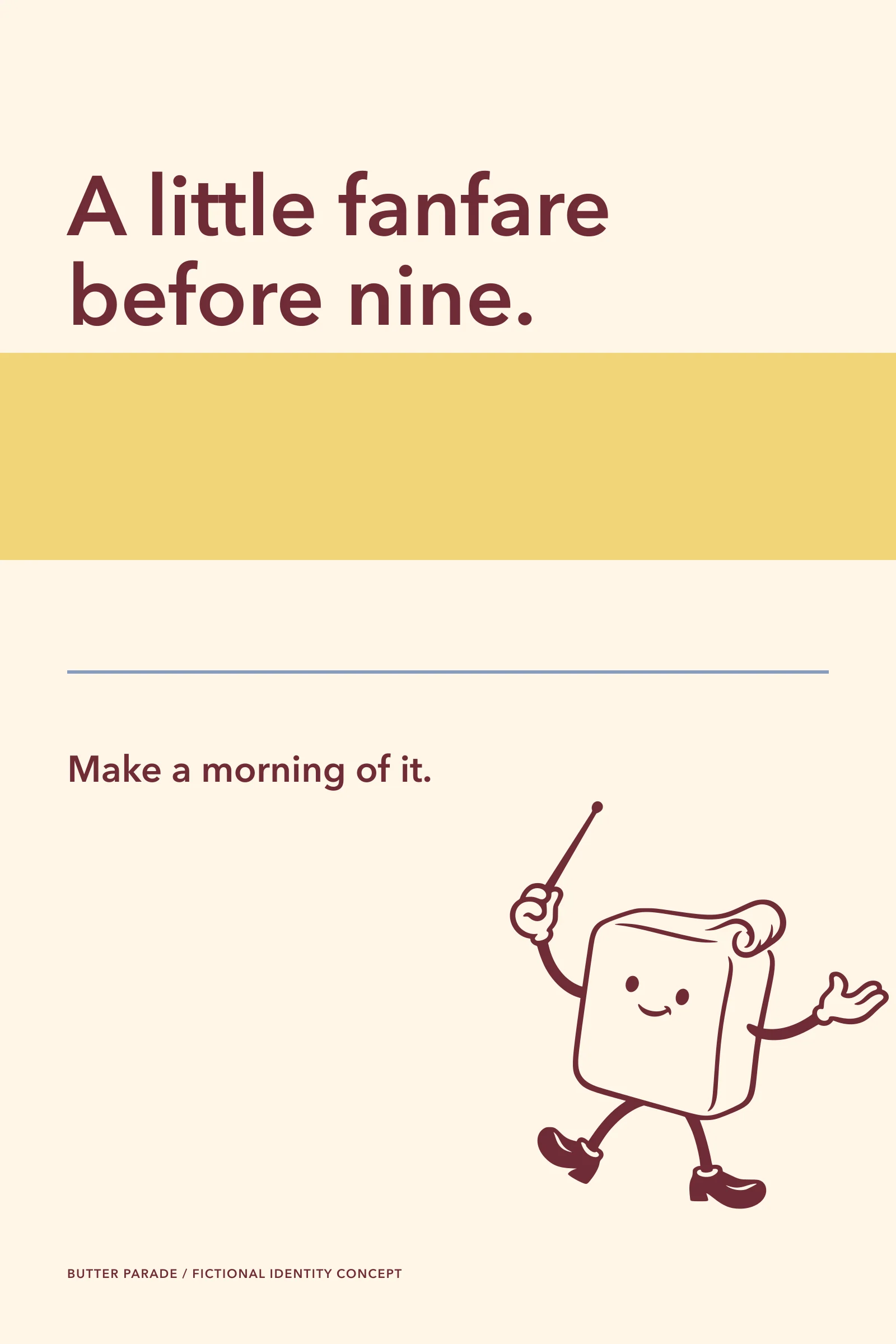
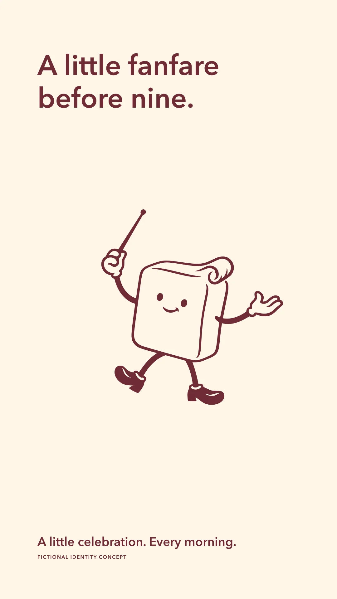
A little fanfare before nine.
The baton turns a routine coffee-and-pastry stop into a tiny parade without claiming that the morning is anything more than a good moment.


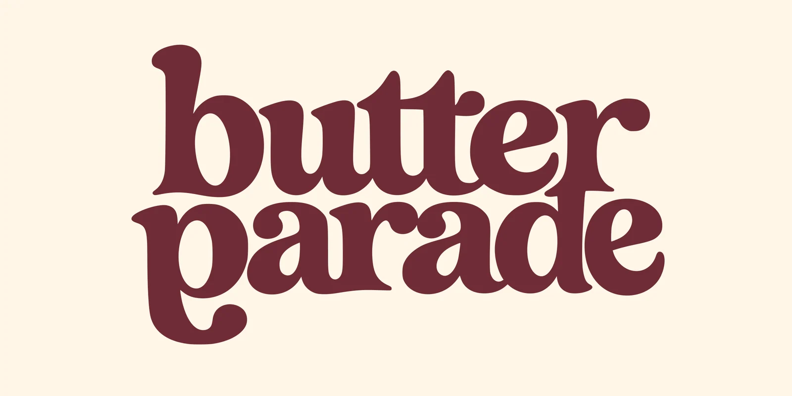
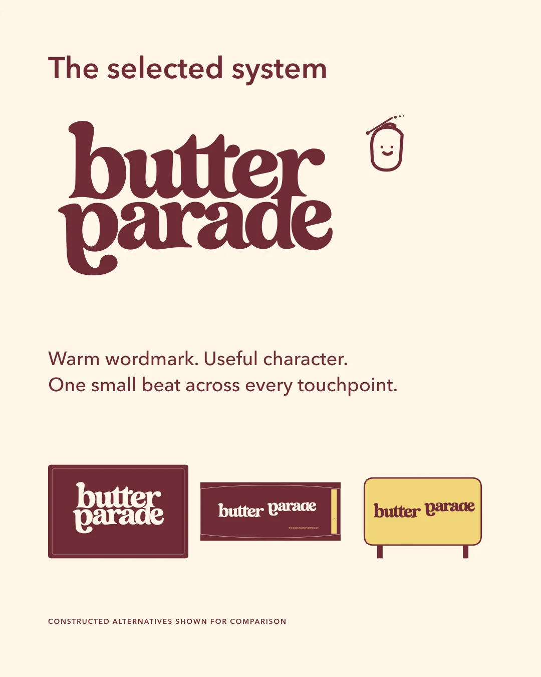
A soft serif with a wink in its stride.
The two-line wordmark is custom outlined. Rounded terminals and a low parade baseline make the name musical while the compact silhouette stays legible on a box and sign.
The conductor makes the warmth visible.
A soft butter block raises a baton and invites the next beat. The one-colour drawing stays expressive without turning the bakery into a children's character brand.

Cherry leads. Butter lifts.
Avenir Next keeps the practical language quick and clear. Cherry is the ink; Butter is the morning field; Paper keeps the system tactile; Cornflower appears only as a quiet accent.
Primary ink, wordmark, body text on Paper, shop frame, reverse field.
Morning field, reverse wordmark, highlight blocks, cup accent.
Base stock, label ground, menu and story negative space.
Sparing accent for one menu rule, launch campaign tab, or route comparison; maximum 10 percent of a frame.
Avenir Next
Every wrapper gets a beat.
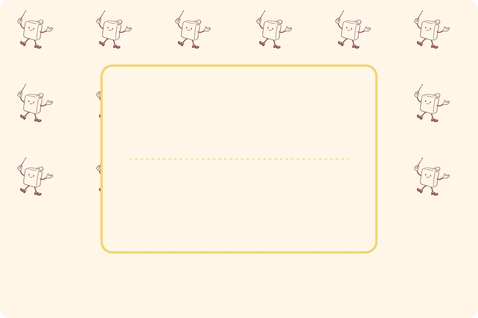
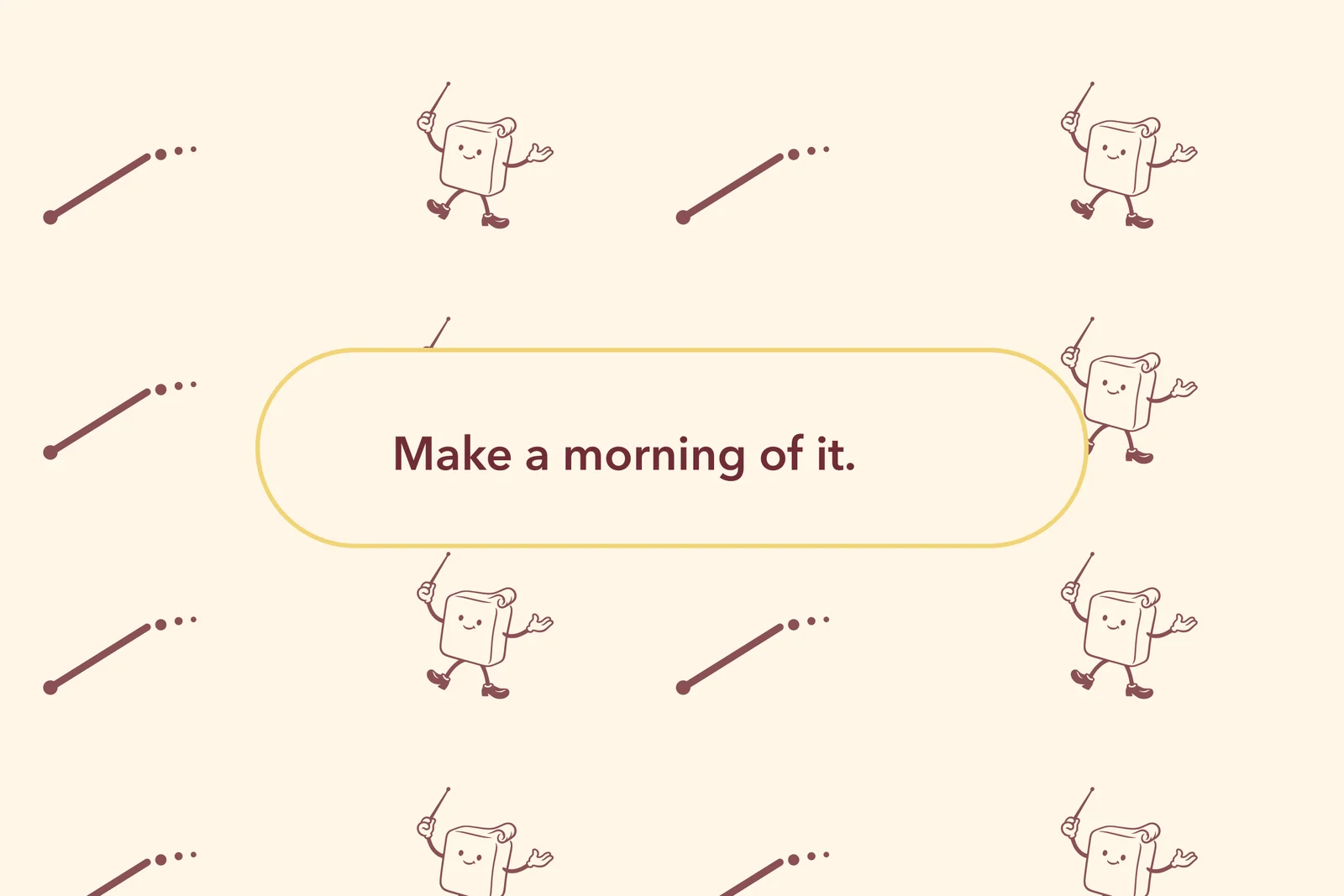
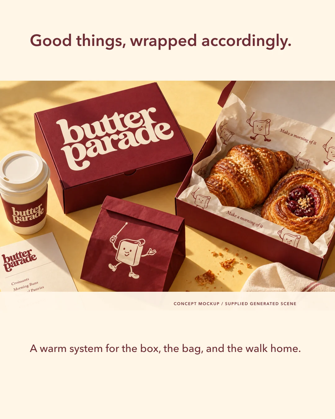
The baton sweep, three dots, and conductor repeat create a small parade that can run across paper without becoming noise.

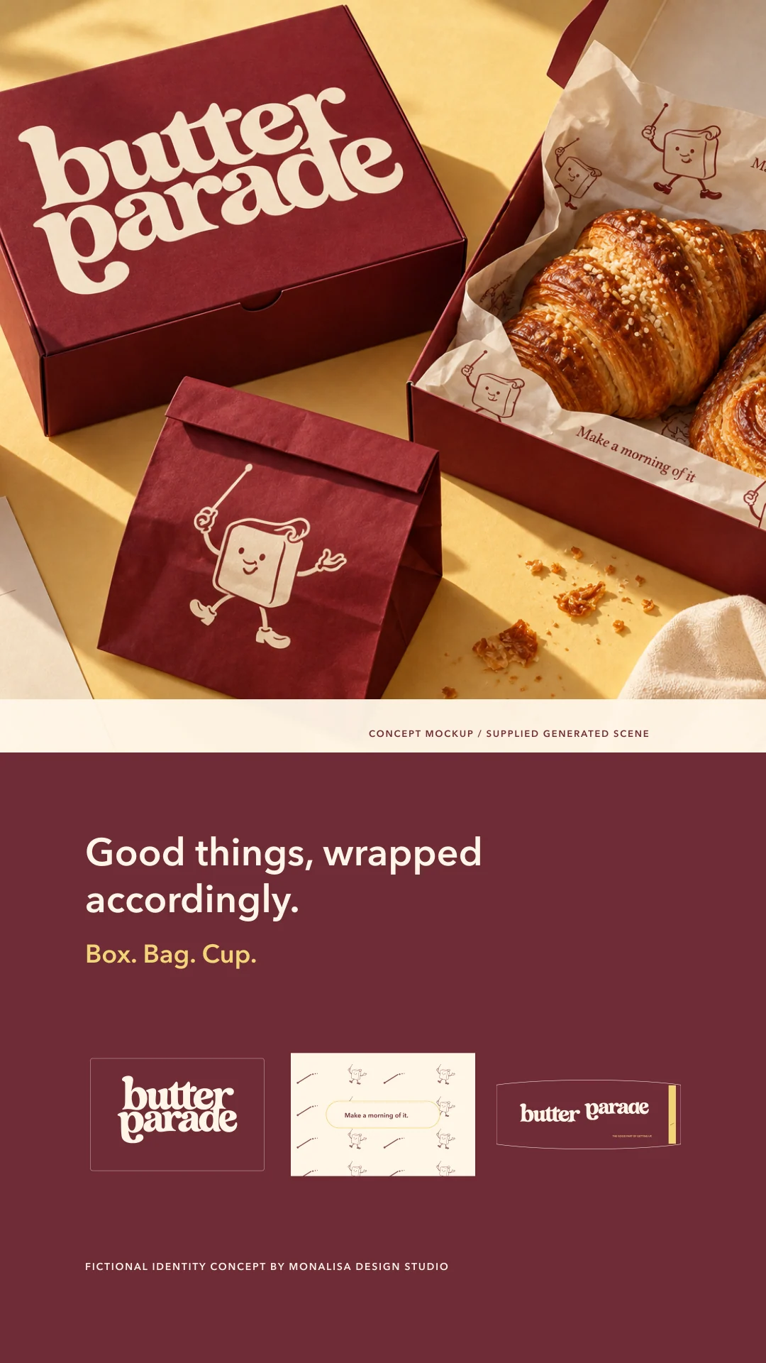
Good things, wrapped accordingly.
The system moves from pastry box to greaseproof sheet and coffee cup through repeat, compact lockup, and a disciplined Cherry/Paper ink relationship.

The counter keeps the tone moving.
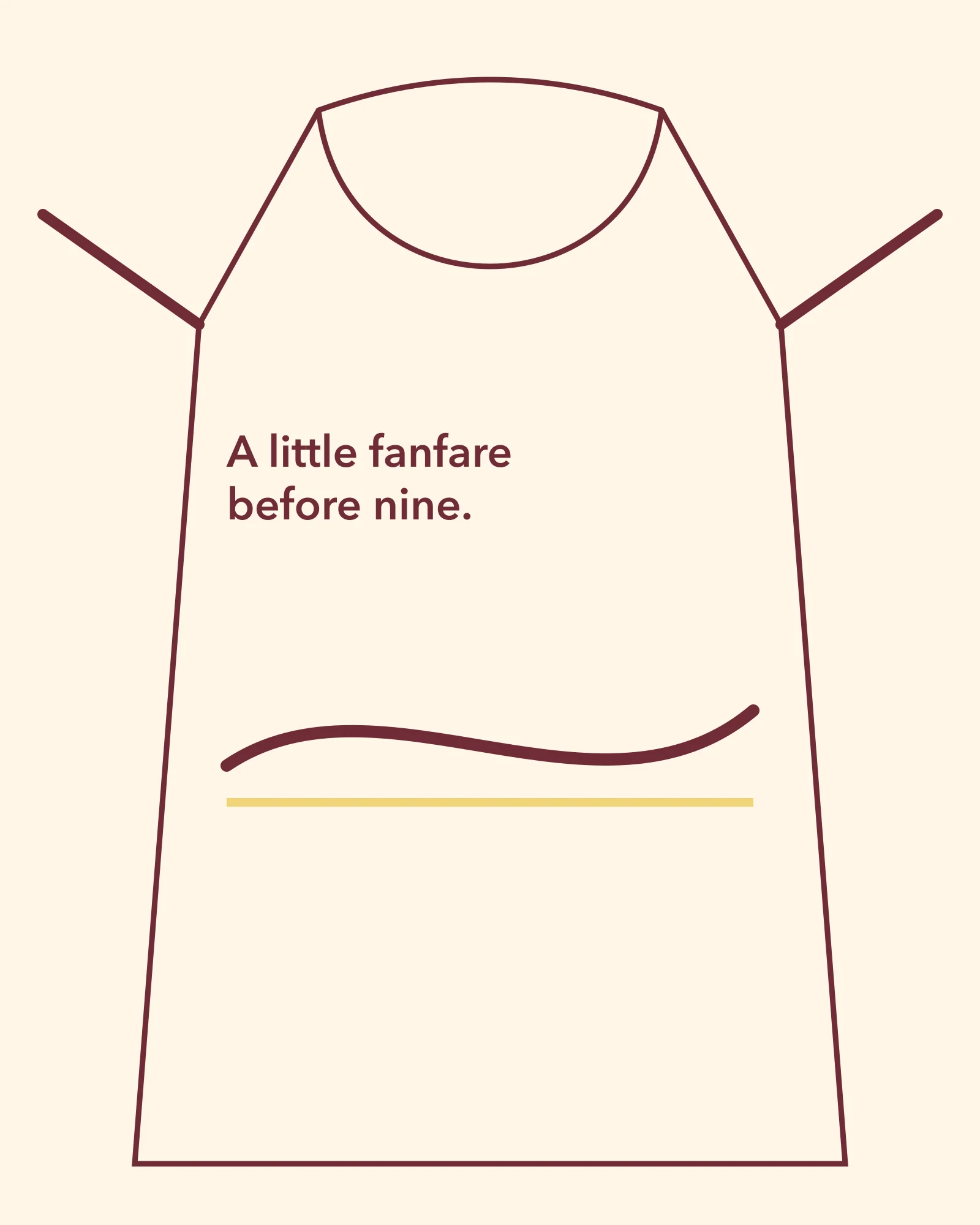
Menu, apron, and shop sign share one compact lockup and one morning line. The menu uses fictional sample items — Croissant — flaky butter layers; Morning bun — orange sugar; Seasonal pastry — ask the case; Espresso / Filter coffee — and makes no operational claim.
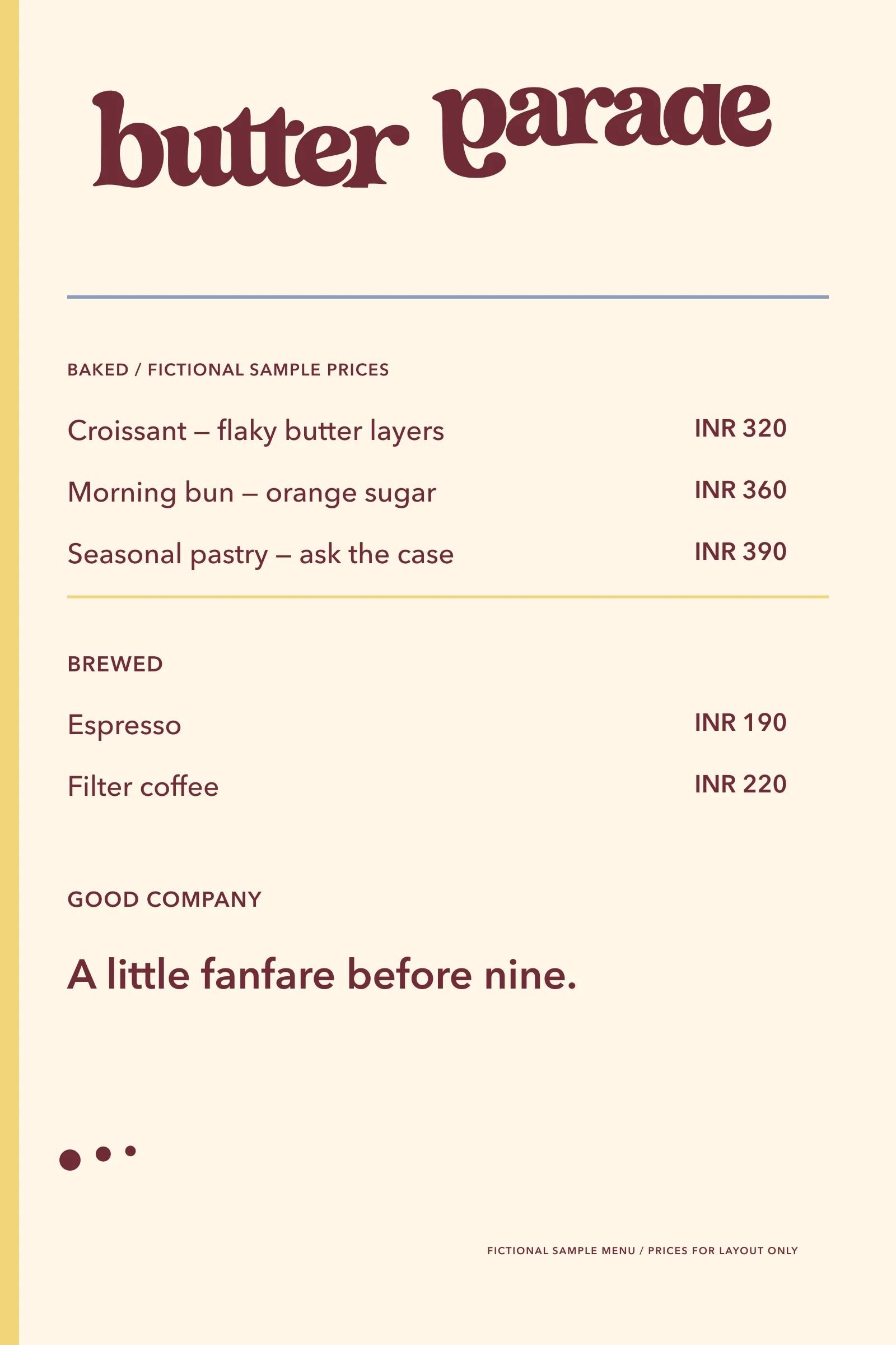
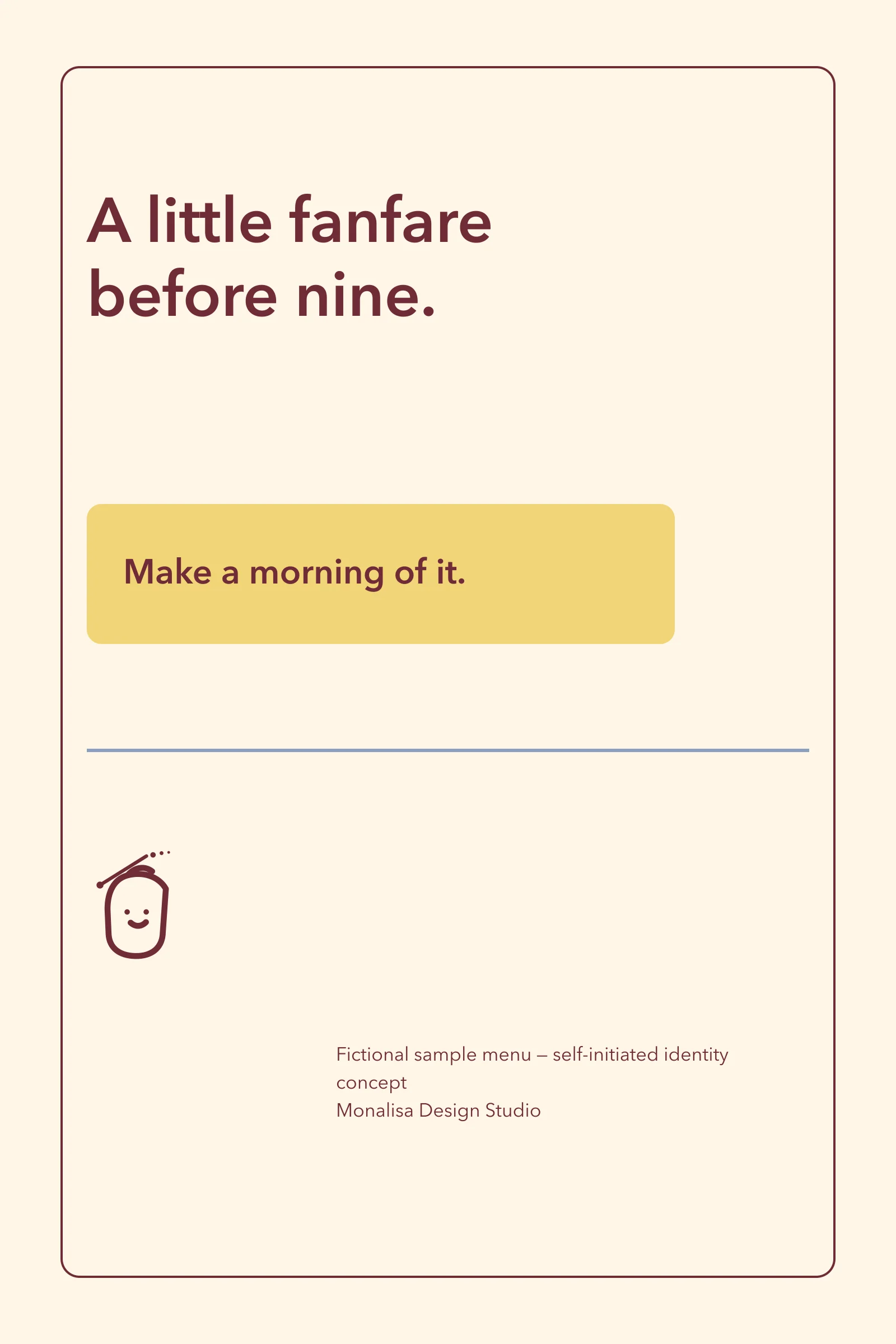
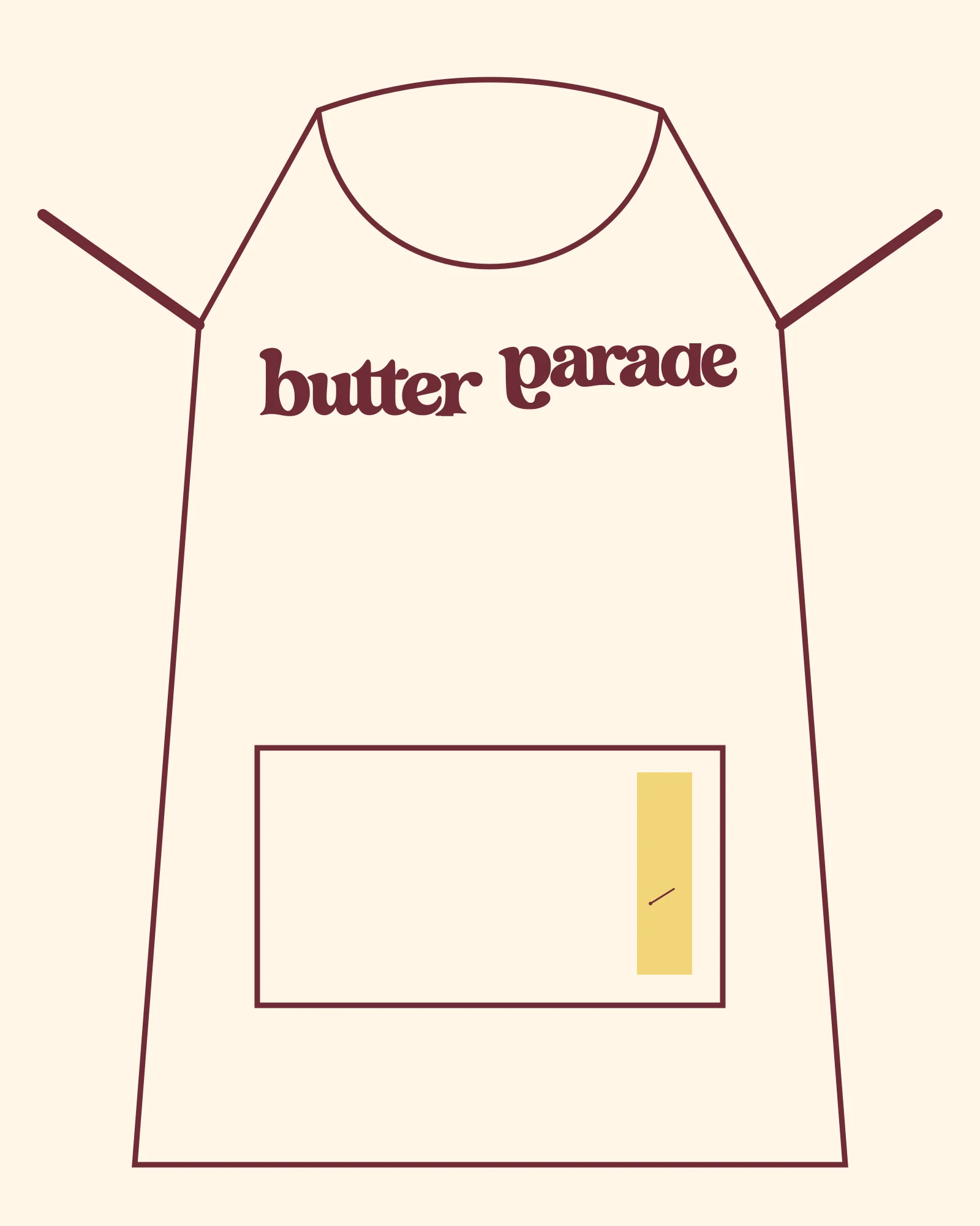
Make a morning of it.
The opening campaign behaves like a poster, not a promise of a real opening: A little fanfare before nine. / The good part of getting up.
The craft lives in the joins.
Path joins, counter shapes, the baton angle, and the paper-to-ink relationship are the decisions that keep the identity ownable at every size.
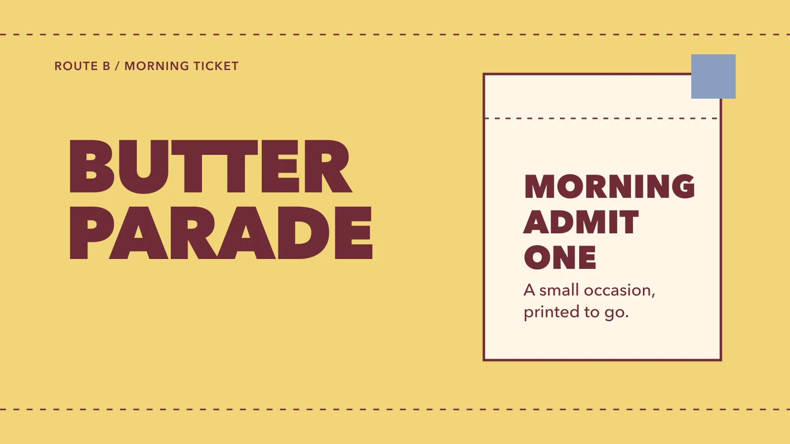
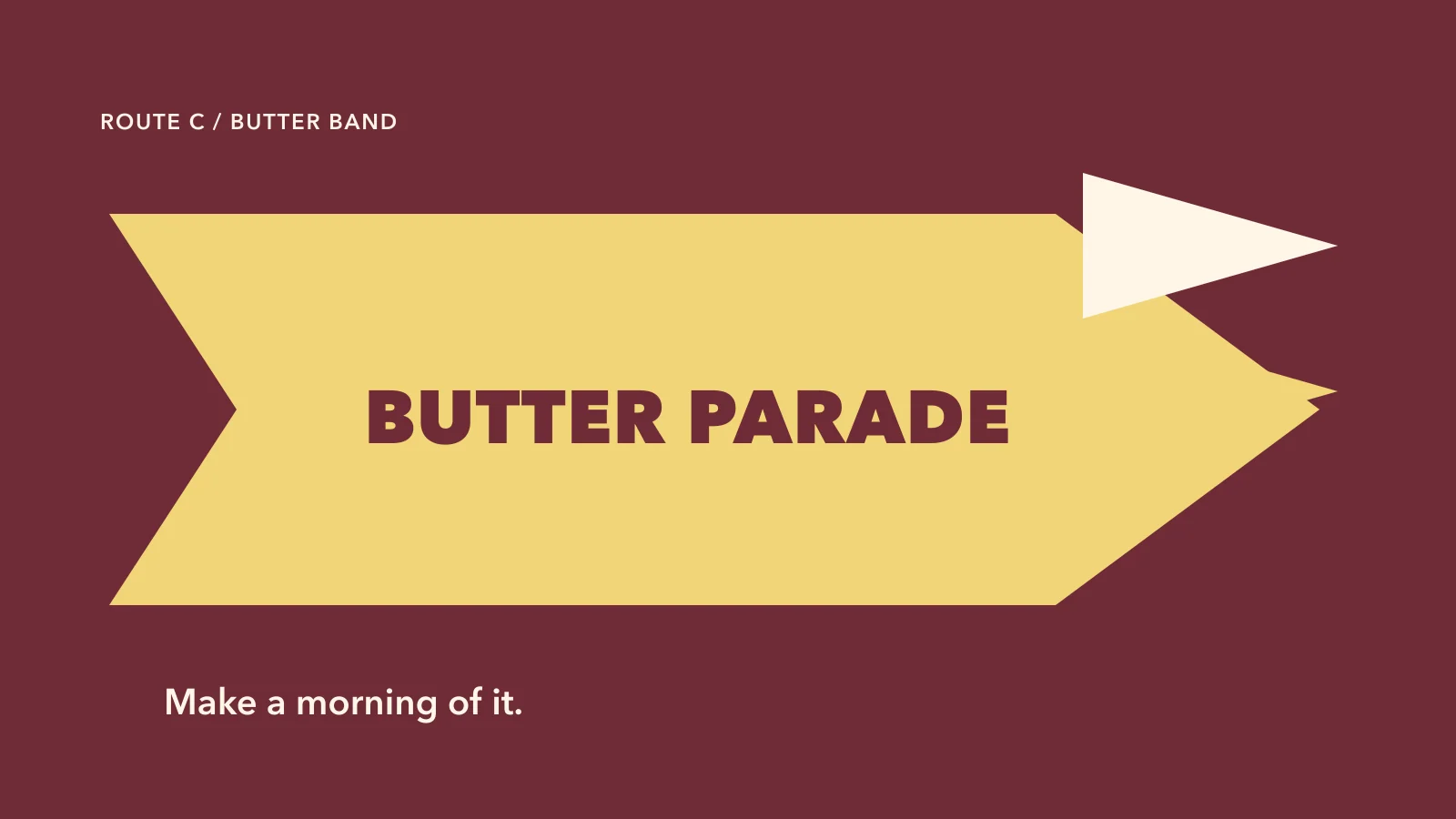
One warm, witty world.
Wordmark, conductor, colour, and voice all point to the same small idea: breakfast can feel like an occasion. Fictional identity concept by Monalisa Design Studio.
The smaller details, considered.
Supporting artwork from the same identity system.

The system, together.
A complete identity overview, from the mark to its everyday applications.
The reveal, frame by frame.
Six portraits introduce the identity, its idea and its applications.
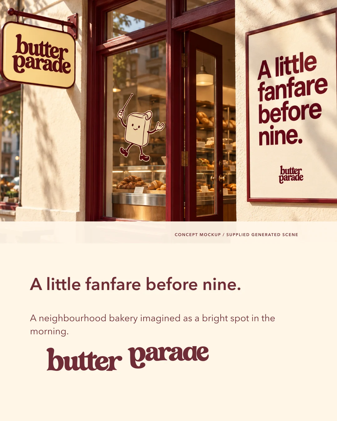
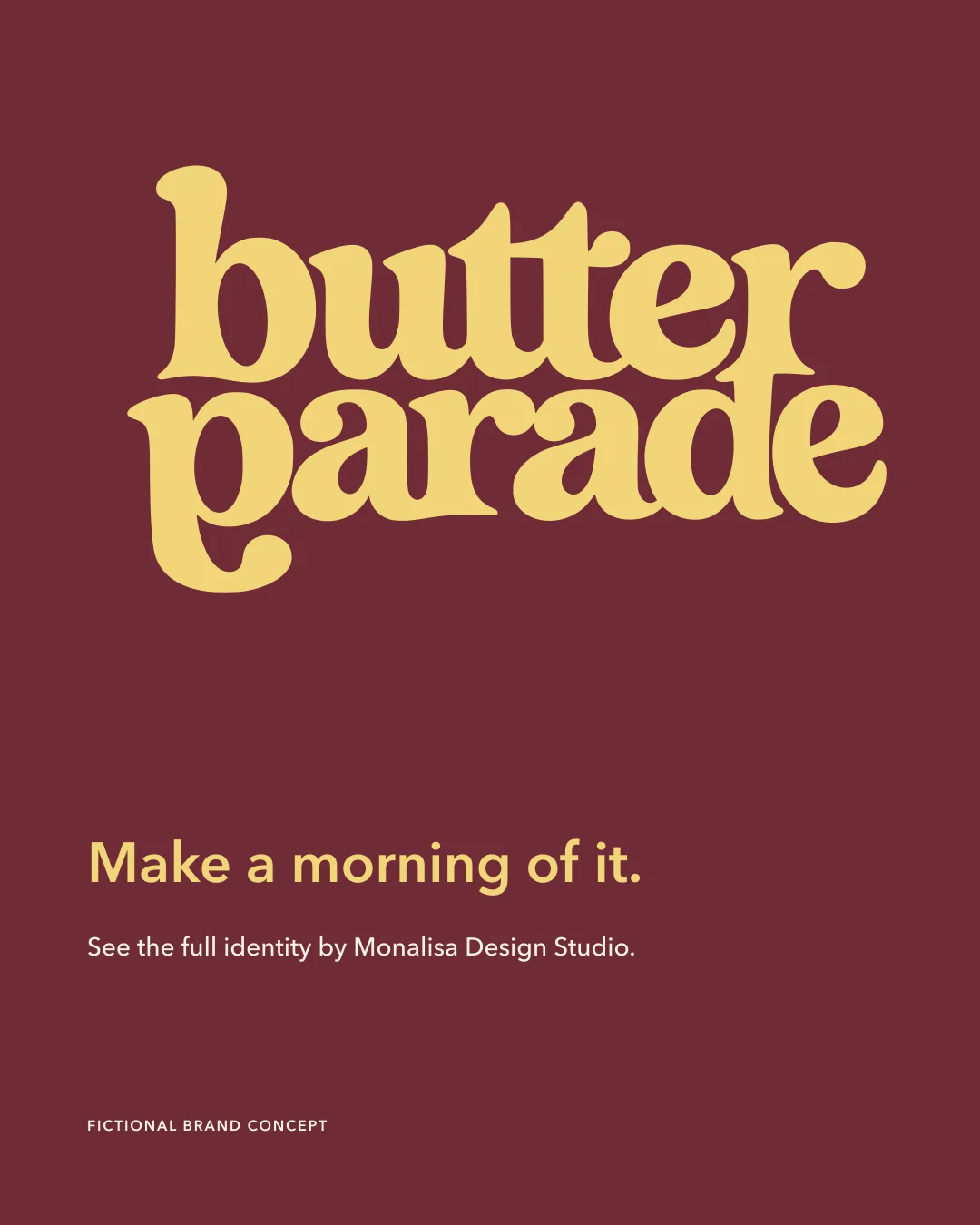
A sequence designed for the small screen. Scroll to explore.
The decisions behind the identity.
A closer look at the geometry, hierarchy and choices that hold the system together.
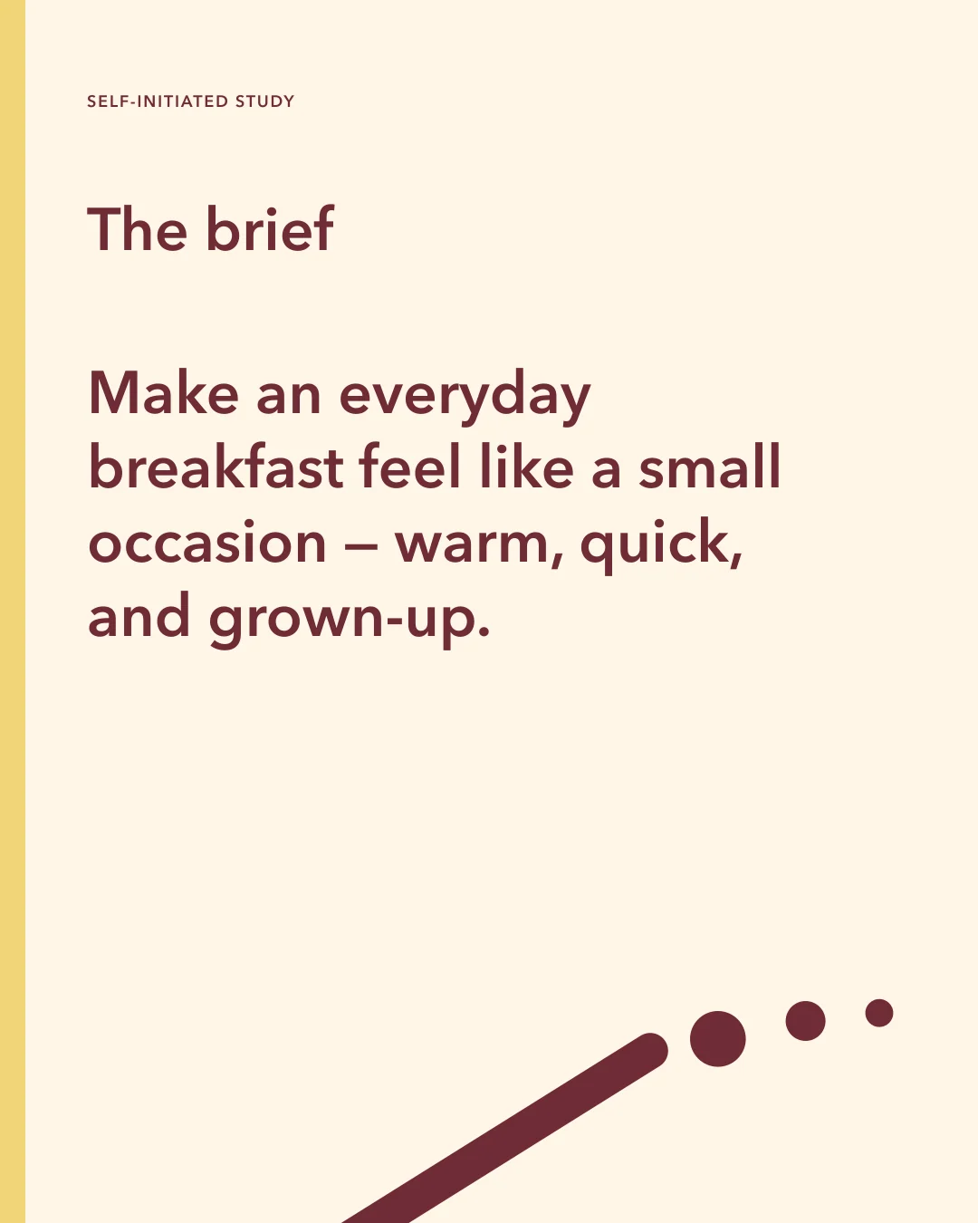
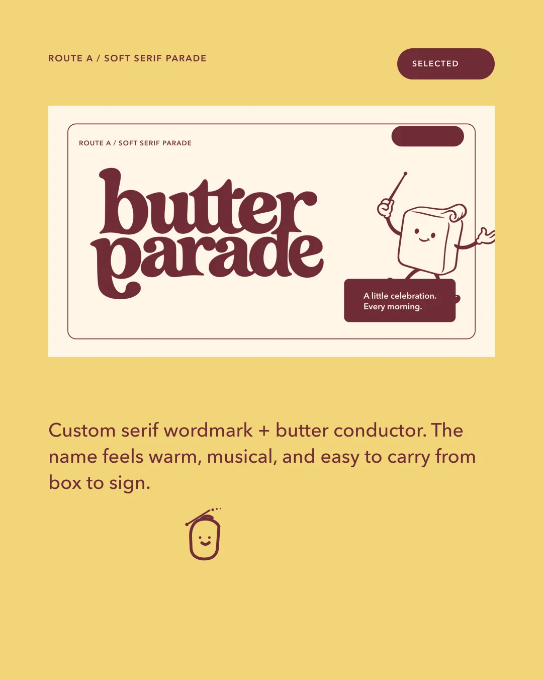
A sequence designed for the small screen. Scroll to explore.
Small screen, full character.
Supporting story compositions from the same identity system.
A sequence designed for the small screen. Scroll to explore.
Concept, visual identity and art direction for Monalisa Design Studio. This is a self-initiated portfolio project for a fictional brand.
Application artwork is supplied as SVG and PNG. Photographic scenes use AI-generated concept imagery. The project does not represent a client commission or an operating business.