
Third Helping
Worth another helping.
SELF-INITIATED CONCEPTFICTIONAL BRAND / 2026
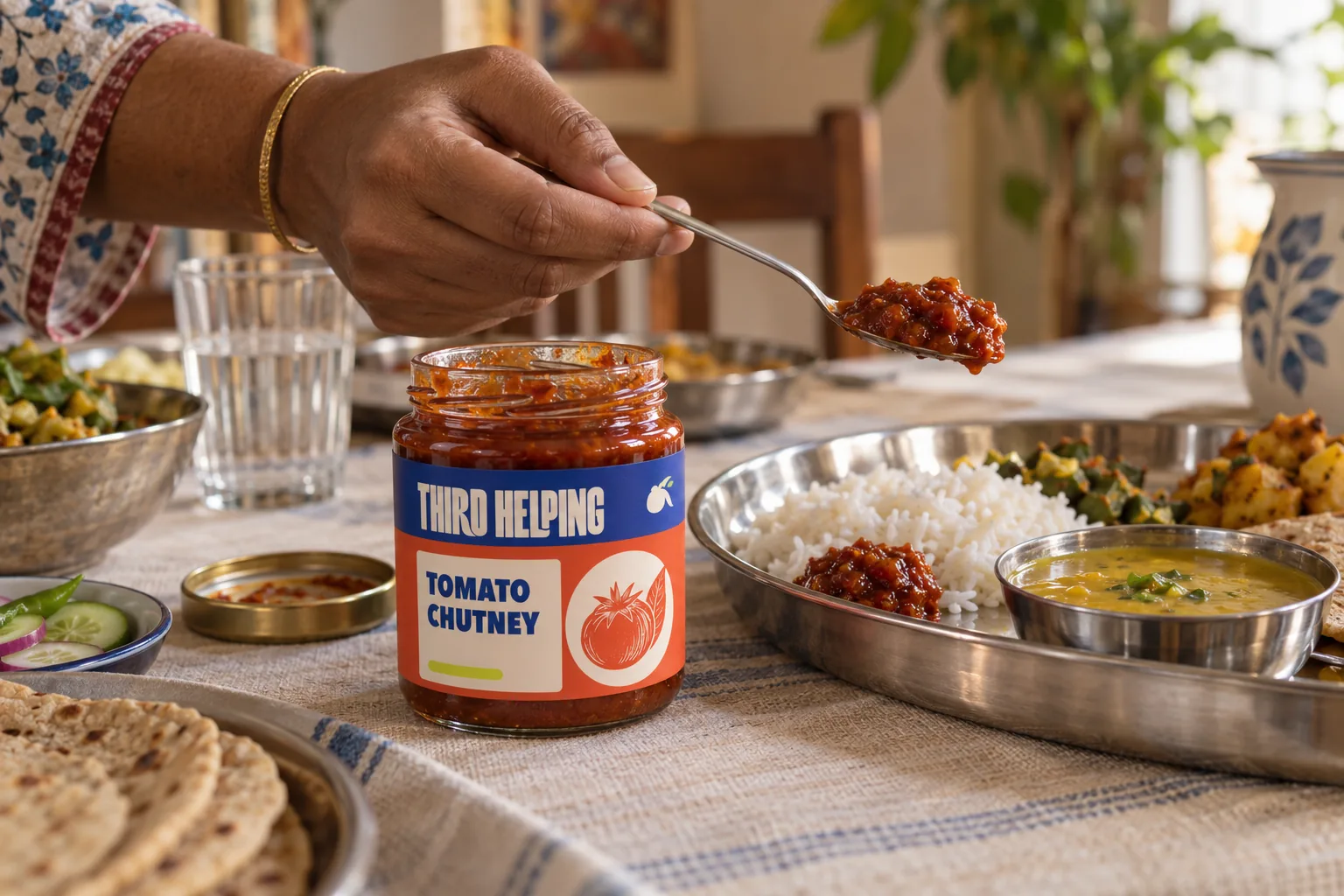
Chutneys, pickles, and finishing condiments that make weekday meals worth another helping.
The imagined audience is the weekday cook who already has a meal in mind and wants one generous finishing note, not a complicated new ritual.
The condiment is the invitation to reach back in. One firm label grid gives the range shelf clarity; ingredient woodcuts and printed-paper texture keep it rooted in the pantry.
- Audience
- Home cooks and pantry browsers who want an easy, generous finishing note for a familiar weekday plate.
- Design scope
- Visual identity, Application artwork, Social series, Motion
- Project type
- Self-initiated identity exploration. Fictional business.
An invitation to pass it around.
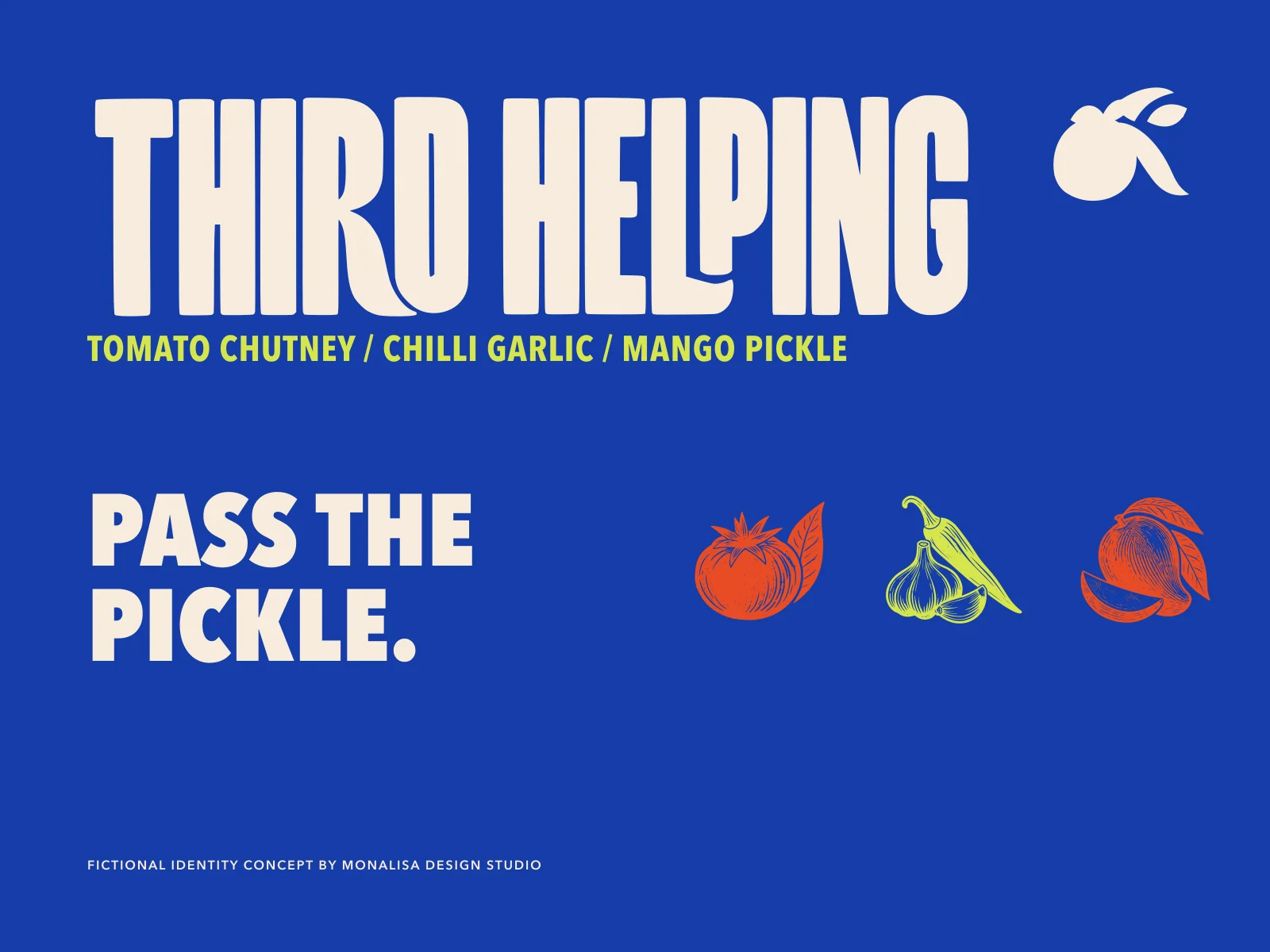
A compact wordmark and a three-part ingredient mark give the name its character. Drawn ingredients and direct labels keep a lively food brand easy to read.


Made for the kitchen shelf.
A shared label structure holds the range together, while flavour colours help each jar find its place.
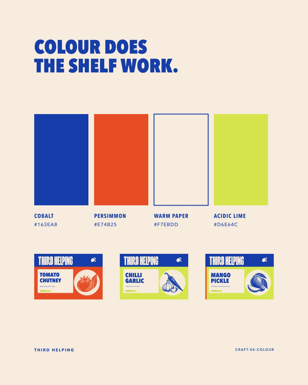
Cobalt holds the shelf. Lime interrupts it.
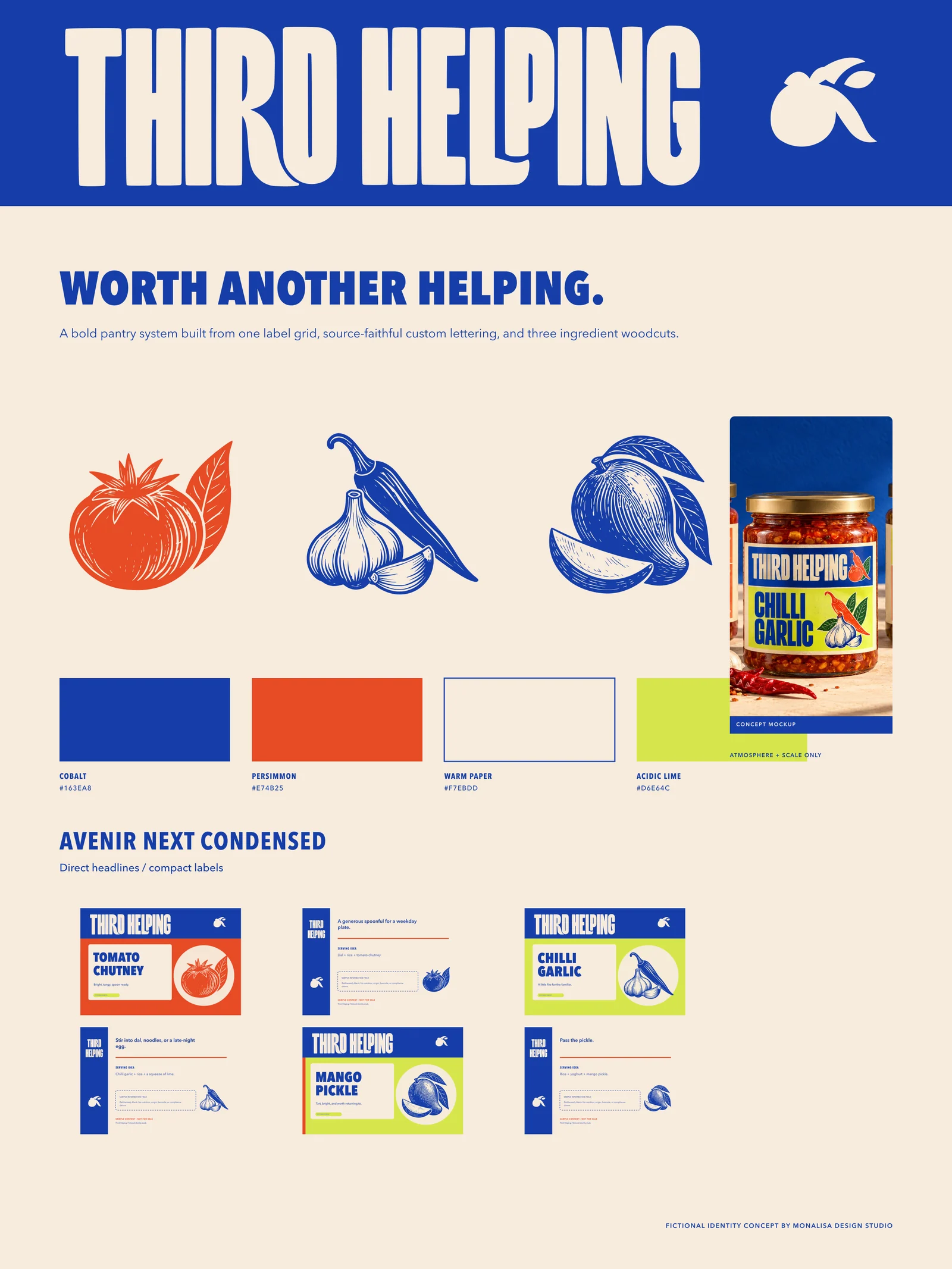
Avenir Next Condensed delivers the direct pantry voice. Cobalt anchors; Persimmon brings appetite; Warm Paper gives labels room; Acidic Lime flags a variant.
Primary ink, brand band, shipping box, digital anchor.
Appetite/ingredient field, tomato and chilli signal, campaign block.
Label ground, recipe card, back-label reading field, presentation base.
Variant flag, chilli-garlic/mango field, small shelf interruption.
Avenir Next Condensed / Avenir Next
Good food travels.
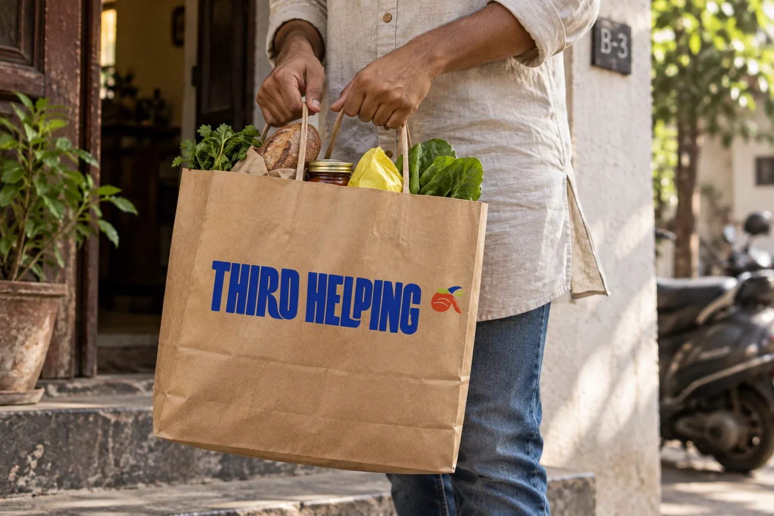
From a familiar table to a small gift, the same generous voice carries through paper, cloth and print.
A small movement. A distinct character.
A short, silent animation built from the same vector identity. The poster provides a still alternative.
Download the filmTHE COMPLETE IDENTITY SYSTEMGo a little deeper.Explore the full artwork, applications and social series.
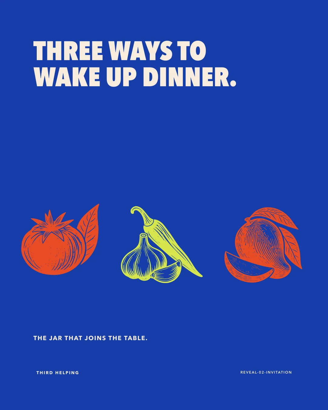
The jar that joins the table.
Third Helping sounds generous, social, and easy to remember. It turns a condiment into an invitation without claiming a real serving outcome.
Compact enough for a jar. Bold enough for a box.
A condensed display wordmark gives the range shelf confidence. The ingredient triad keeps the food story close without becoming a mascot.

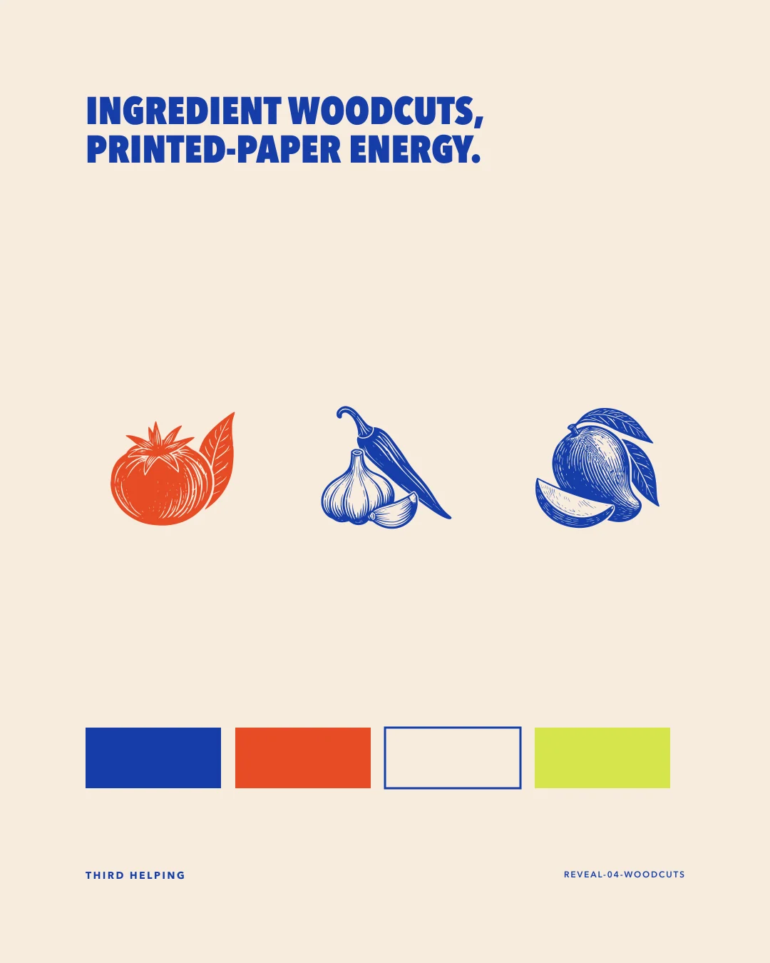
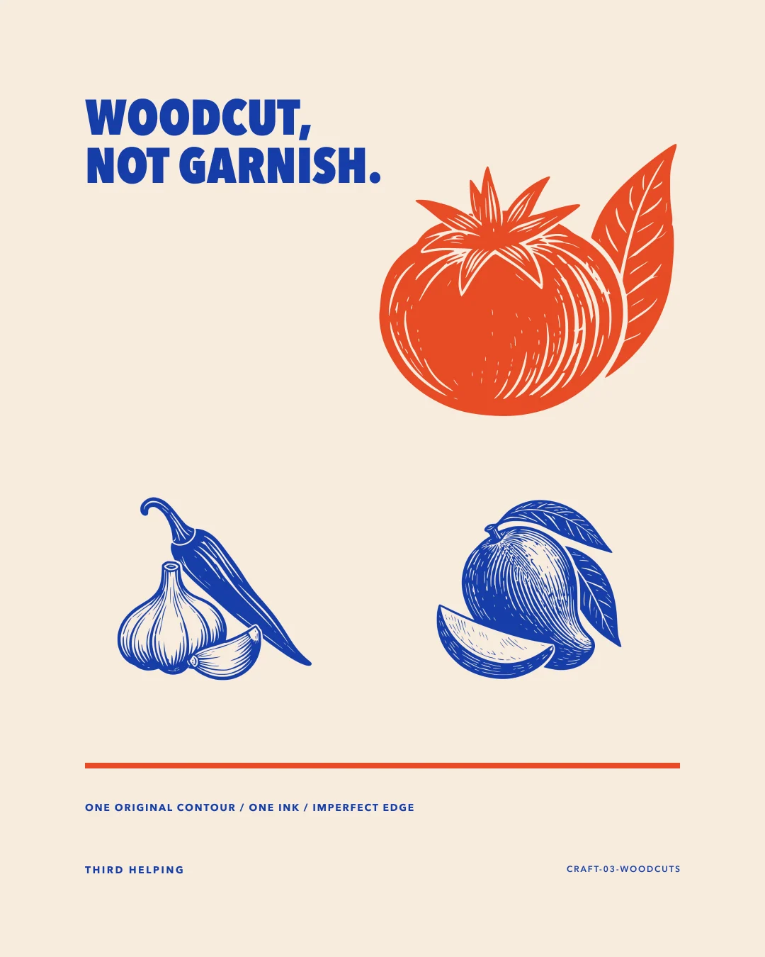
Three ingredients, one ink language.
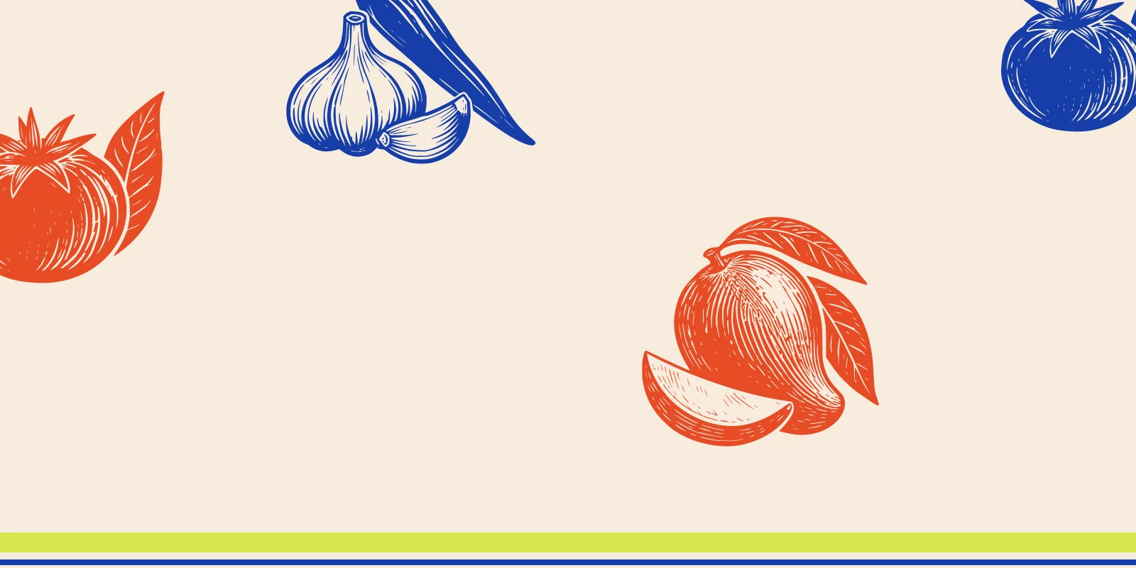
Tomato, chilli-garlic, and mango are drawn as original woodcut vectors with a common contour, hatch, and slightly irregular edge.



Cobalt holds the shelf. Lime interrupts it.
Avenir Next Condensed delivers the direct pantry voice. Cobalt anchors; Persimmon brings appetite; Warm Paper gives labels room; Acidic Lime flags a variant.
Primary ink, brand band, shipping box, digital anchor.
Appetite/ingredient field, tomato and chilli signal, campaign block.
Label ground, recipe card, back-label reading field, presentation base.
Variant flag, chilli-garlic/mango field, small shelf interruption.
Avenir Next Condensed / Avenir Next
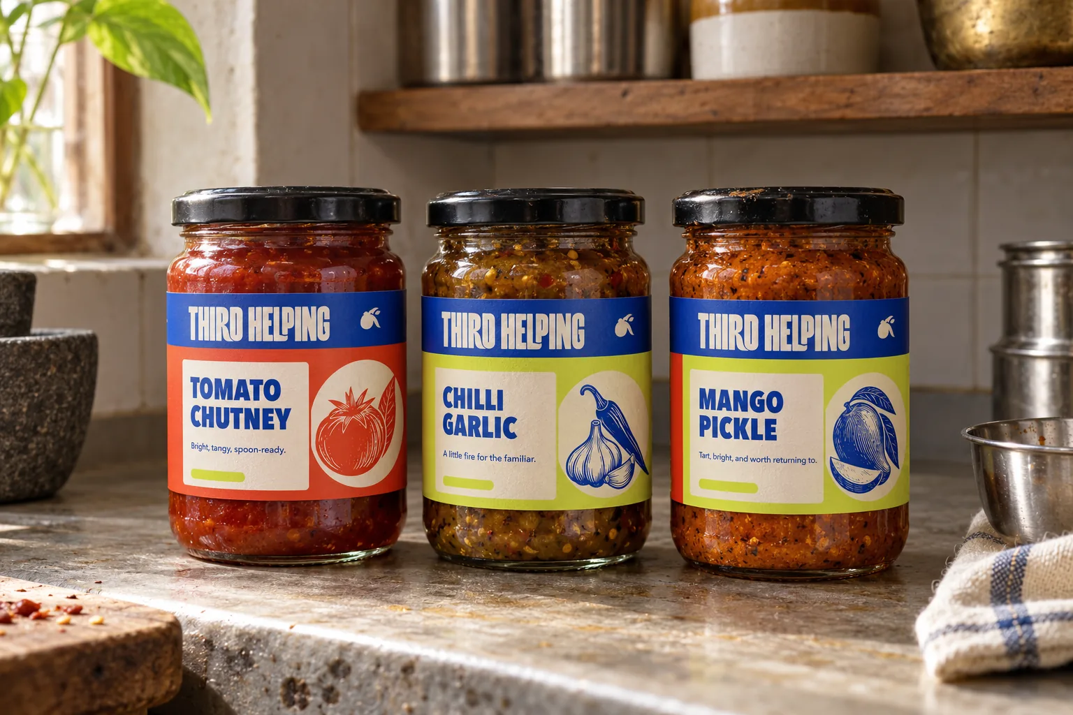
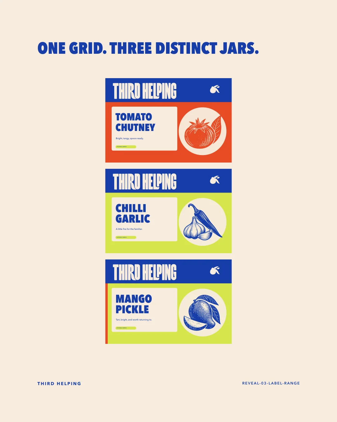
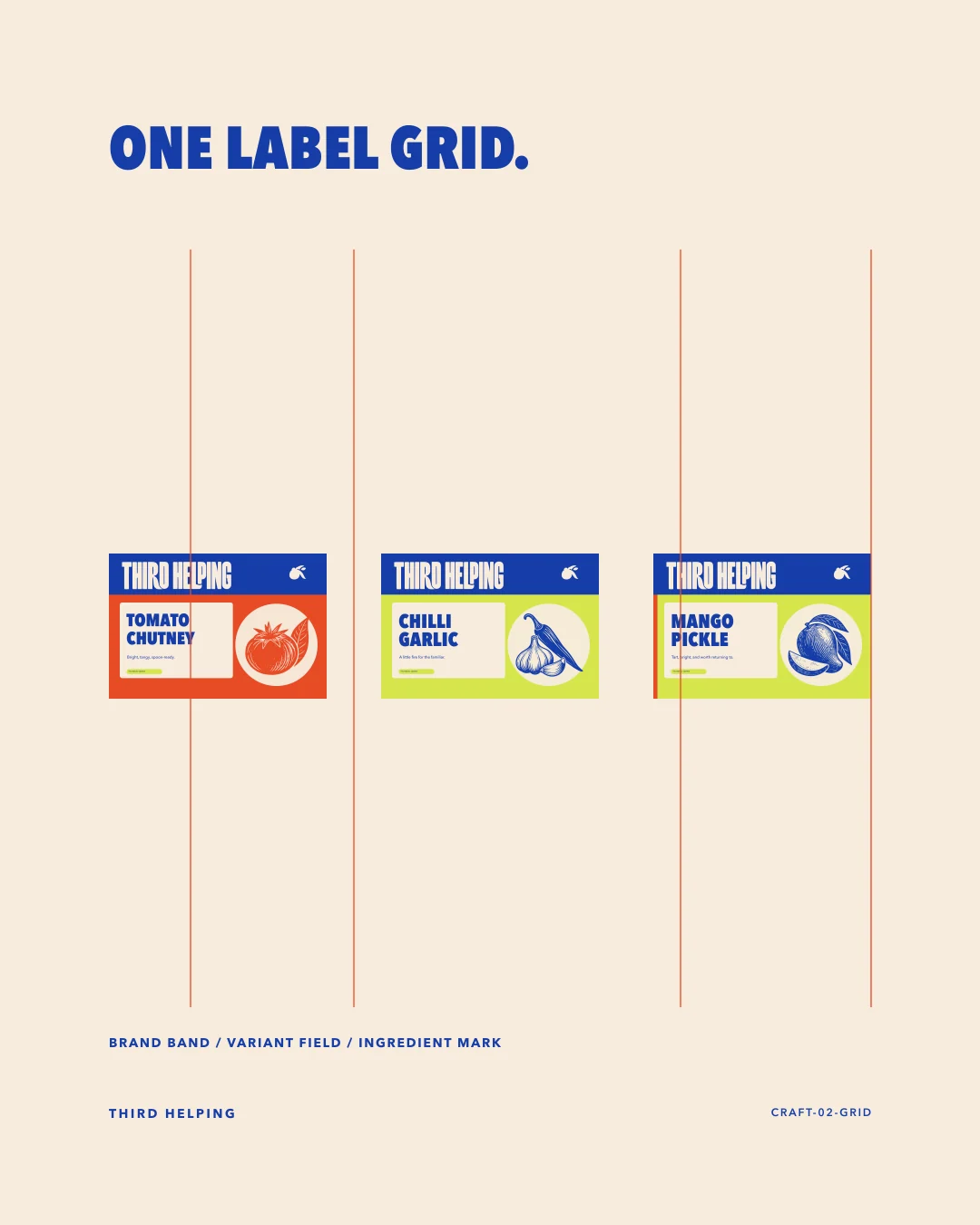
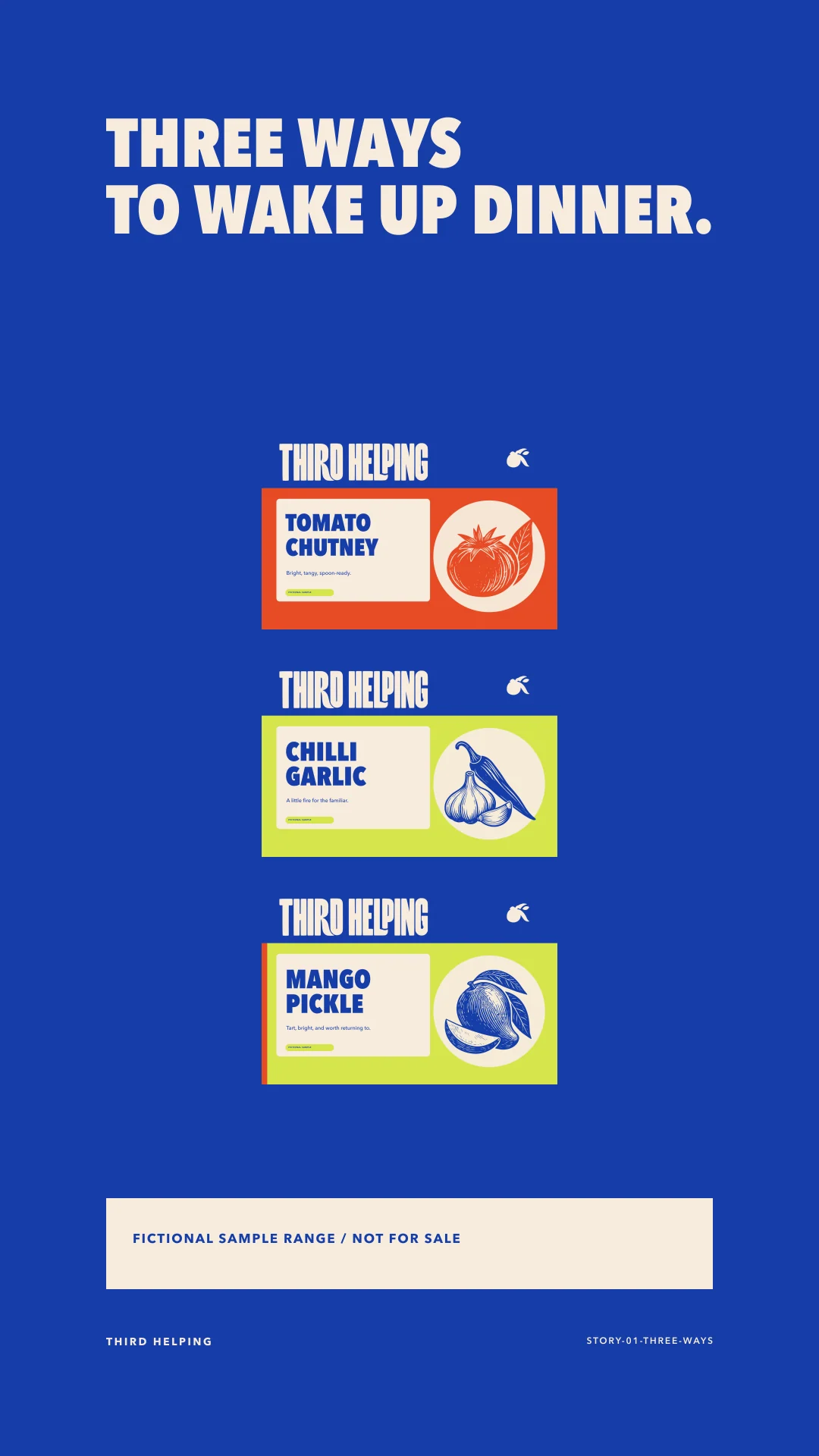
One firm grid. Three distinct jars.
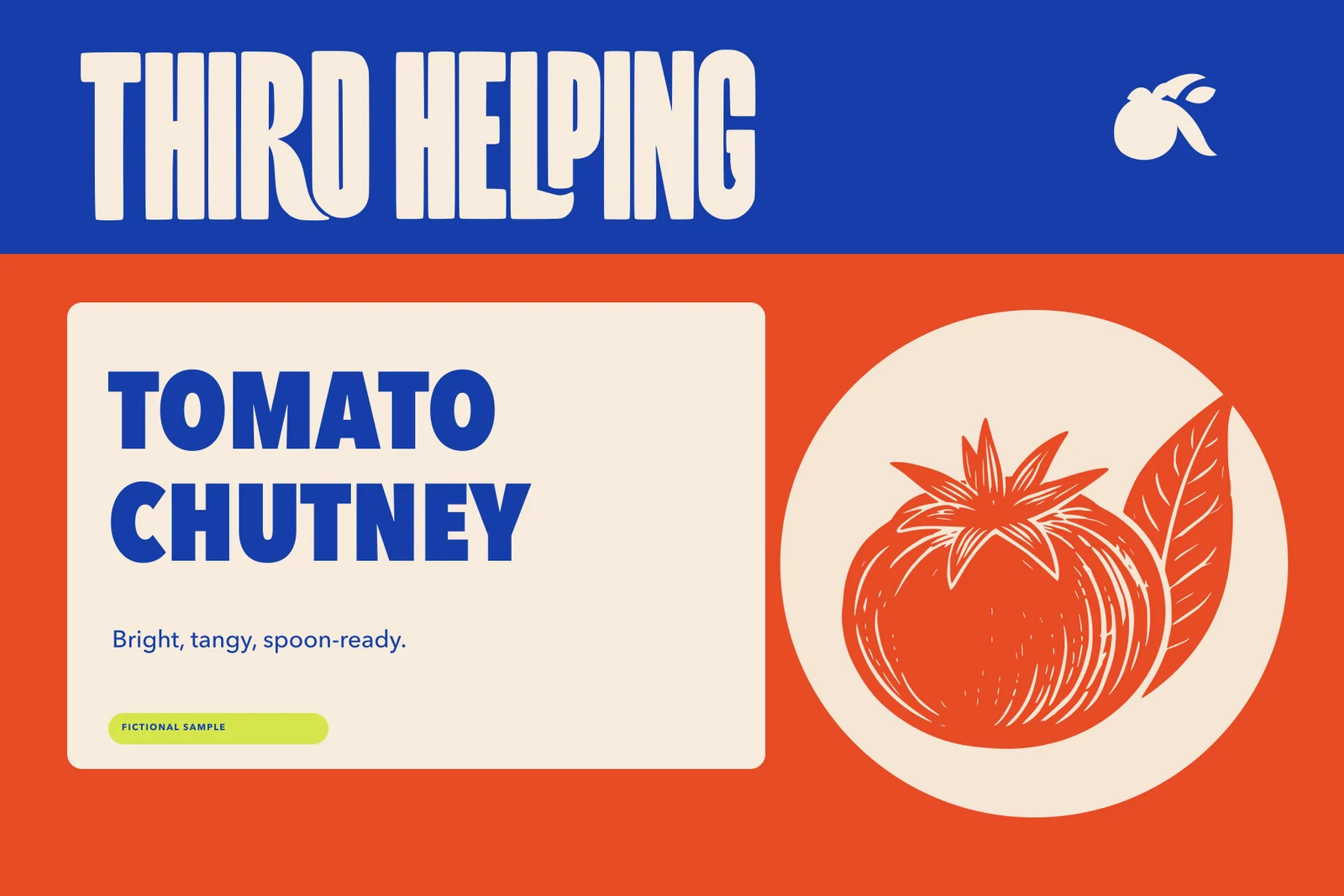
Every front label repeats the same brand band, variant hierarchy, ingredient mark, and fictional sample notice. Colour and illustration do the differentiation.
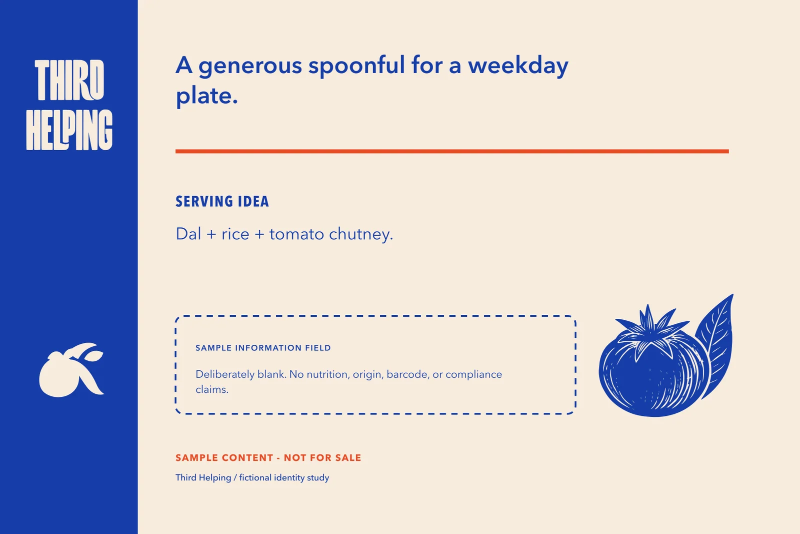
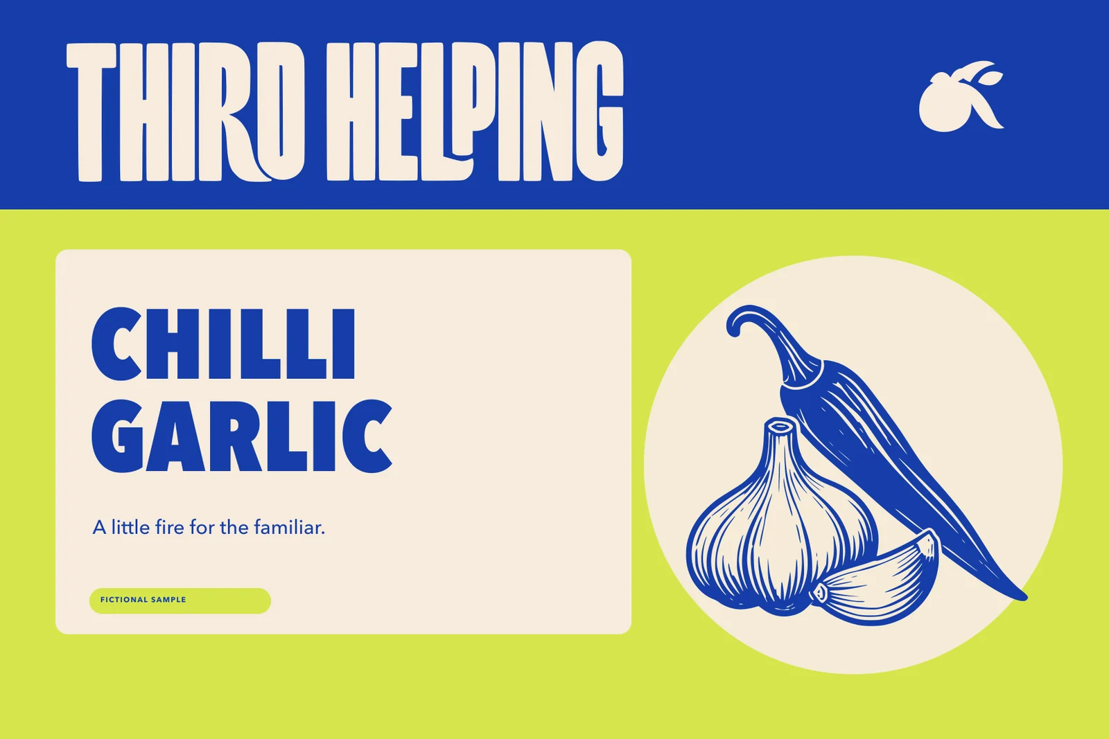
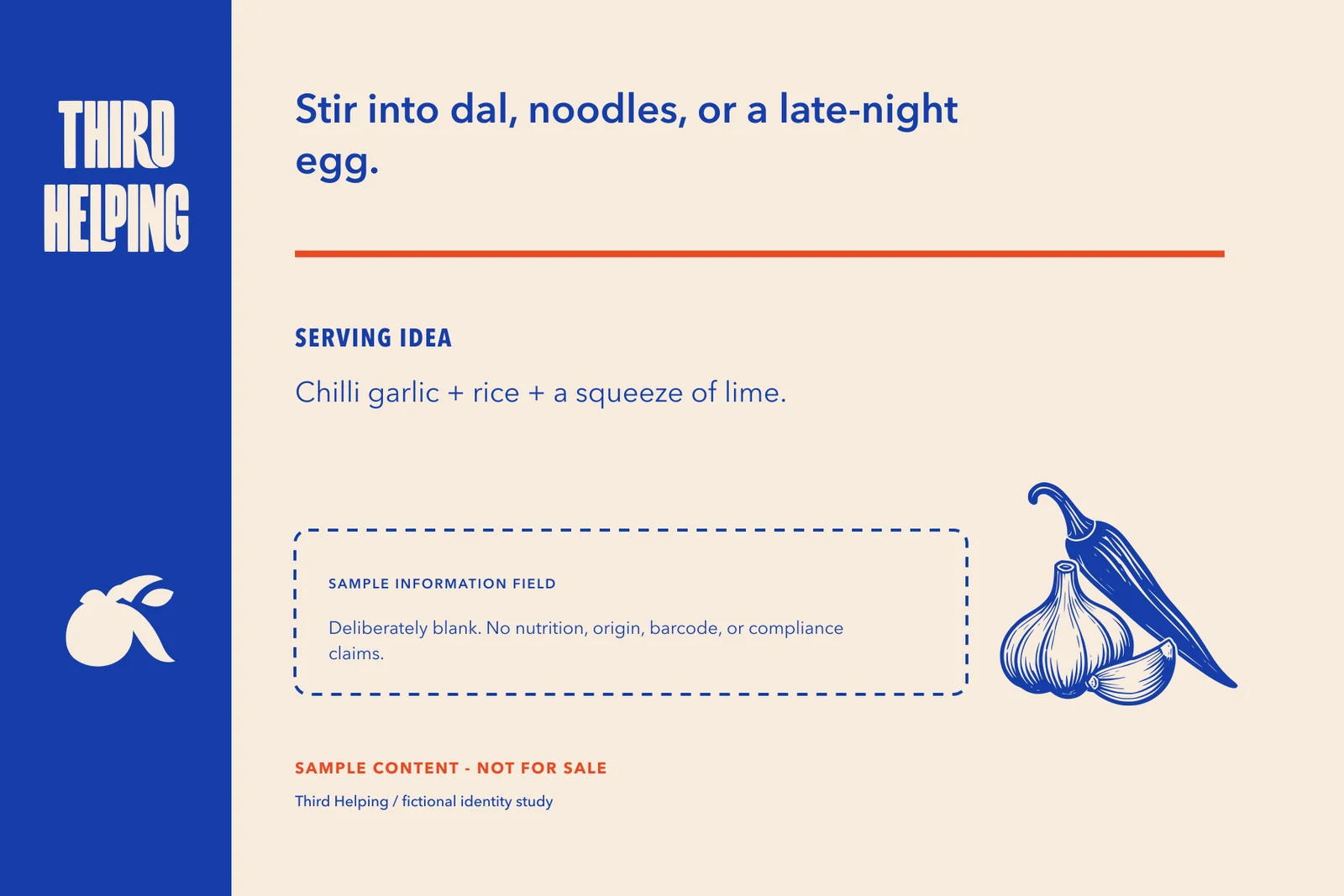
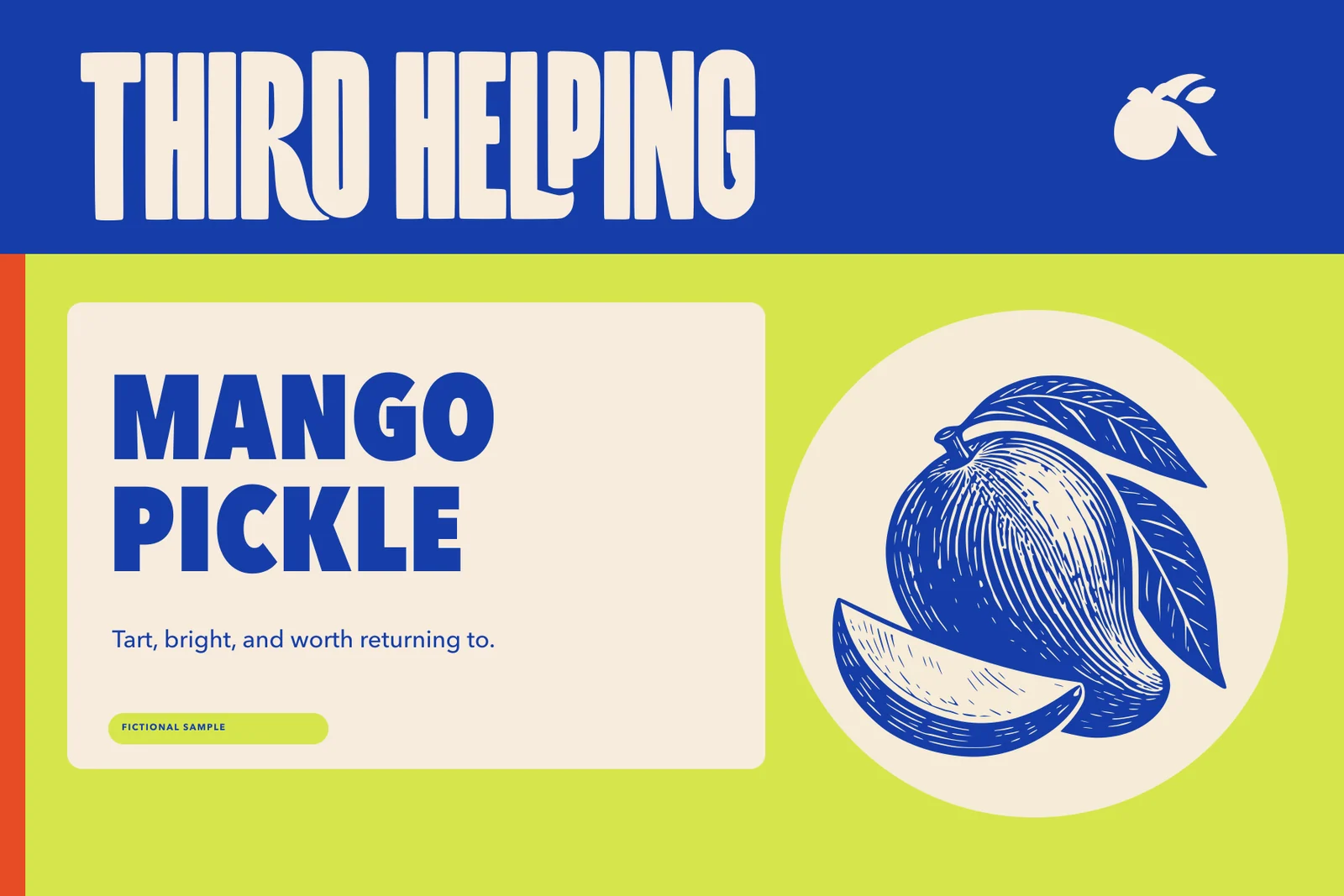
A range that reads before the flavour does.
The three variants share a parent system, but each has a fast visual cue. The generated jar image remains a concept scene; the flat labels are the exact artwork.
From pantry shelf to shared table.
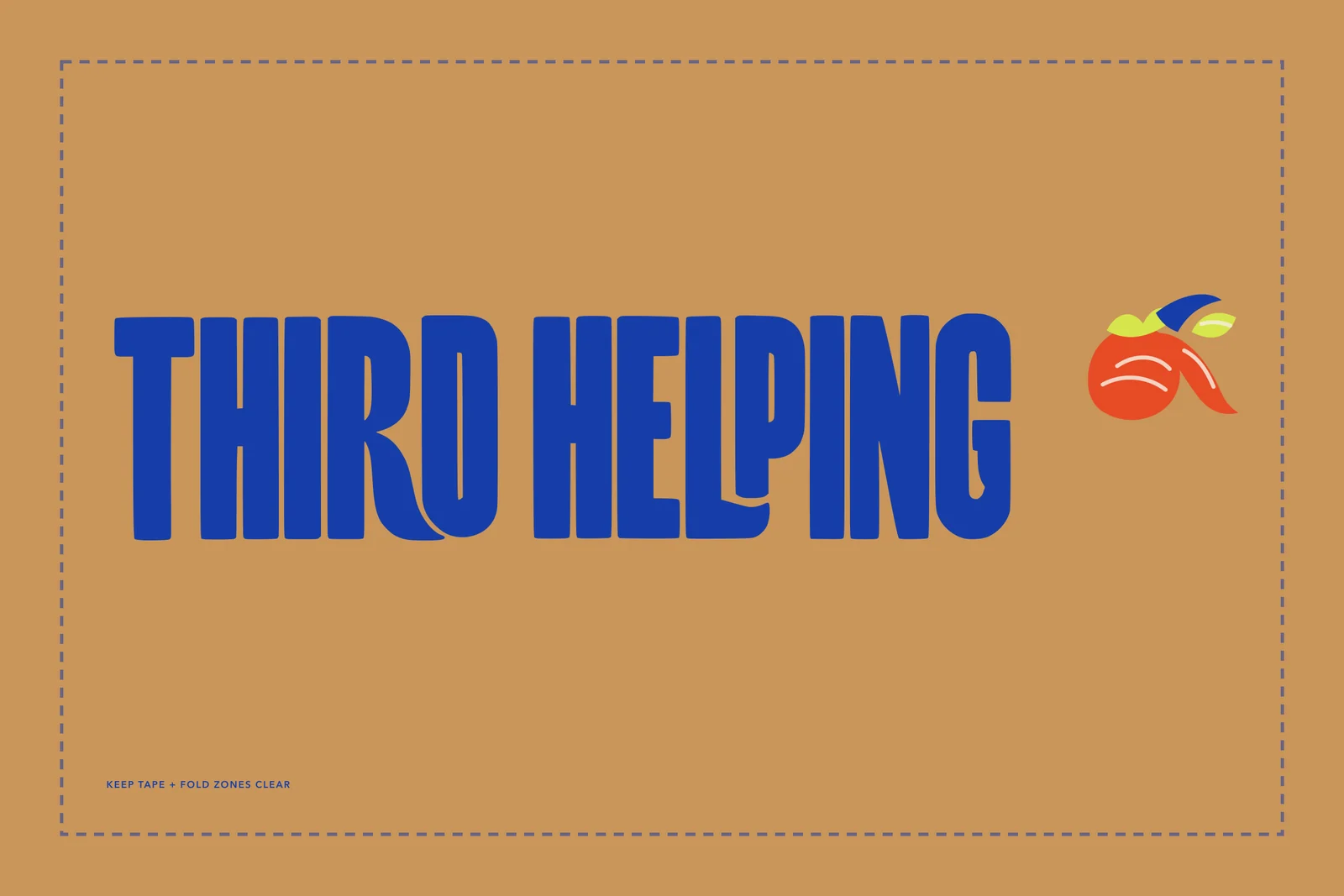
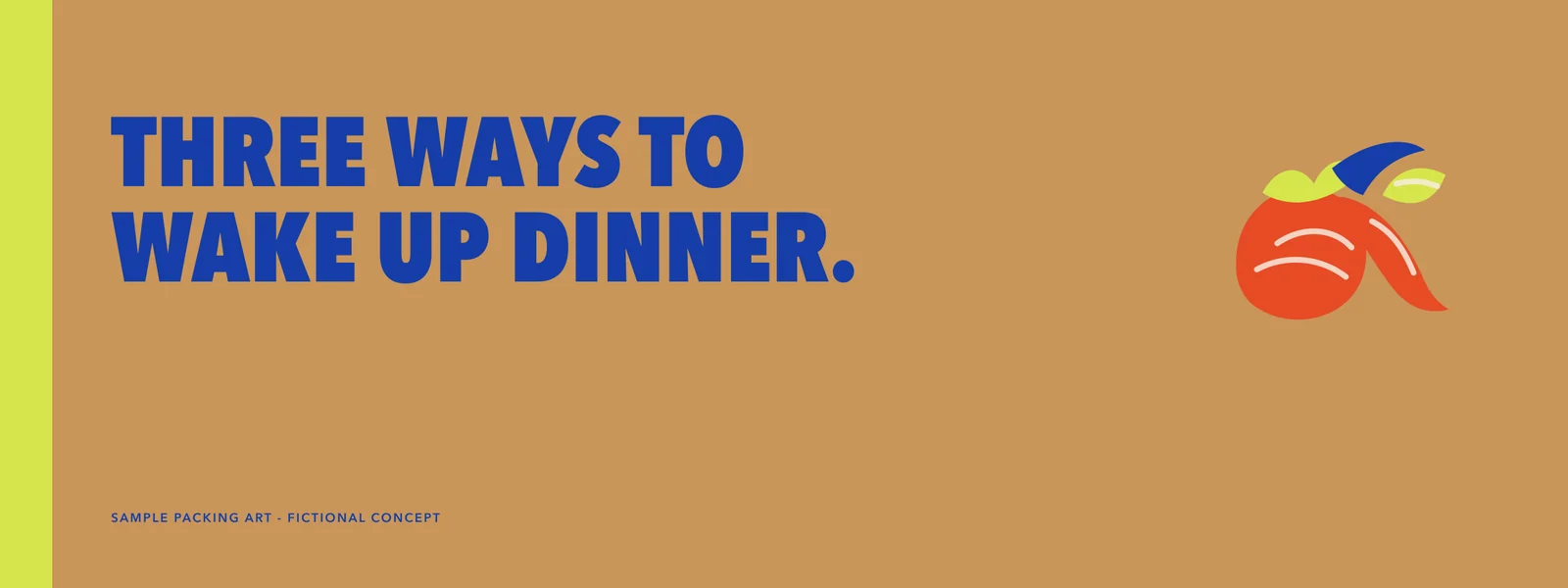
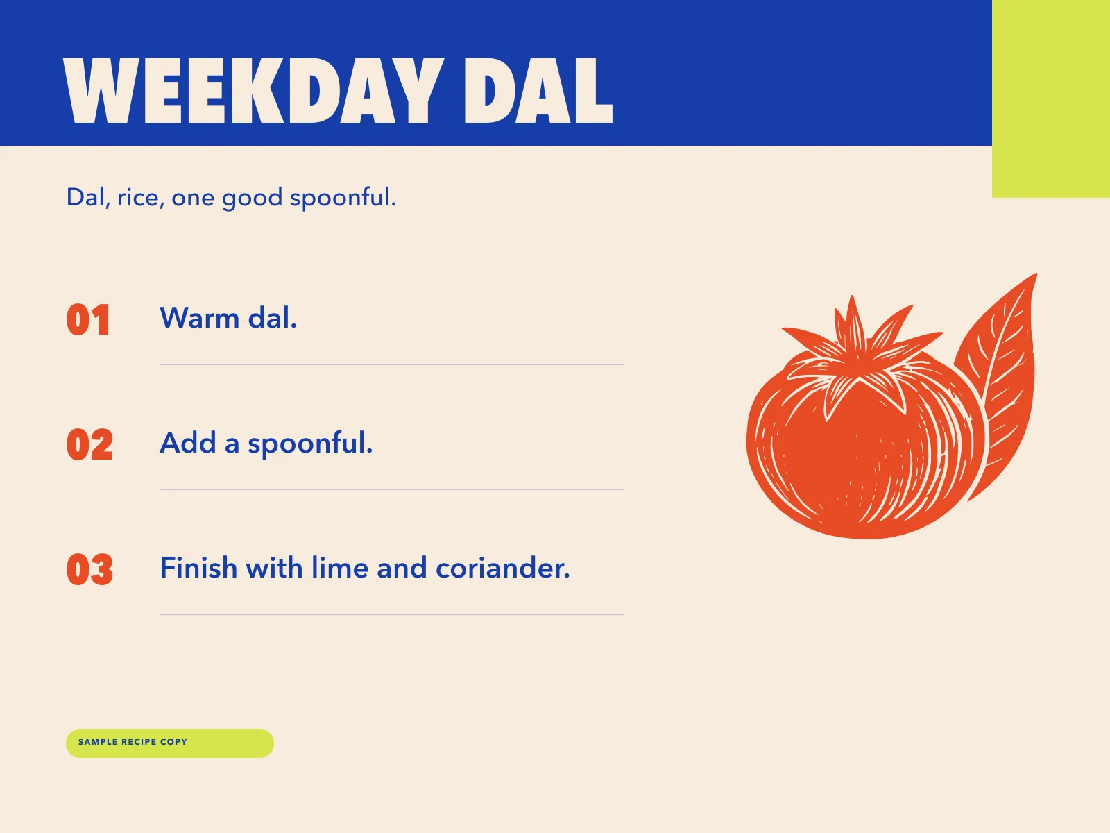
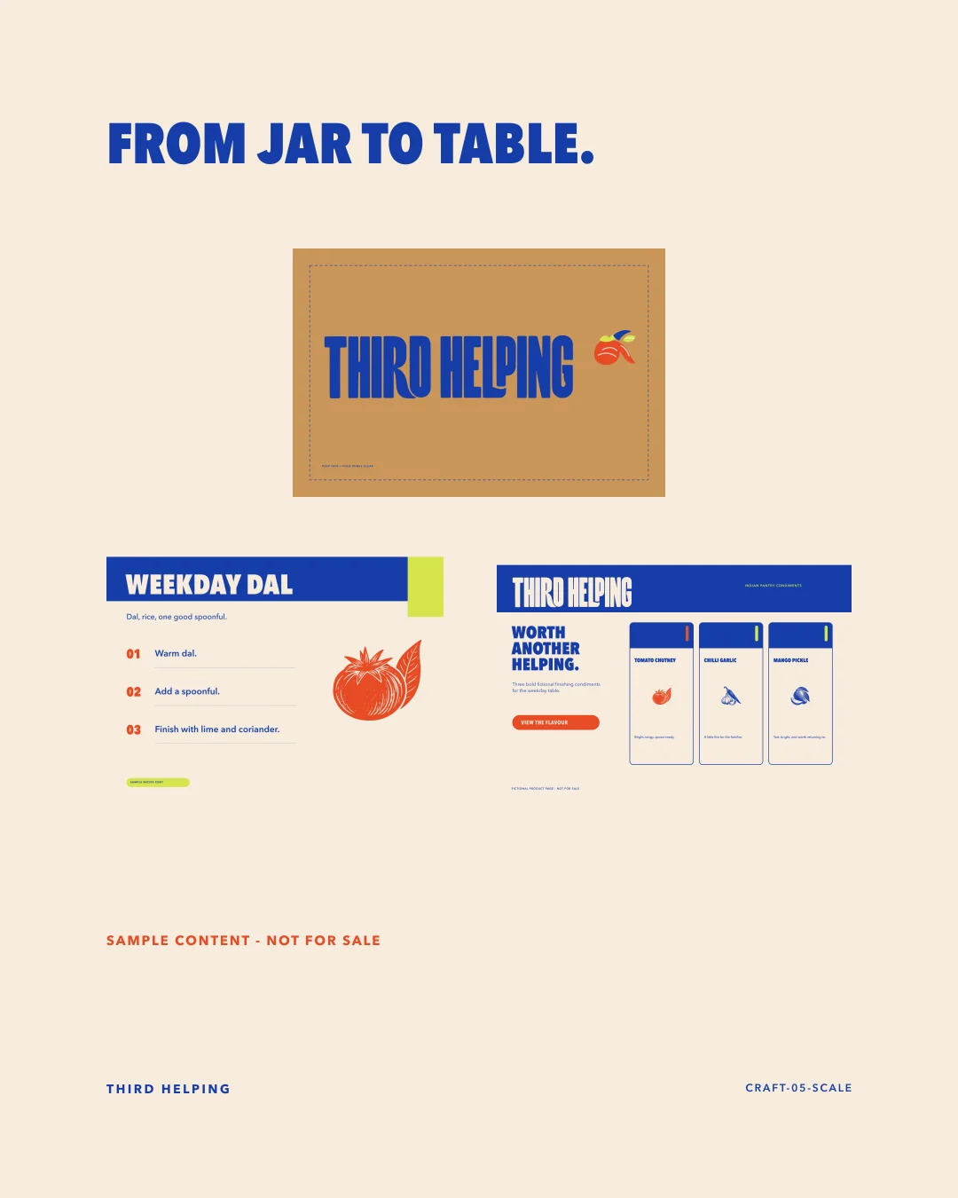
The shipping box and recipe card extend the same band-and-woodcut logic. Weekday Dal is fictional sample recipe copy, not a real product instruction.
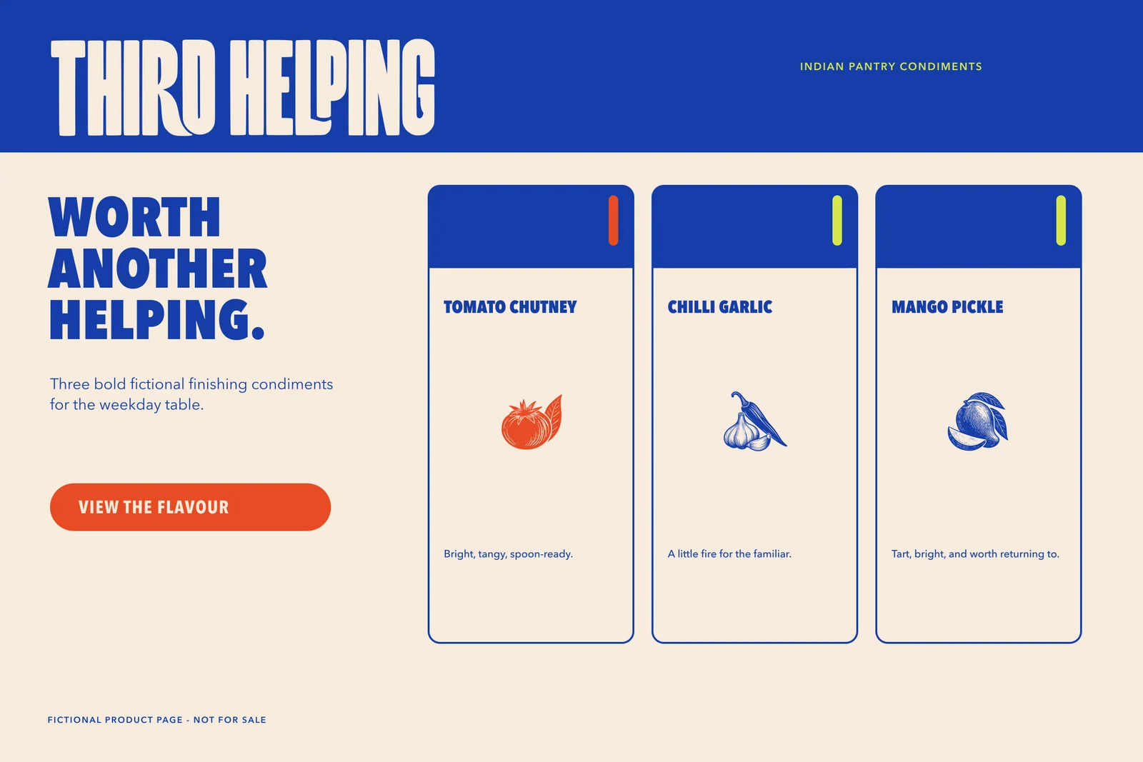
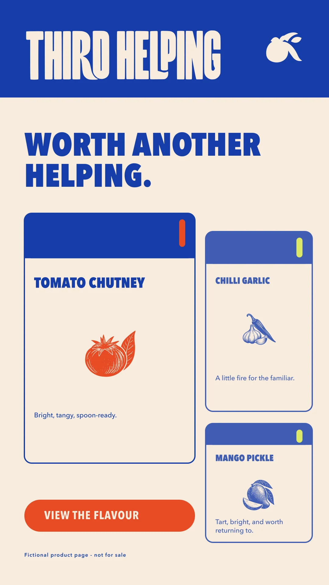
A bright little digital shelf.
The product page keeps the range simple: one anchor, three cards, short fictional descriptions, and a view action instead of an invented checkout.
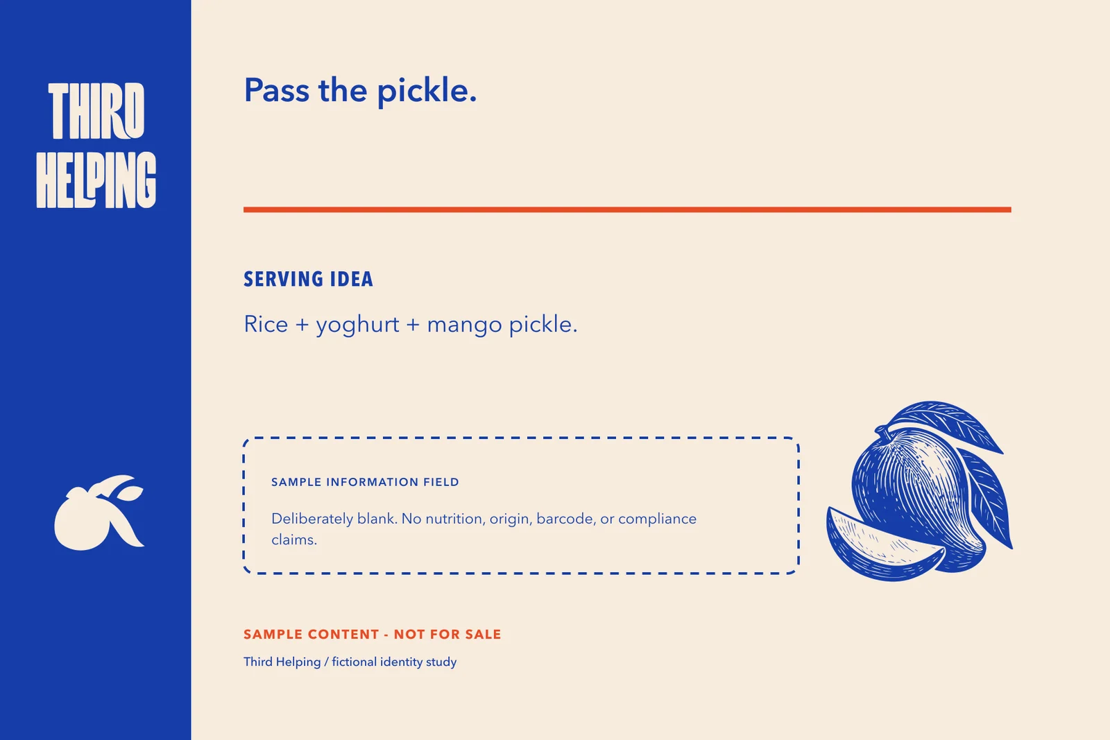
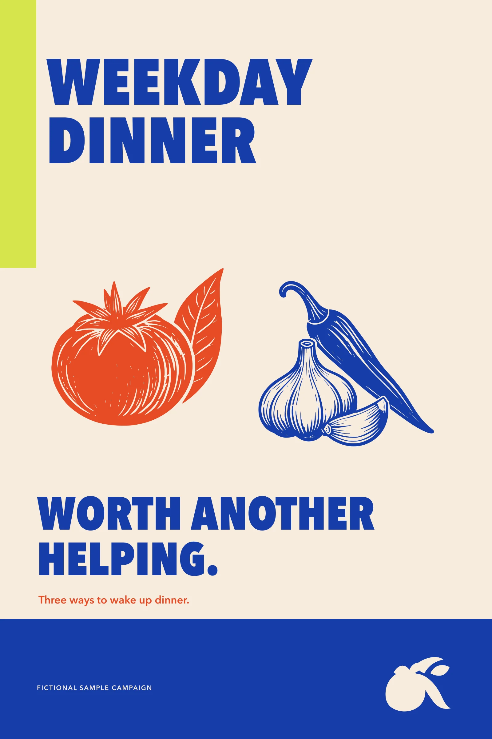
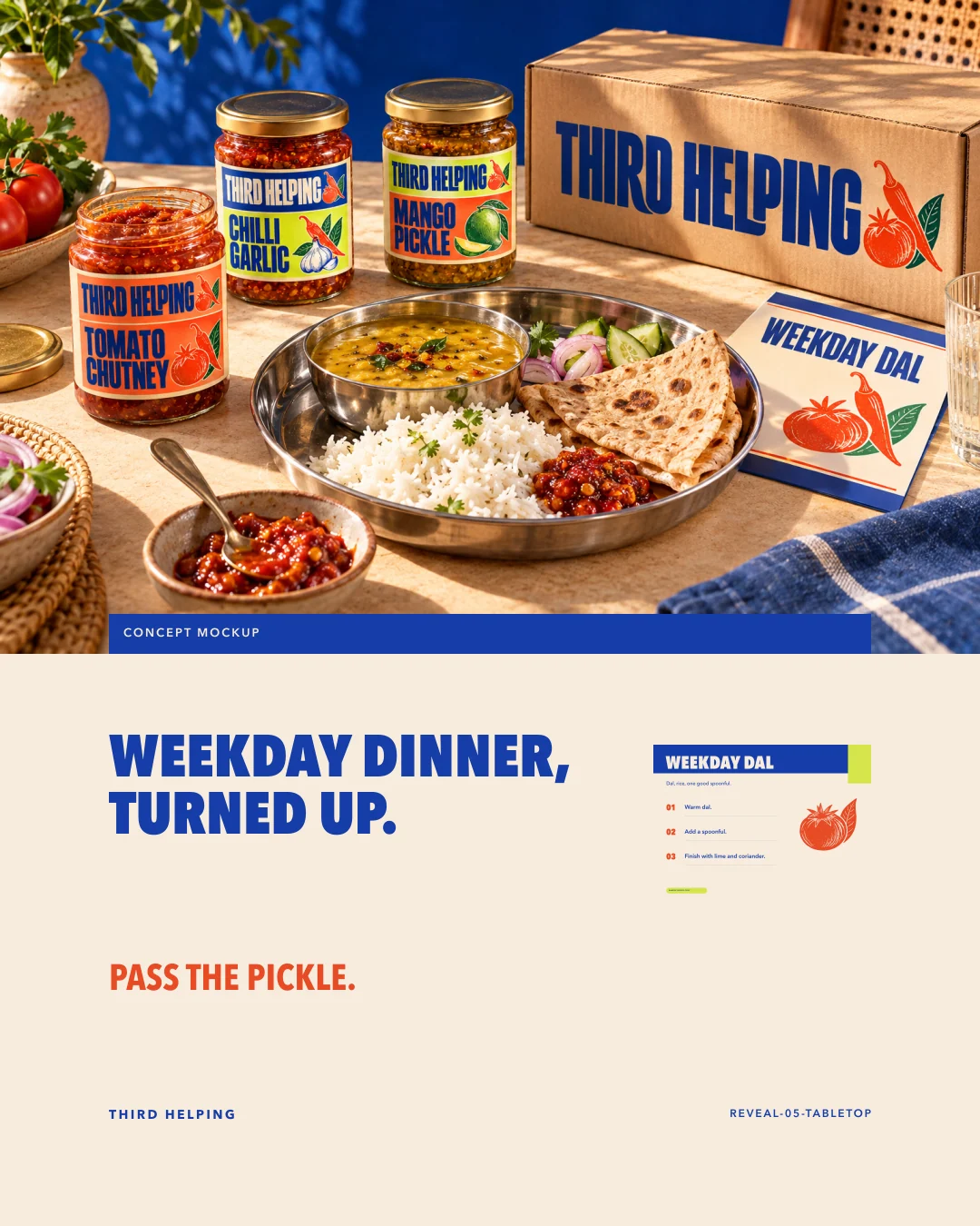
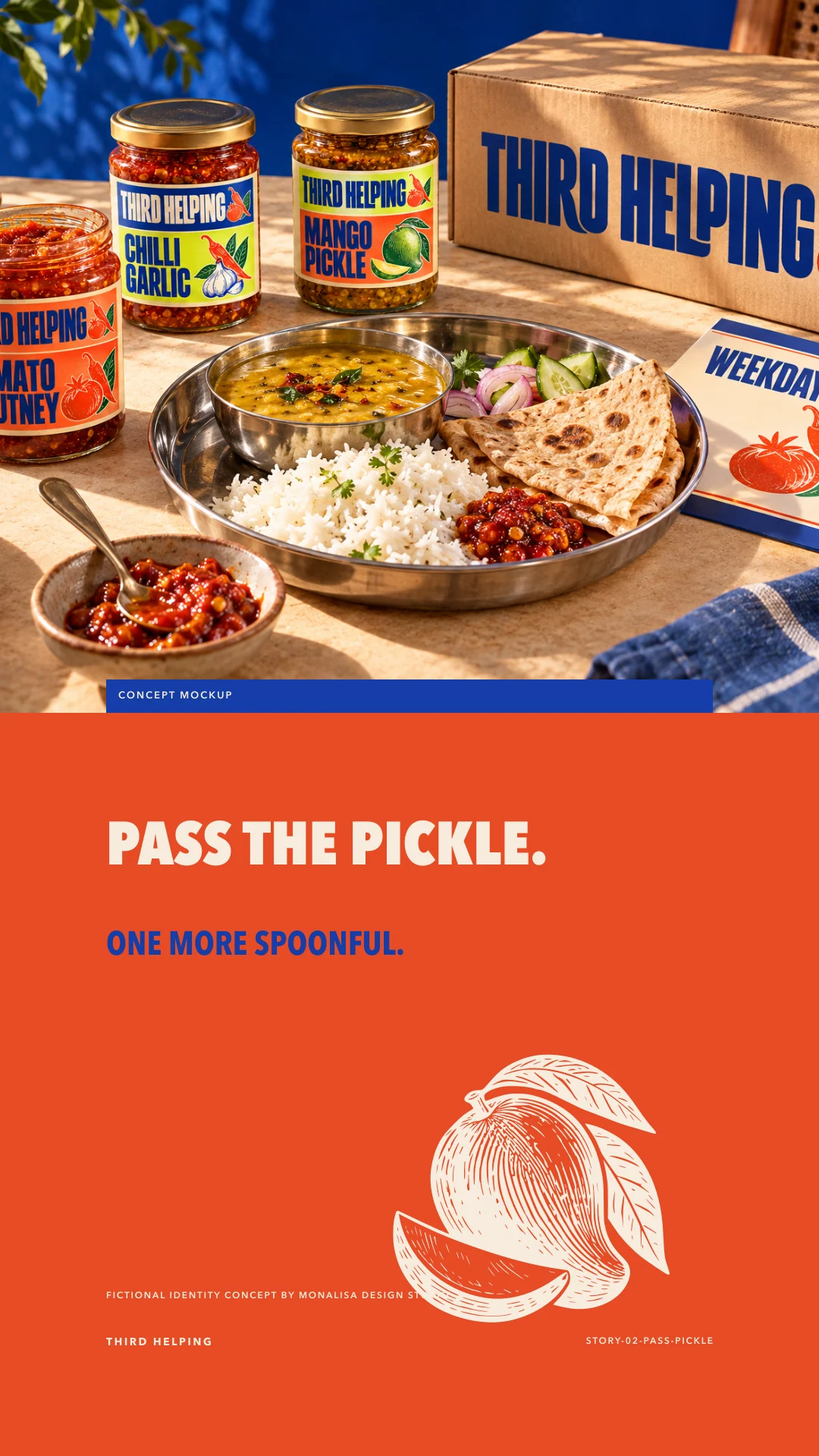
Pass the pickle.
A tabletop campaign turns the palette into appetite: Weekday dinner. Worth another helping. The supplied meal image is an atmospheric concept mockup, not evidence of a real product.
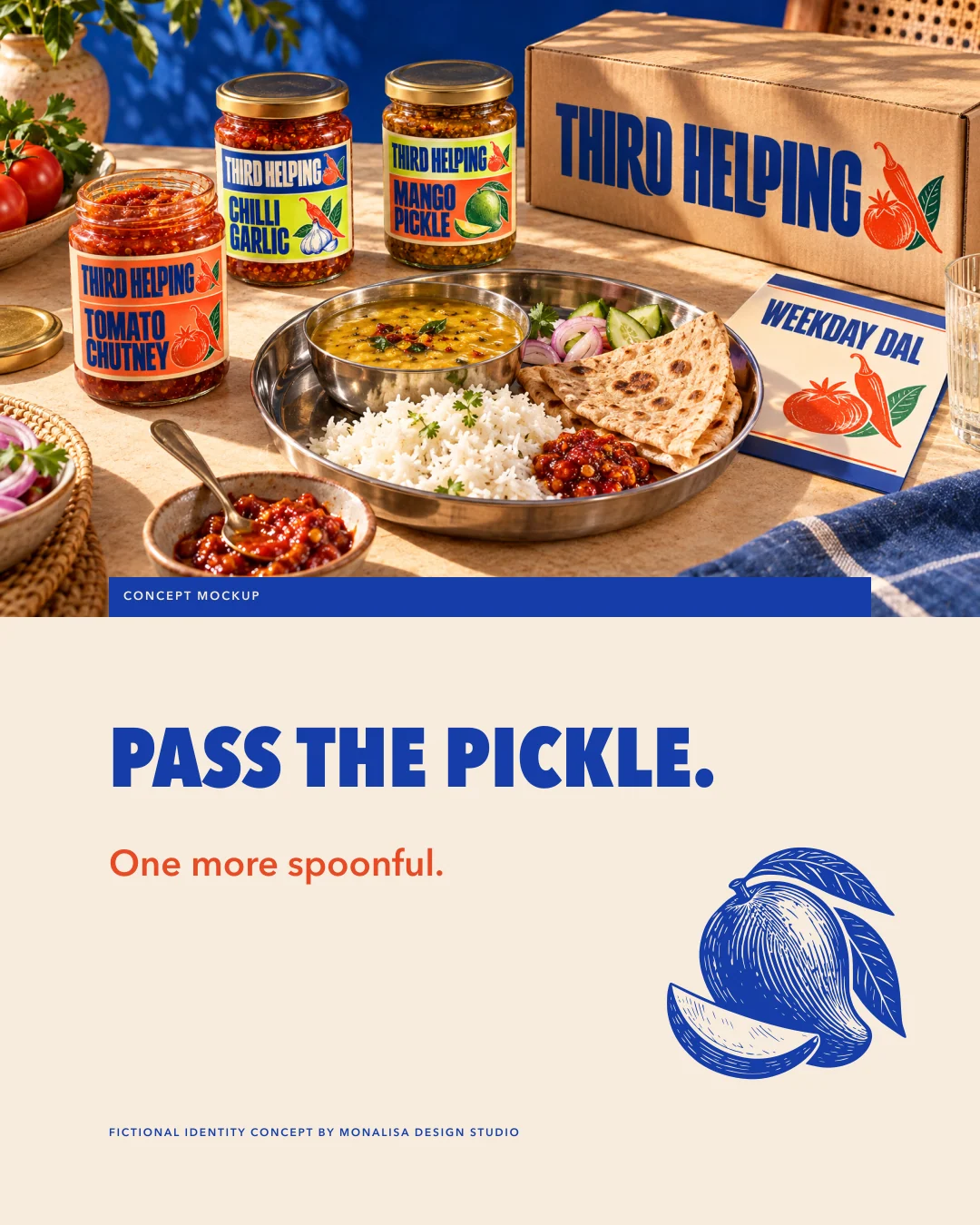
One more spoonful.
Wordmark, woodcut, label grid, and colour roles keep the pantry world generous and direct. Fictional identity concept by Monalisa Design Studio.
The smaller details, considered.
Supporting artwork from the same identity system.
The system, together.
A complete identity overview, from the mark to its everyday applications.
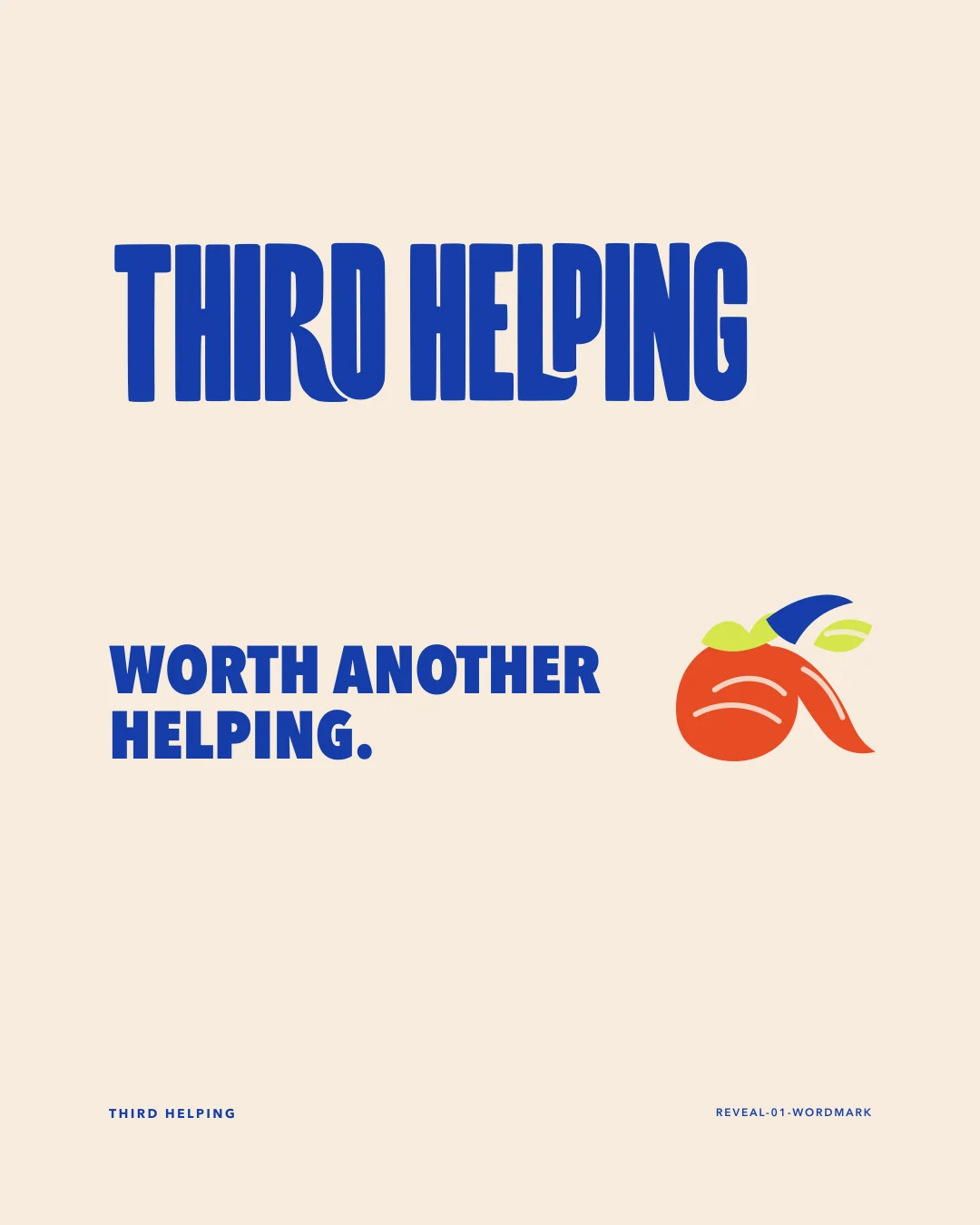
The reveal, frame by frame.
Six portraits introduce the identity, its idea and its applications.
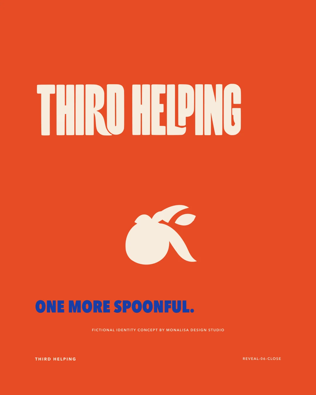
A sequence designed for the small screen. Scroll to explore.
The decisions behind the identity.
A closer look at the geometry, hierarchy and choices that hold the system together.
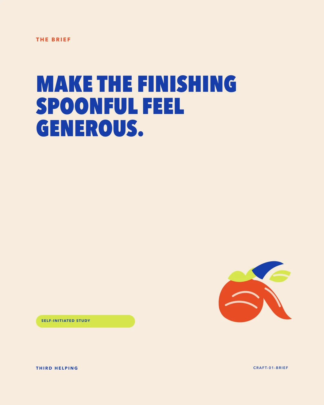
A sequence designed for the small screen. Scroll to explore.
Small screen, full character.
Supporting story compositions from the same identity system.
A sequence designed for the small screen. Scroll to explore.
Concept, visual identity and art direction for Monalisa Design Studio. This is a self-initiated portfolio project for a fictional brand.
Application artwork is supplied as SVG and PNG. Photographic scenes use AI-generated concept imagery. The project does not represent a client commission or an operating business.